
Type@Cooper Display Type, Summer 2021
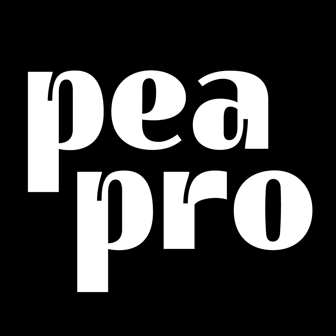
Pea Pro
Andrea Groisman
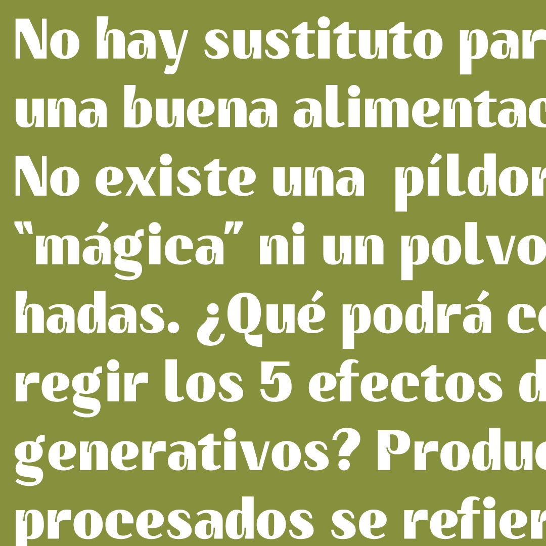
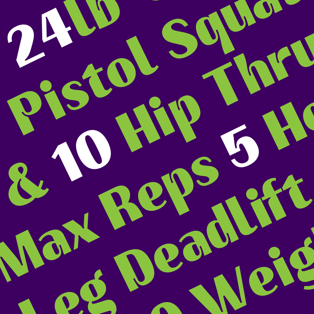
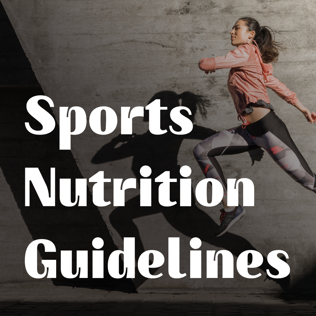
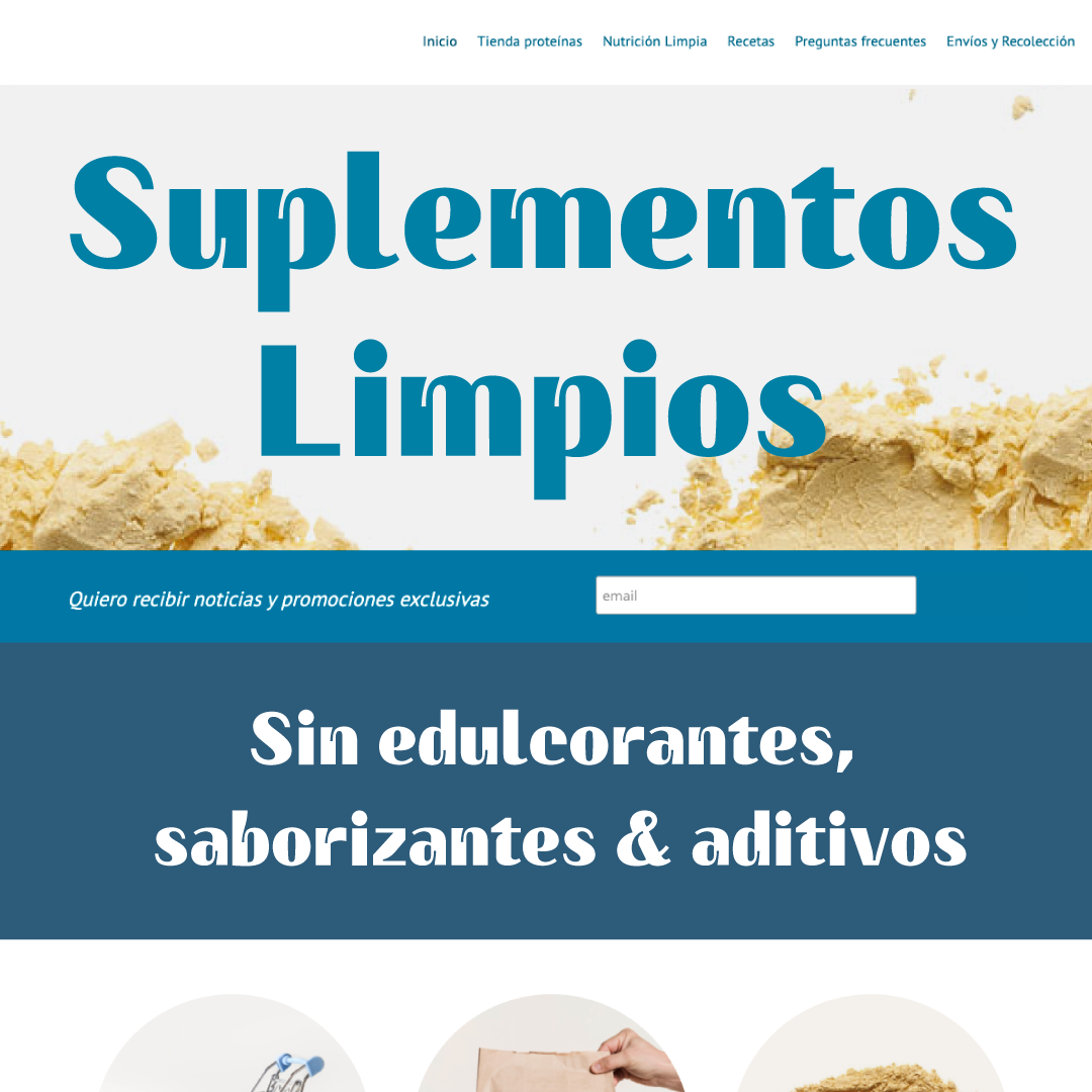
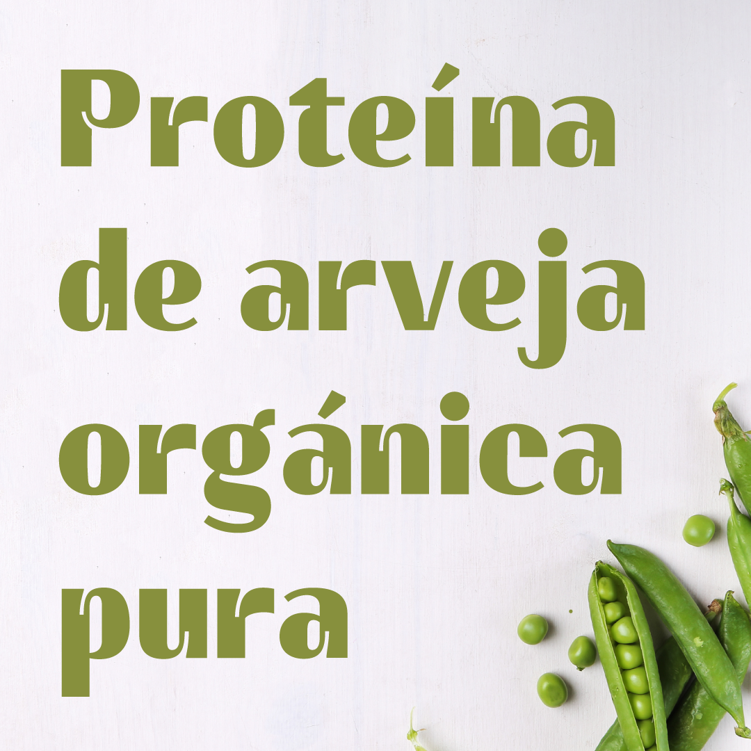
Pea Pro is display sans serif typeface inspired by the sports nutrition industry. Big ink traps and heavy weight features give it a strong character, ideal for large headings and branding applications. A variable font that will include a style without ink traps to show the contrast between healthy and unhealthy lifestyles.
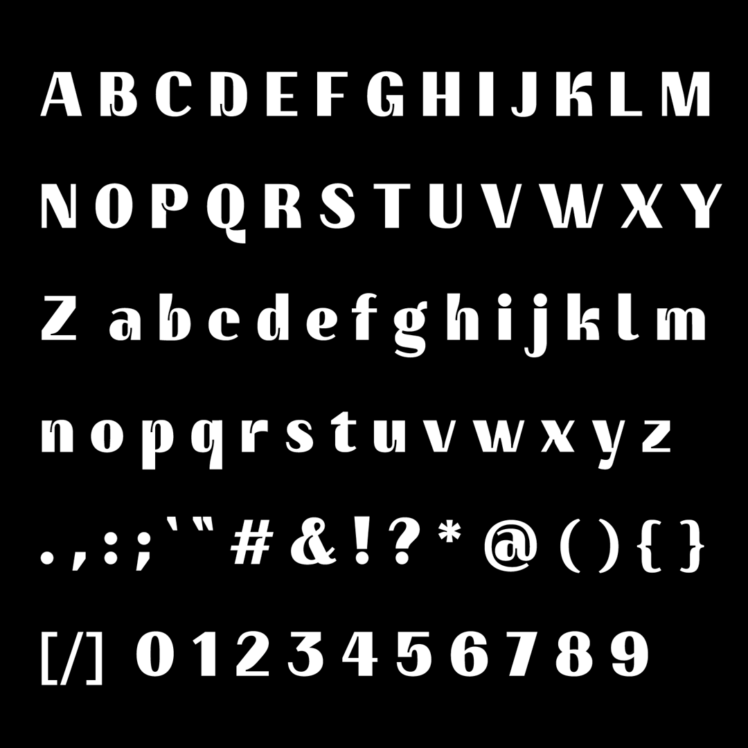
Started off with translation pen sketches, and once digitized I added more weight to the letters. The ink traps got deeper and larger every week. Then I concluded not all letters needed this feature, to keep the typeface sober and not overkill the feature.


Andrea Groisman
A passionate Costa Rican freelance designer who loves coffee, travel and letters. Looking forward to meet, learn from and collaborate with typeface designers from all around.


