
Type@Cooper Display Type, Spring 2021
Maya
by Shaily Patel
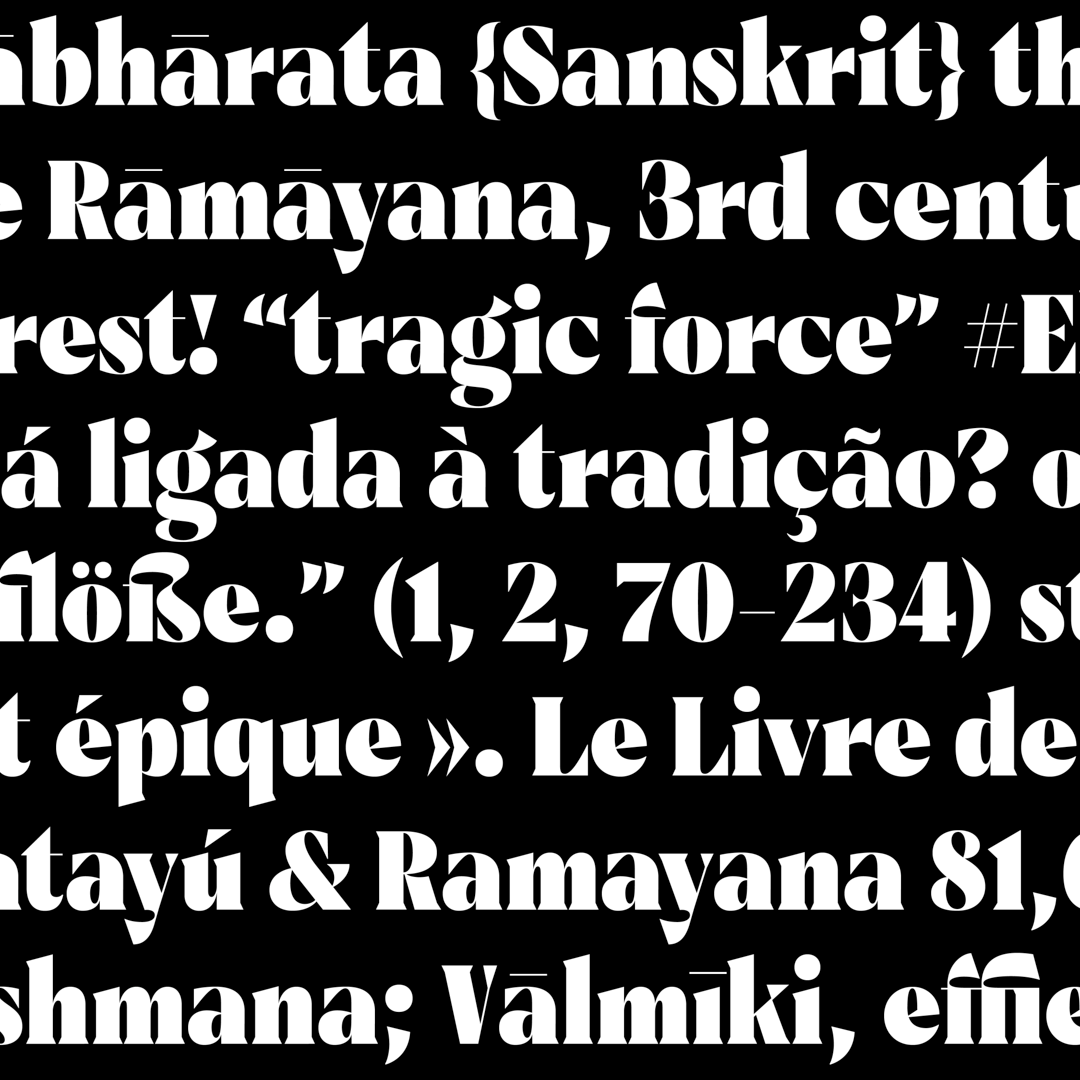
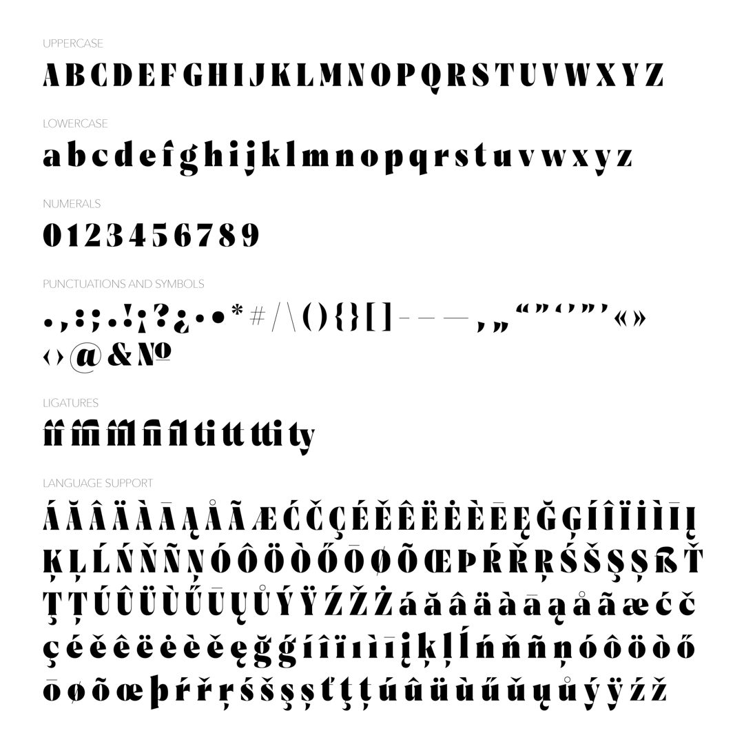
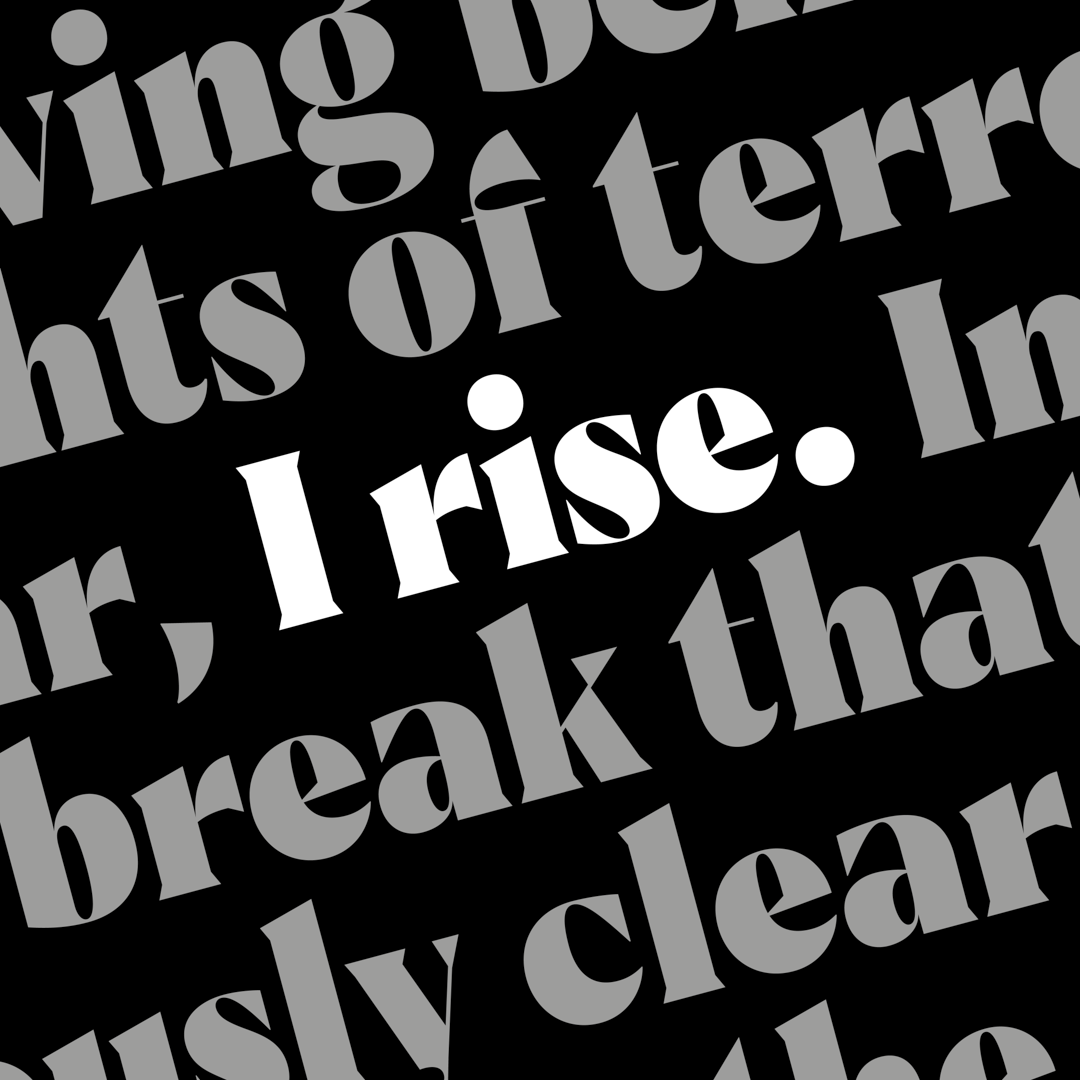
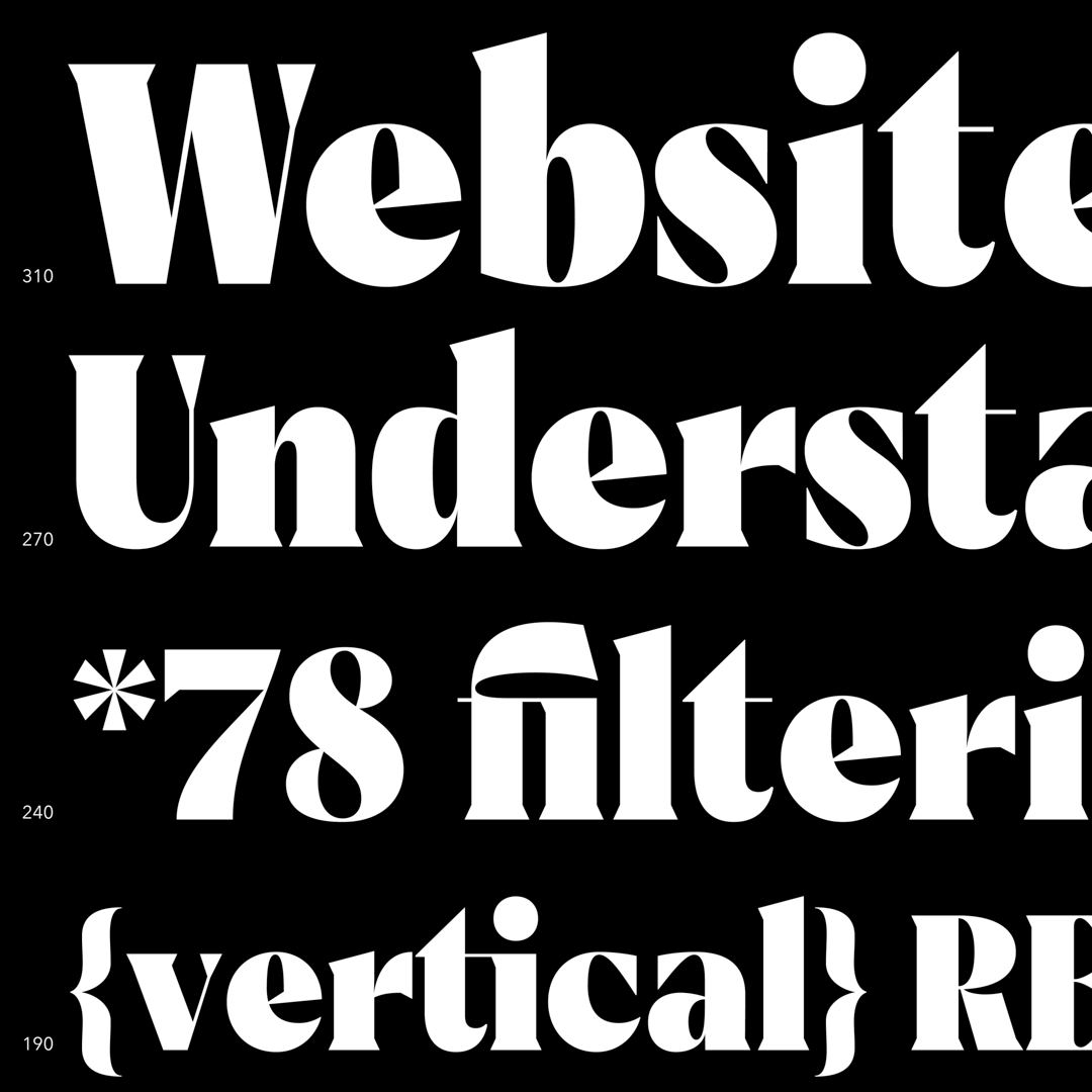
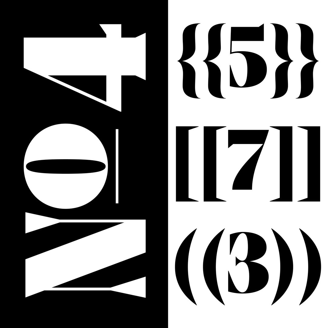
Maya is inspired by the strength and quirkiness of the poem ‘Still I Rise’ by Maya Angelou. Shaily wanted the typeface to look classic yet feel experimental. The pointy serifs and triangular stroke endings of a few letterforms make it look strong, edgy, sassy, yet feminine. Maya is built on the foundations of contrast and expansion theory, with a touch of fun. The typeface in still in progress and is planned to be a family of varied weights, widths and styles, including a text version.
The conceptualisation for the brief began by listing adjectives describing the kind of typeface Shaily wanted to design, followed by numerous sketching different letterforms with varied features. During the process, she happened to come across several feminist poems which ultimately inspired the key features of the typeface. Maya is evidently named after the poet Maya Angelou. The typeface started off with a lot of ideas and features which made the overall texture look bumpy. But over the weeks, with the invaluable feedback from Juan, Phædra and Romina, the features were filtered and defined, making a smooth texture.


Shaily Patel
Shaily Patel is a graphic design student, fond of designing type. She is born and brought up surrounded by a wide array of scripts and writing systems in India. Shaily wants to pursue a career in type design and aims to explore possibilities of designing display type in Indic scripts.


