
Type Electives Display Type, Fall 2023
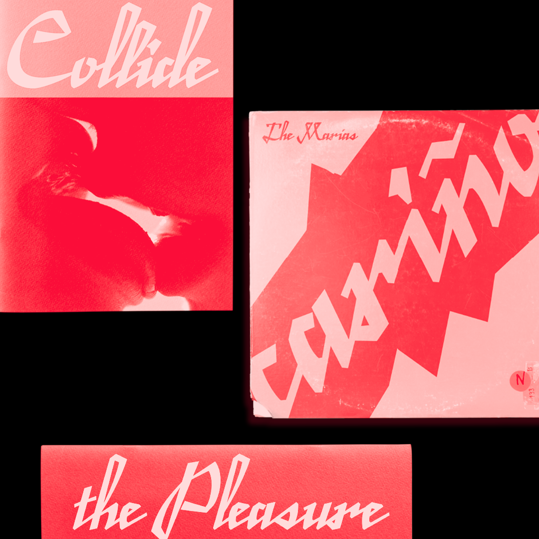
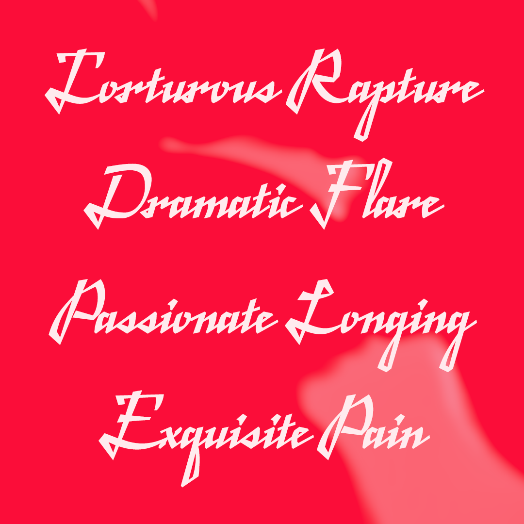
Enrapture
by Grace Han
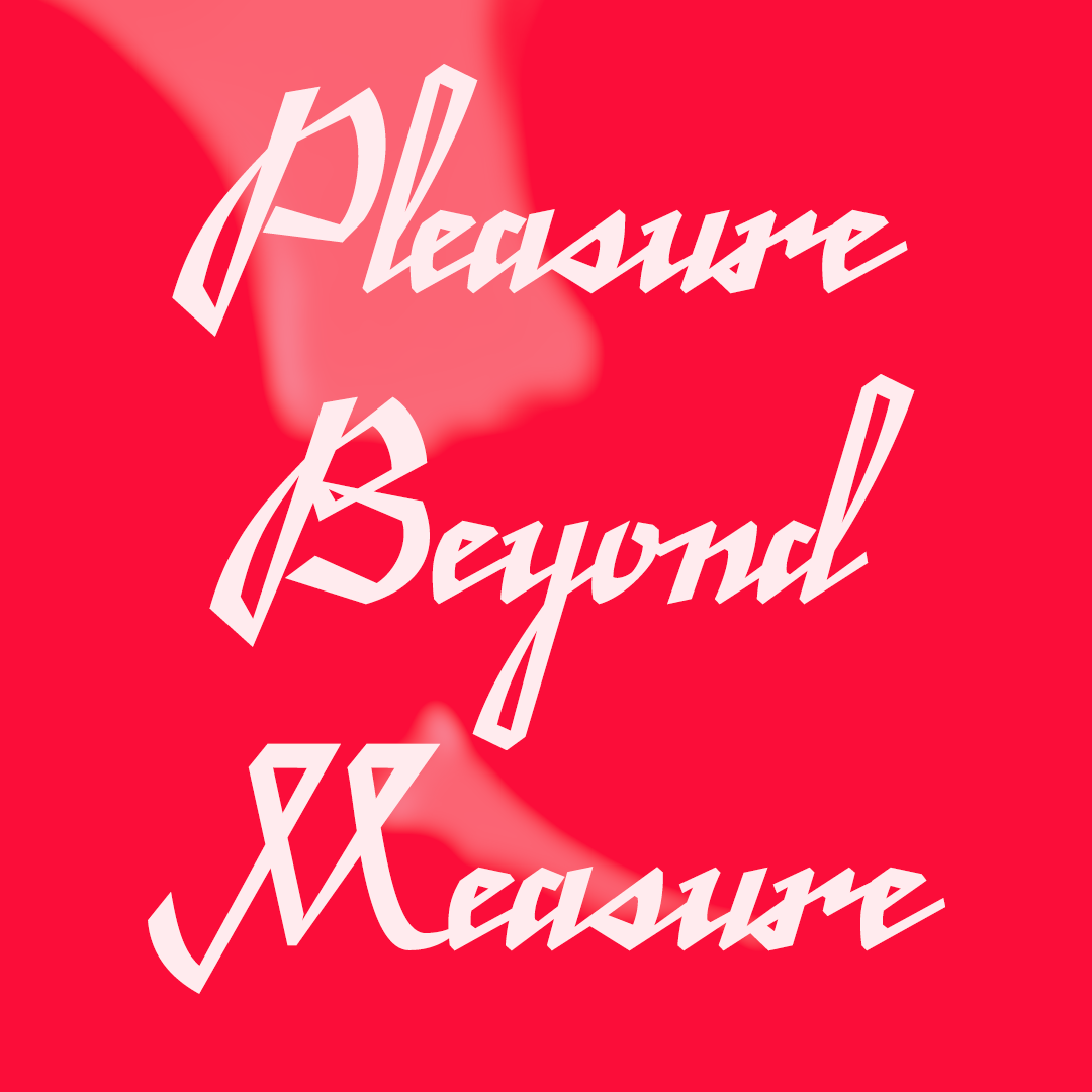
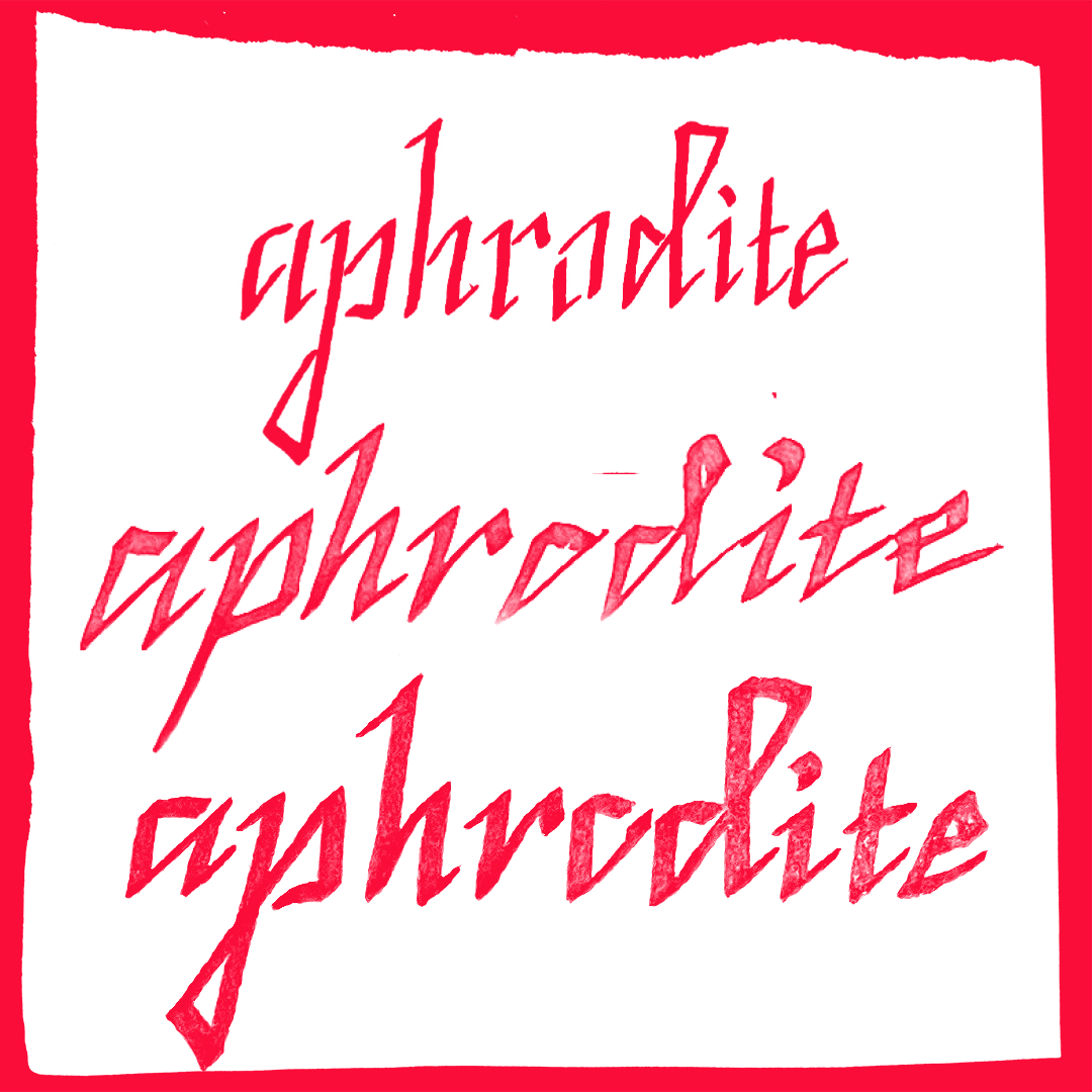
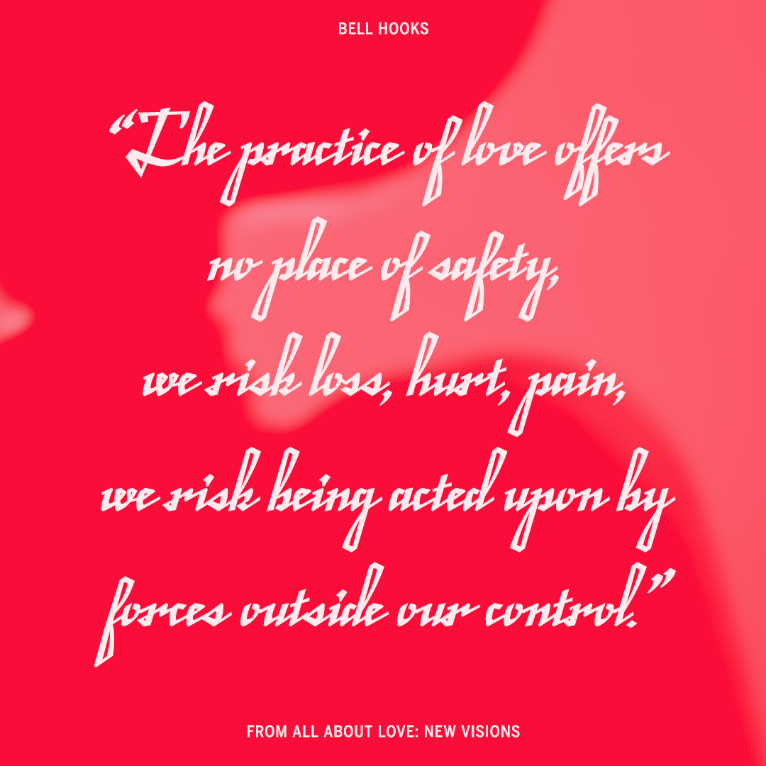
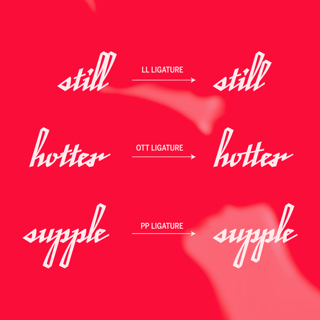
Enrapture is a translation-contrast, italic, connecting script typeface. The forms reference script typefaces made from the first half of the 1900s, as well as the designer’s own handwriting with the broad-nib pen. The typeface is meant to convey a sense of speed, urgency, and the hand. Ideal use cases include: love poems, passionate manifestos, and confessions to your crush.
I originally was solving for a completely different brief. At the beginning of class, I wanted to create a typeface that was both calligraphic and dimensional. Through researching script forms and construction, I fell in love with making a typeface that was informed more by handwriting. It led to shapes that felt more personal and a new challenge of understanding how to to make each character connect.
Grace Han
Grace Han is a designer and occasional researcher/writer based in Queens, NY. She was a Making Policy Public Fellow with the Center for Urban Pedagogy in 2020, and has written for AIGA Eye on Design and Left Bank Books. She has worked with clients like Apple, Brooklyn Public Library, and the NYC Department of Environmental Protection. When she’s not designing, she’s probably making ceramics or talking about jiu jitsu grapples.


