
Type@Cooper Display Type, Summer 2021
Rosenda
Karen Cartas
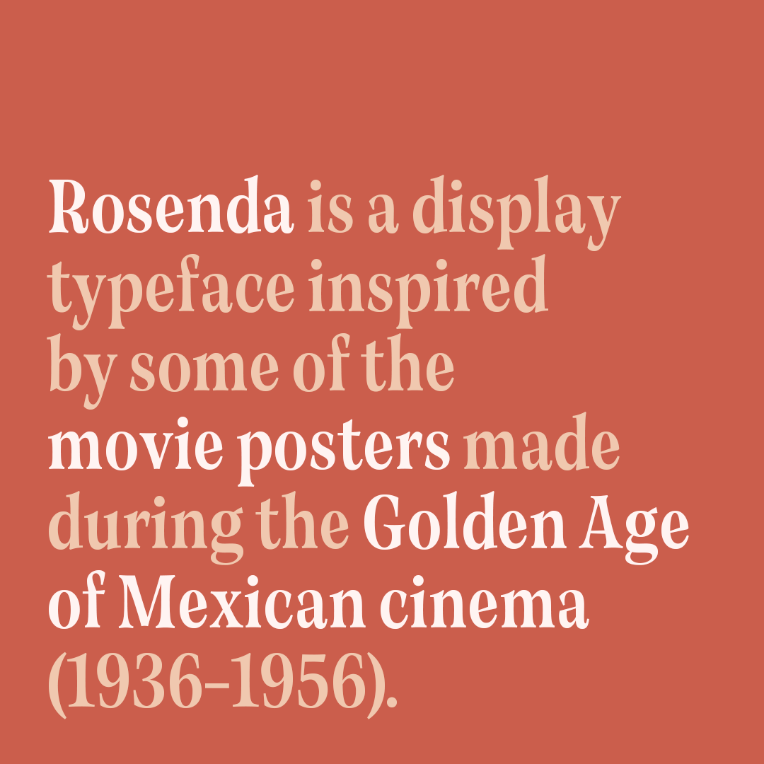
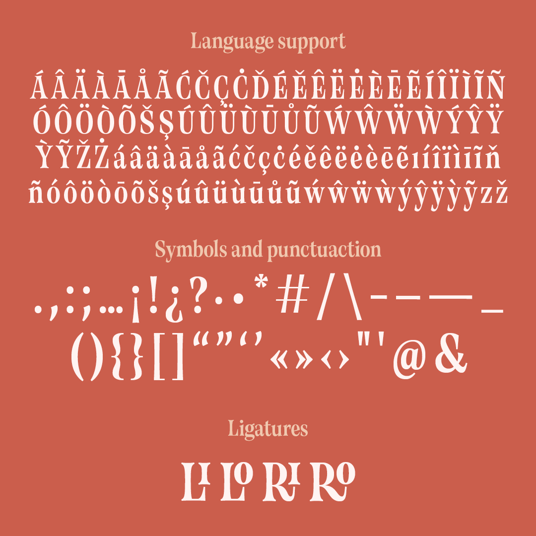
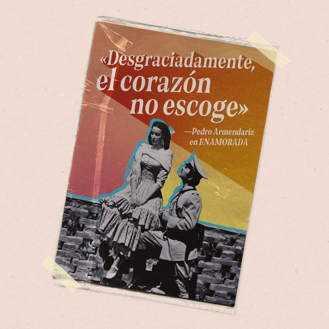
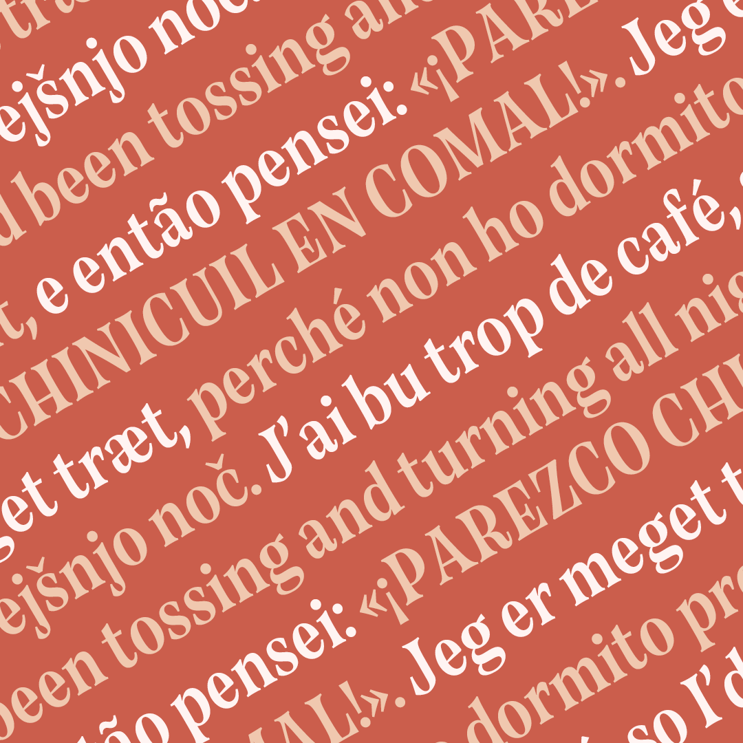
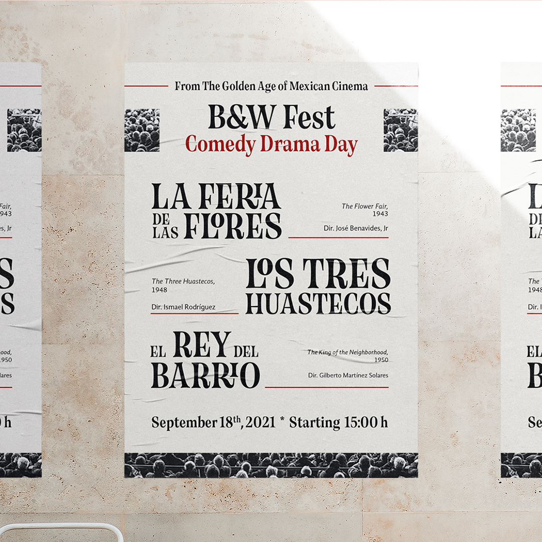
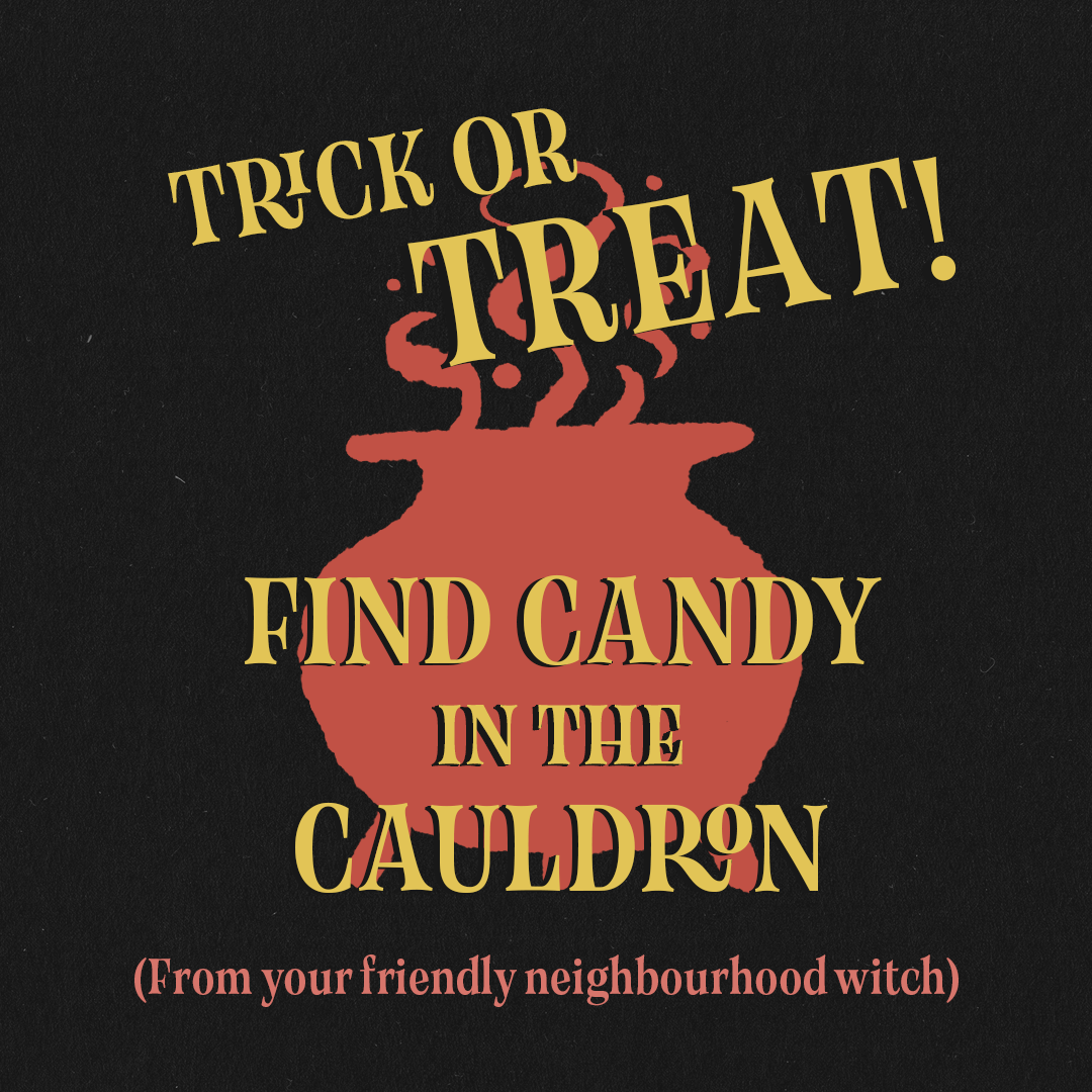
Rosenda is a display typeface inspired by the movie posters made during the Golden Age of Mexican cinema (1936-1956). Designed to replicate the look & feel of those pieces of lettering: interesting type compositions that play with letter sizes, textures, colours and photography; and to convey feelings of adventure, strong emotions and drama. It has a small (but expanding) set of discretionary ligatures to aid the composition process, and supports a wide variety of languages. Despite its medium to high contrast, condensed width and closed openings, it is readable enough to set medium-length subheads with it. Some of the use cases for Rosenda are poster design, editorial and album cover art.
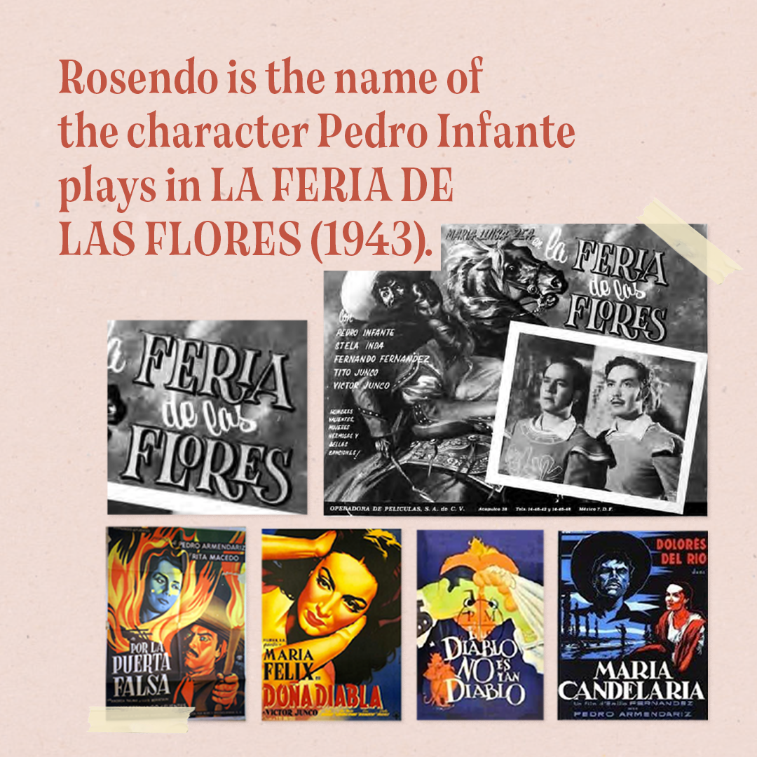
After doing a long research on classic Mexican movie posters and analysing the different styles that represented each genre, I chose a few that got me really excited about their letterforms. The lettering that stood the most to me was from a poster-adapted-to-calendar-cover from the movie La Feria de las Flores (The Flower Fair, 1943) for its condensed width, flared stems and funky ligatures. To have as secondary references (and find possible solutions for different letters) I collected a few more examples that displayed similar uppercase serif styles.
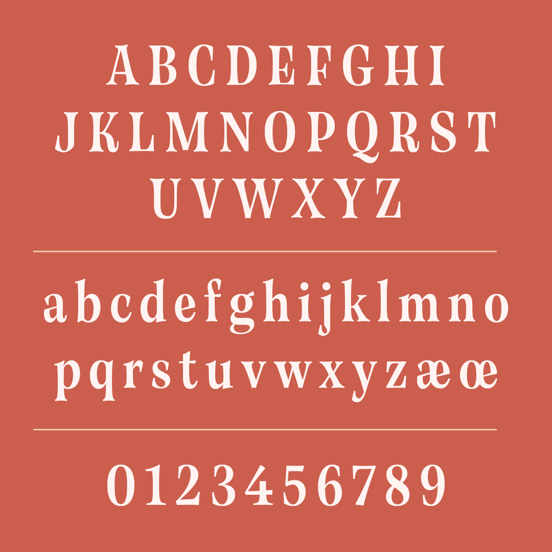
From these eight different letters I started drawing keywords with the intention of preserving the original features I liked the most, however with a desire to exaggerate the serif size, create small apertures, keep a deliberate low-waist for the middle bars and find a more systemic approach for the thin segments. The fact that my main reference had only uppercase letters made me carry my first decisions from them into the lower case instead of the other way around (which I normally do), and also pursue a design that worked just as well in uppercase-only settings.
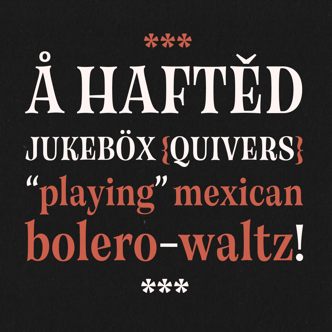
As if it were a living thing (in a way it is?), Rosenda ended up having an attribute that I didn’t quite expect but willingly embraced: not only did it looked dramatic, but it was actually starting to look kind of spooky, something I tie to the sharp, long design of the serifs.

Karen Cartas
Editorial designer, letterer and aspiring type designer from Mexico City. Karen designs digital magazines by day and gets entangled in threads, inks and pencils by night. An enthusiast of the world around letters, in a typographical, linguistic and editorial sense, she believes in the quality and relevance of hand-made design, just like a food recipe, and how that cooking style can be translated to digital production.


