
Type@Cooper Display Type, Summer 2021
Allegheny
Bree Rice
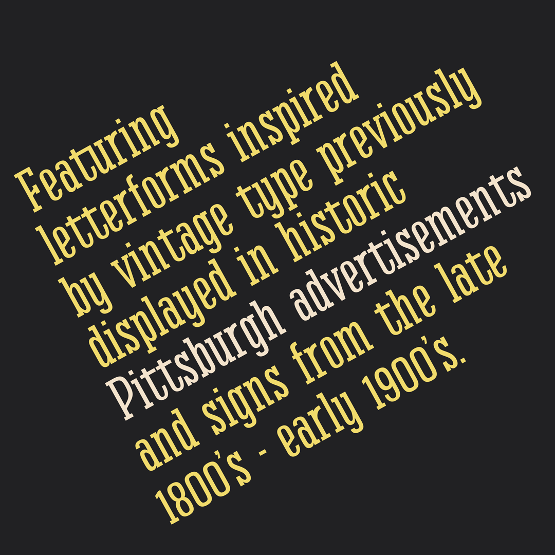
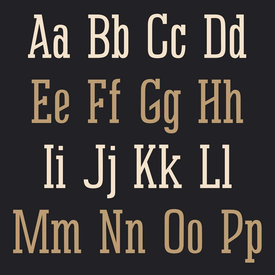
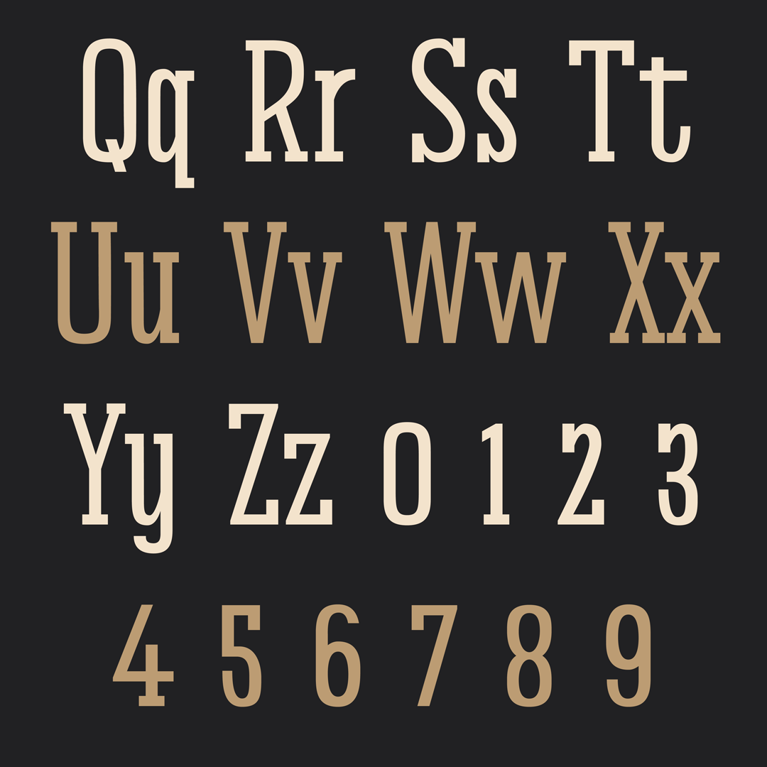
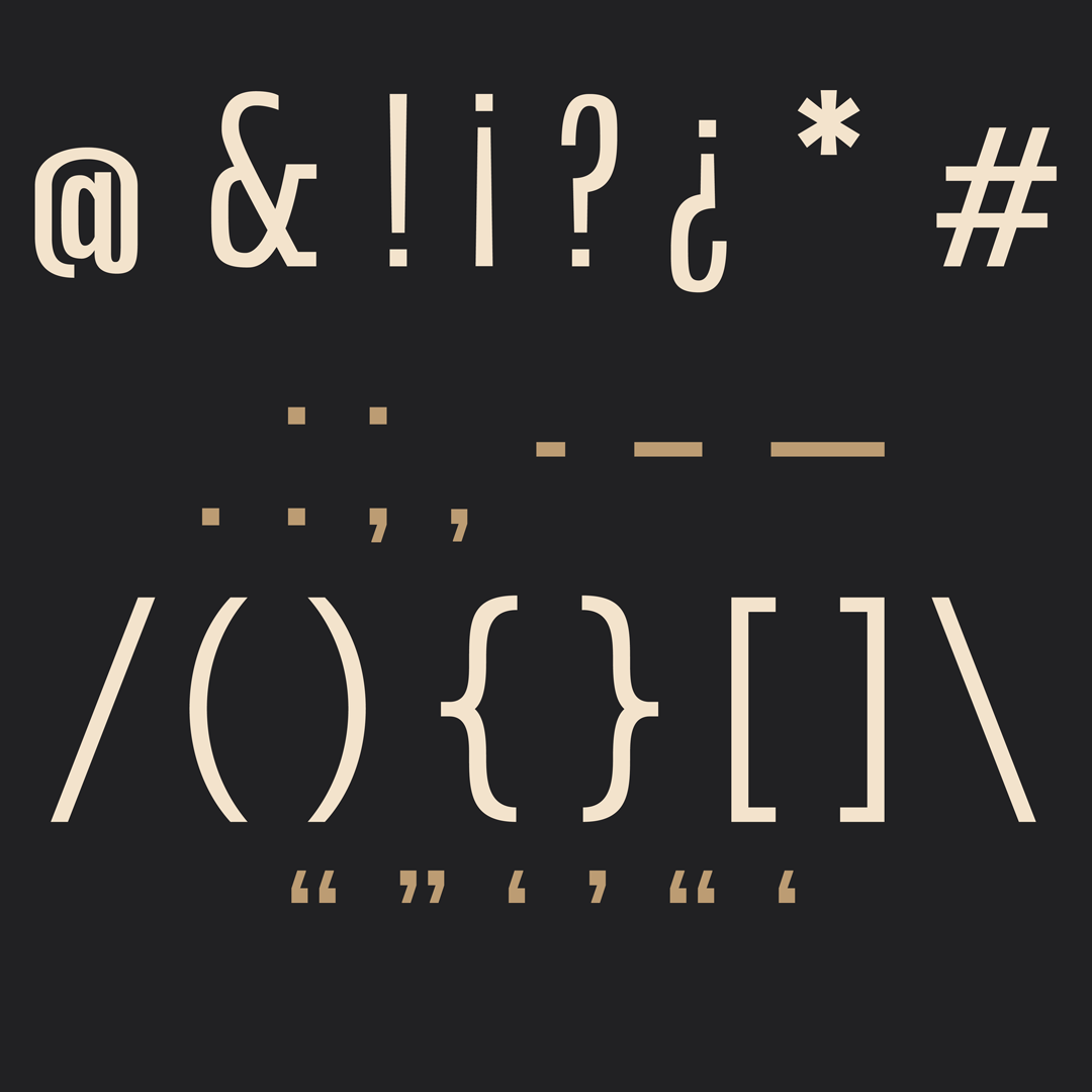
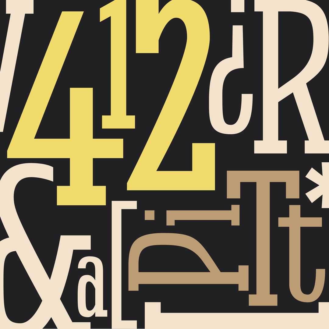
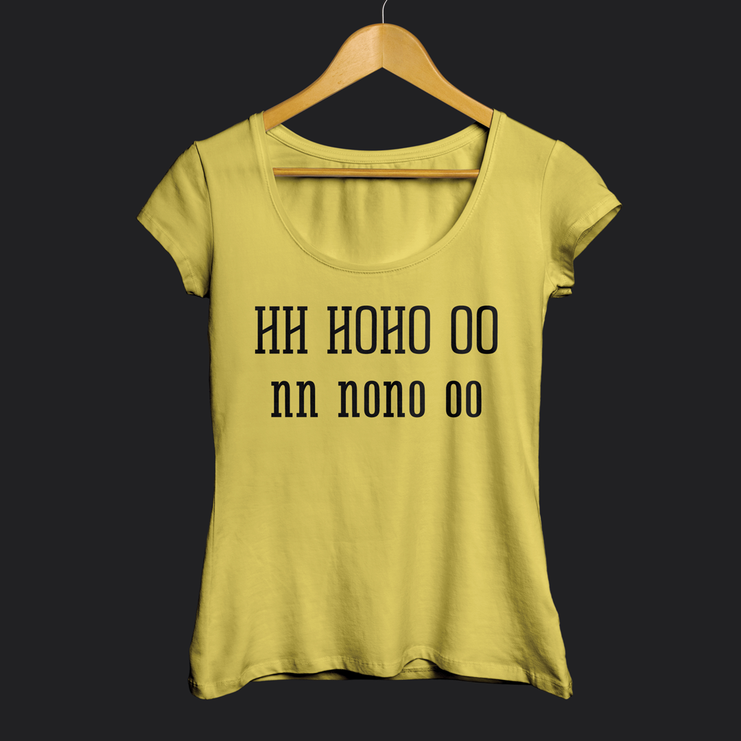
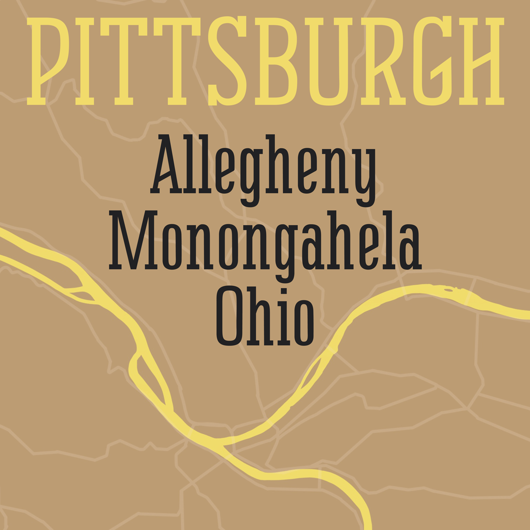
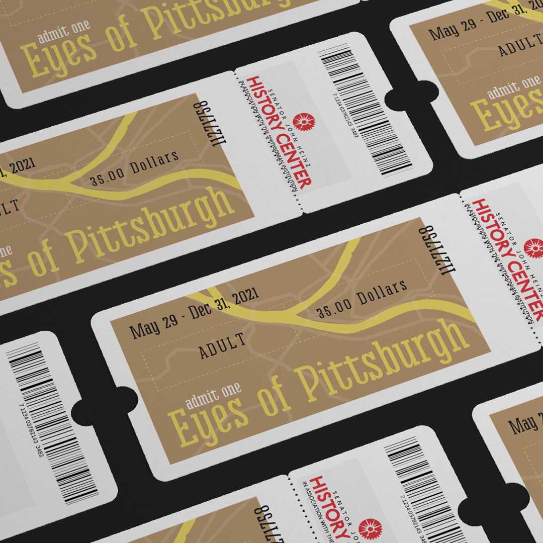
Allegheny features letterforms inspired by vintage type previously displayed in historic Pittsburgh advertisements and signs from the late 1800’s/early 1900’s. The goal was to make a condensed, bold, slab serif, low contrast font to use in advertising. I specifically looked through historical city directories from the late 1800’s for inspiration.
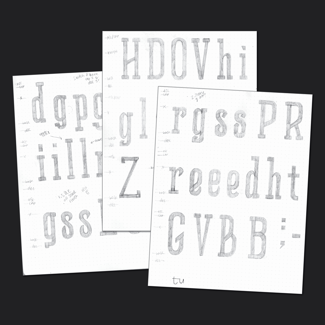
I started digging through the various city directories and historic imagery for inspiration and created a mood board. I ideated and sketched and then completely scrapped everything and started over with a narrower focus and brief. I wanted to reimagine a particular set of letterforms that I was drawn to as a bolder, updated, slab-serif. After the new direction was thought out I began sketching letterforms and have been sketching, digitizing, and refining since.
Bree Rice
Bree is a freelance designer, marketer, and chips and salsa aficionado. She specializes in brand collateral and standards, digital assets, signage, and print collateral, such as billboards, editorial pieces, and mail, but also has a strong passion for letters. When she’s not working, you can find her swimming, traveling, or hanging out with her Australian Shepherds.


