
Type@Cooper Display Type, Fall 2020
Ruhling
Jamie Otelsberg
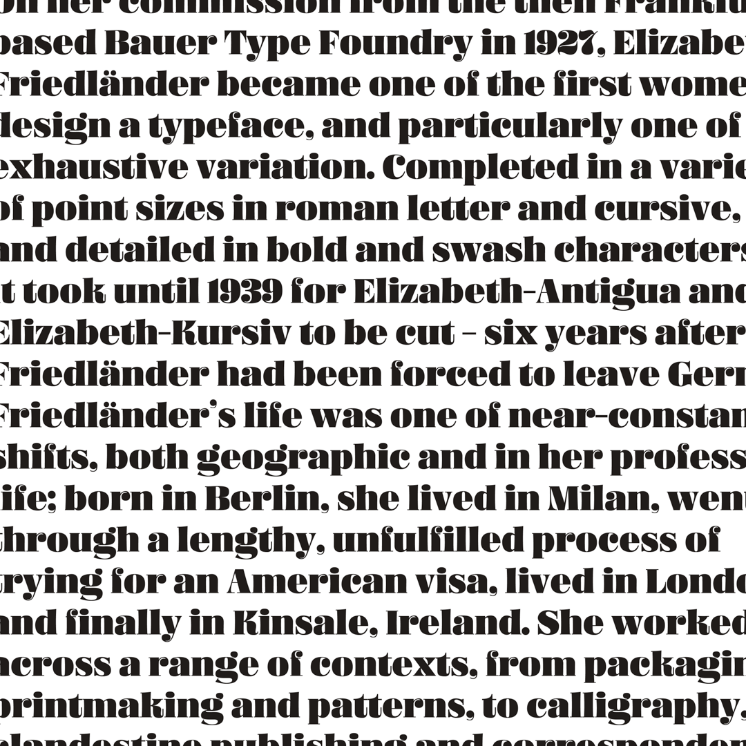
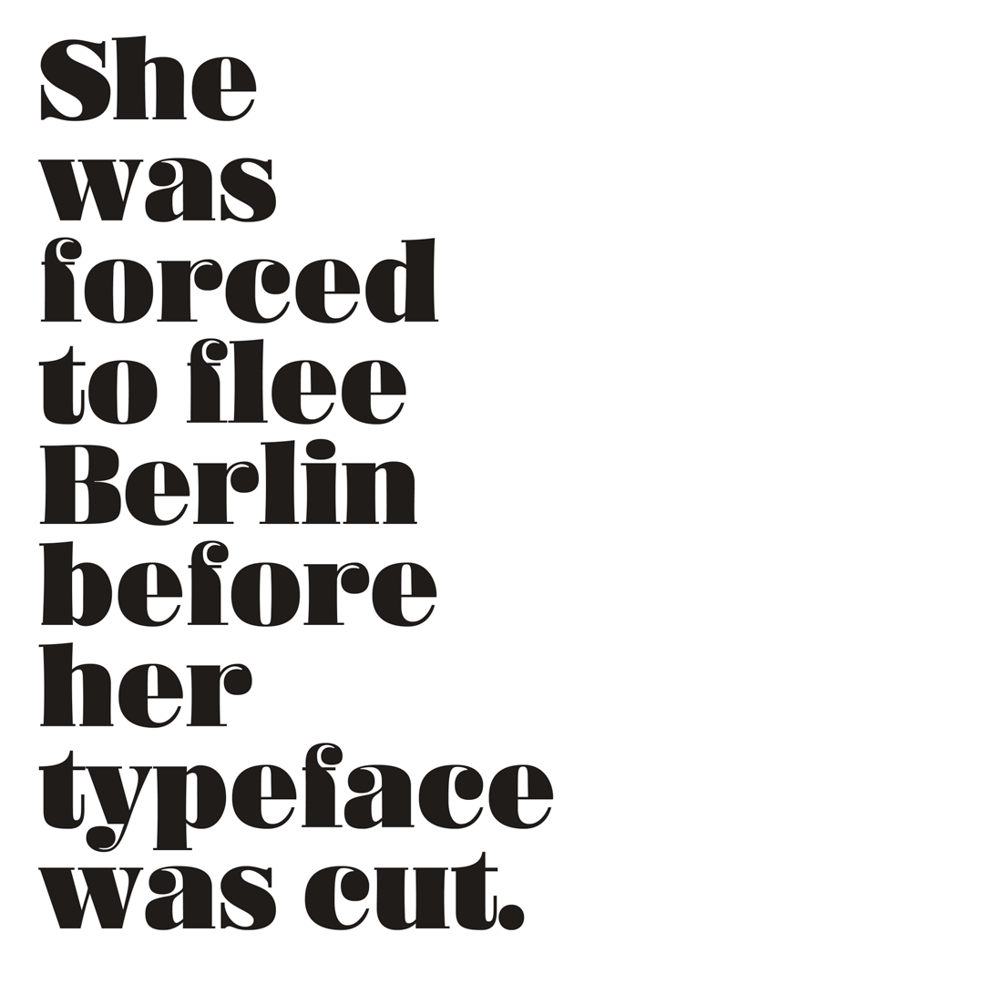
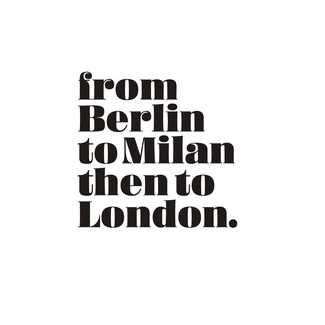
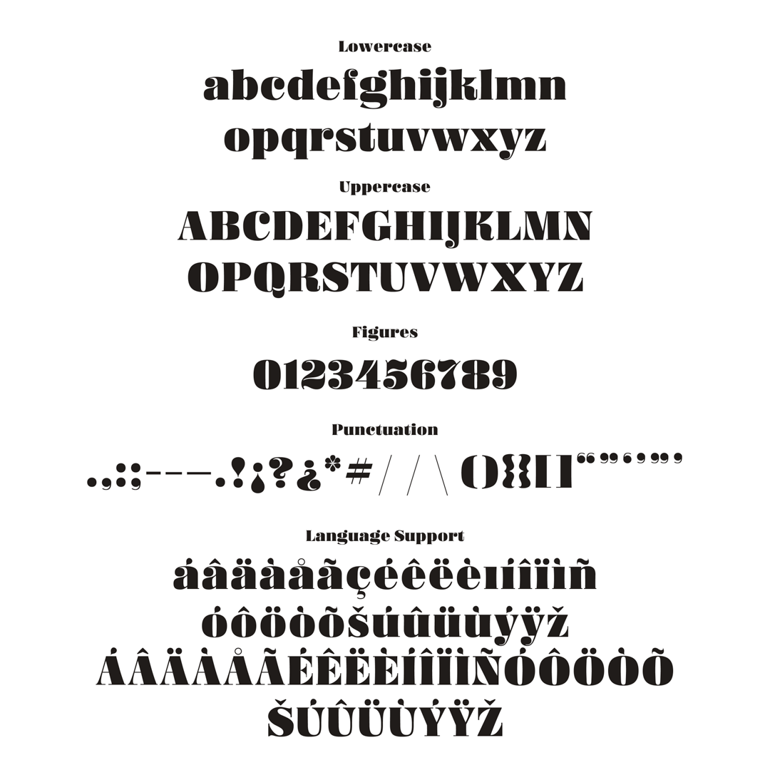
I set out to design a display typeface loosely inspired by Elizabeth Friedländer’s “Elizabeth”. The fact that her typeface is so beautifully crafted is accentuated by the fact that she designed it under such dire circumstances. I wanted to design something completely different, but with hints of inspiration from the special features that Elizabeth contains. I thought, why not combine those features with a modern fat-face style? I liked the idea of combining features of Elizabeth which was designed in Berlin, with a fat-face style that originated in London, since Elizabeth Friedländer’s journey took her from Berlin to a new life in London.
It proved challenging to combine these features, like the modulating stem widths and the diagonally pointing serifs and beaks, with a tightly spaced rhythmic fat-face style. After many many sketches and literally going back to the drawing board dozens of times over, I finally abandoned some of my original brief and ended up with a working version of a modern fat-face, with a slightly quirky personality.
Ruhling was born out of my time in lockdown in the Ruhr region of Germany.


Jamie Otelsberg
Jamie Otelsberg is a visual designer originally from Los Angeles, CA, and living in Essen, Germany. She is currently working for a Bay Area-based design firm and volunteering at a human-computer interaction lab in rural India. You can find her practicing lettering and studying type design while in lockdown.


