
Type Electives Display Type, Spring 2023
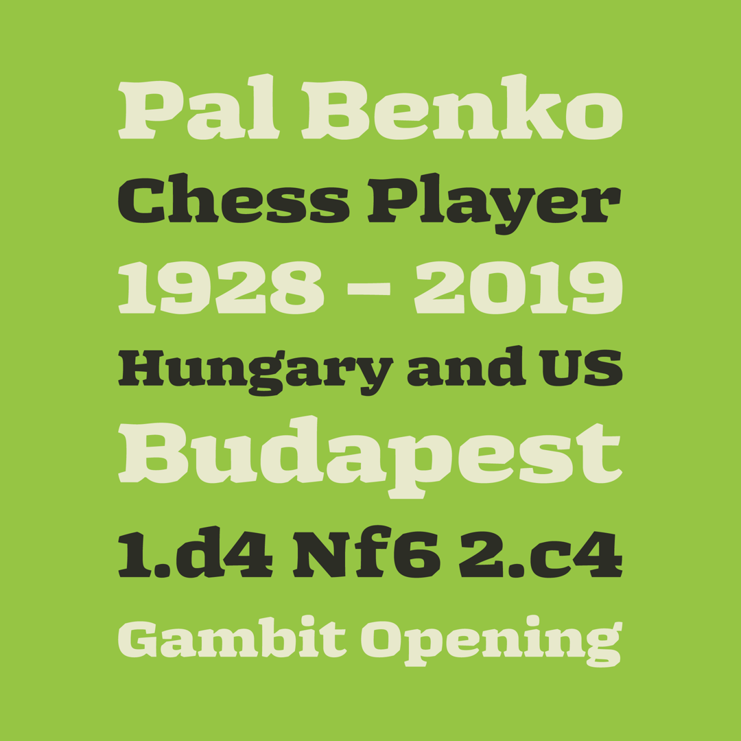
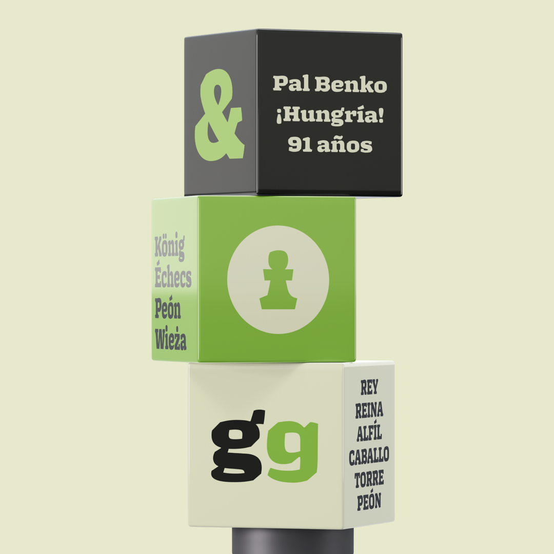
Benko
by Tomas Castiglioni
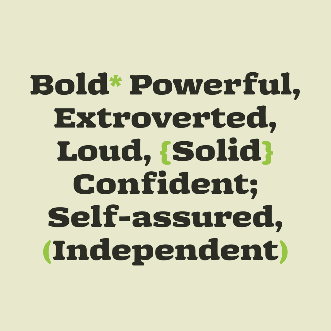
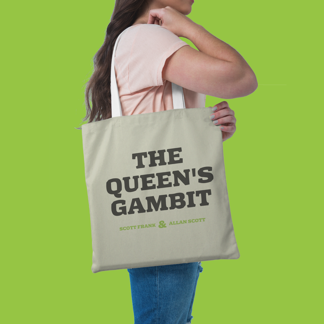
Benko is a display typeface that draws inspiration from the game of chess and is named after the renowned Hungarian chess player, Pal Benko. The key attributes that guided my design process were boldness, power, solidity, confidence, independence, and fearlessness. My primary objective was to create my very first serif typeface that would embody these characteristics while also adhering to the traditional chess theme. I aimed to achieve a contemporary look by implementing unique design decisions in the creation of the glyphs.

The process of designing this typeface began with an open brief requesting a chess-related, bold serif typeface. While contemplating the brief, I experimented with a broad nib pen and traced the ideas that resonated with me. Once I refined the sketches, I digitized the typeface and made adjustments to achieve the desired appearance.
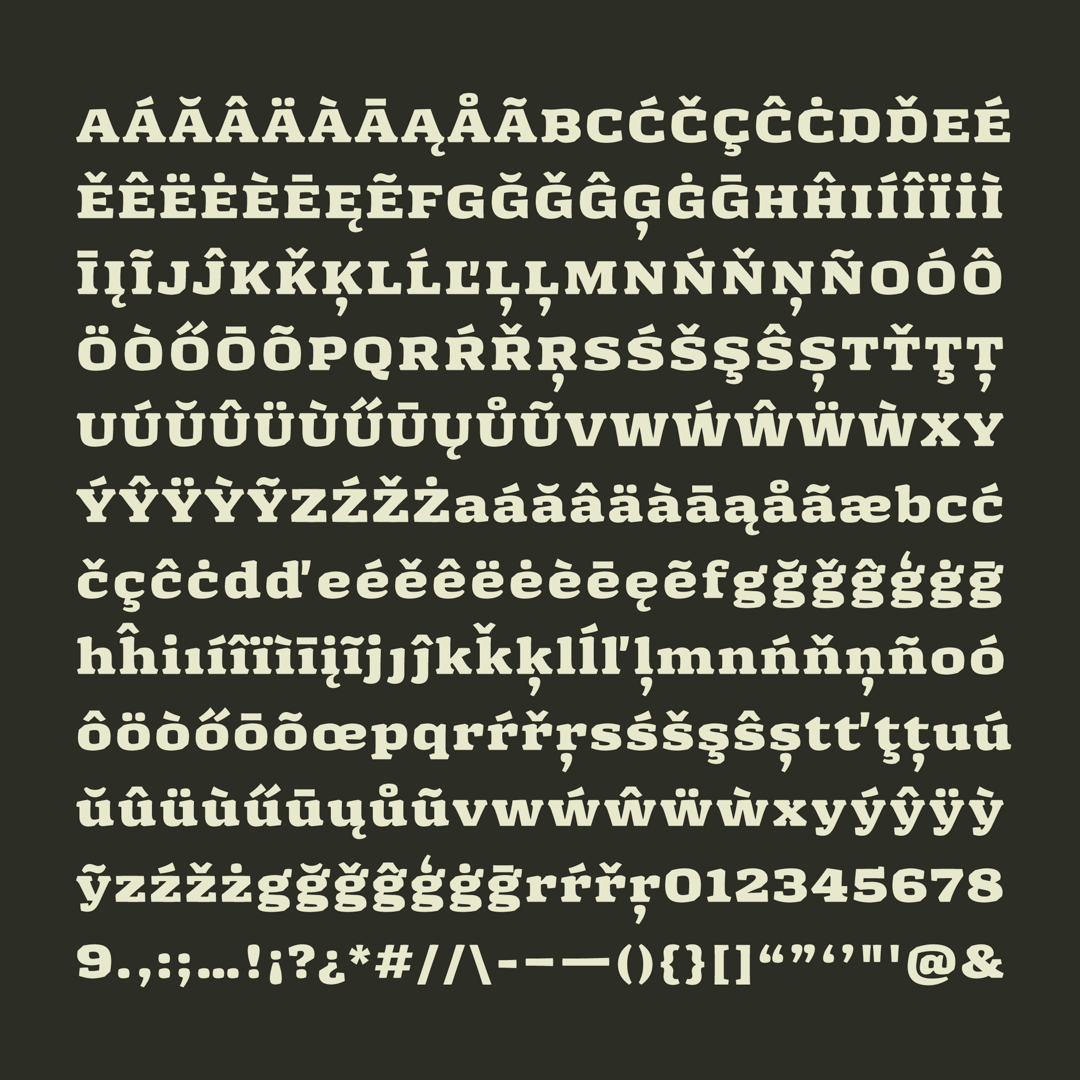
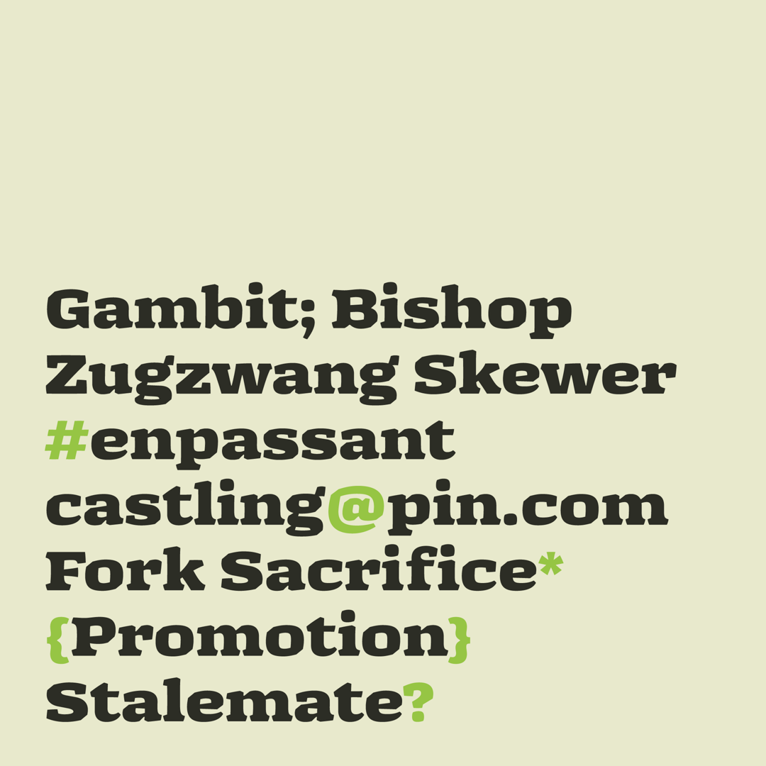
The typeface is based on a translation model and features some contrast, expanded width, and an ExtraBold to Black weight. It also has short ascenders and descenders, asymmetrical serifs with diagonal endings that emulate the shape of chess pieces. Additionally, it includes pronounced joints with inktraps for a more contemporary look, and the rounded shapes have a squarish appearance.
Overall, this typeface incorporates unique features inspired by chess and contemporary design to create a visually distinct typeface that is both functional and aesthetically pleasing.

Tomas Castiglioni
I am a Graphic and Brand Designer based in Buenos Aires, Argentina. In 2019, I discovered a deep passion for letters, and since then, I have been continuously learning and exploring letterforms through lettering and type design. When I am not working, you can find me spending time with my loved ones and playing with my dog.


