
Type Electives Display Type, Spring 2023
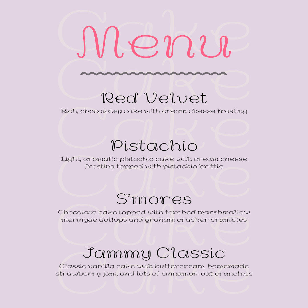
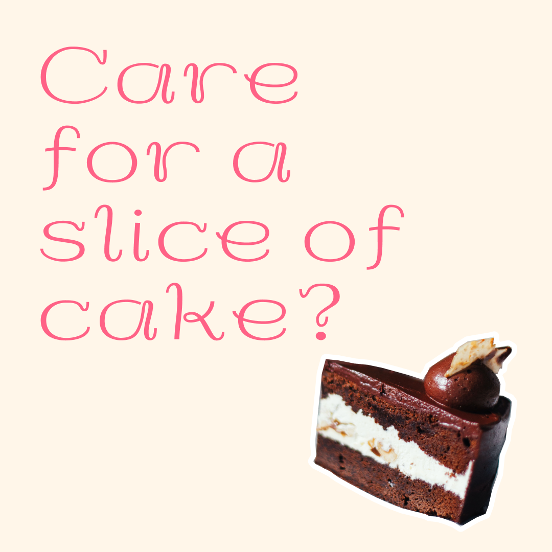
Meringue
by Tiffany Lo
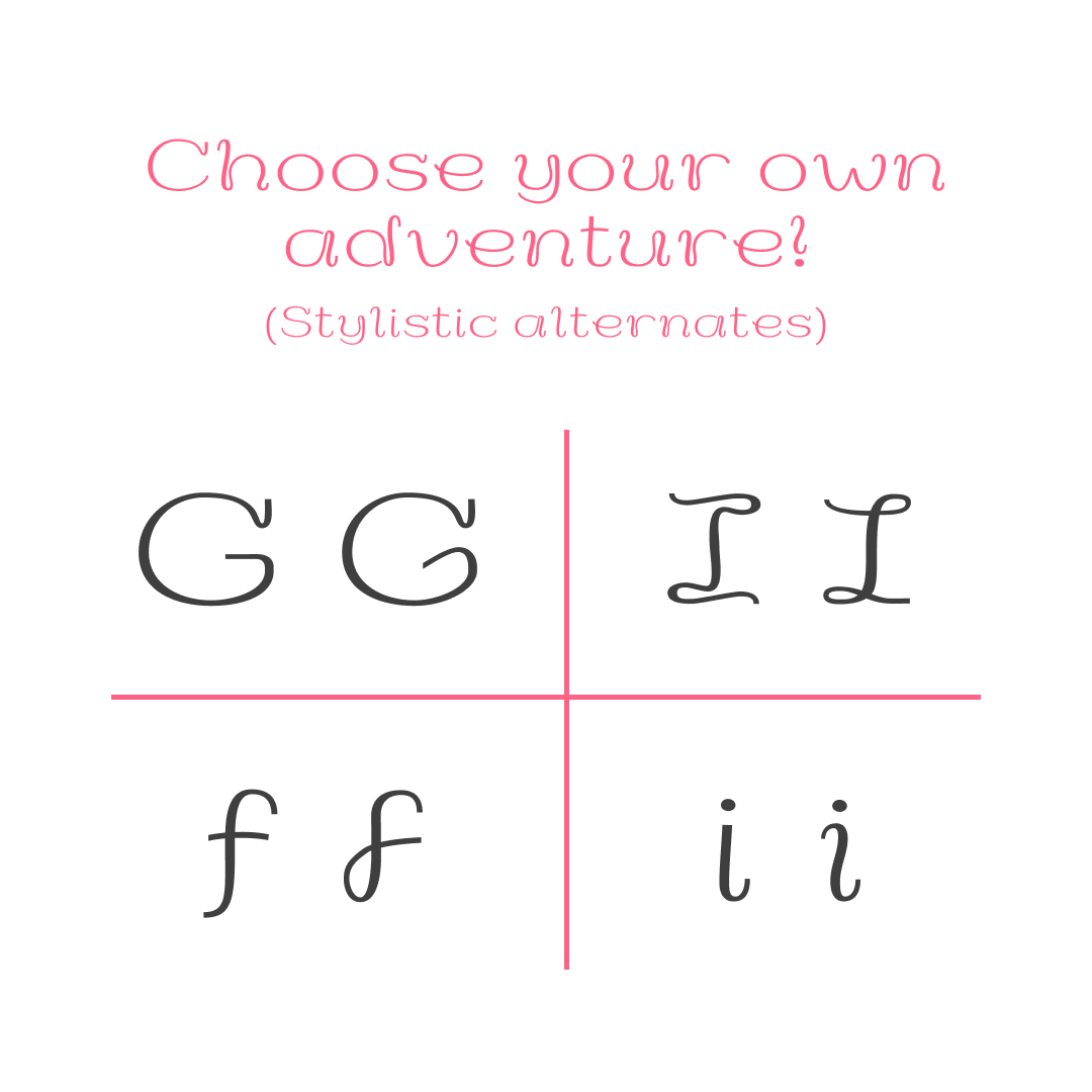
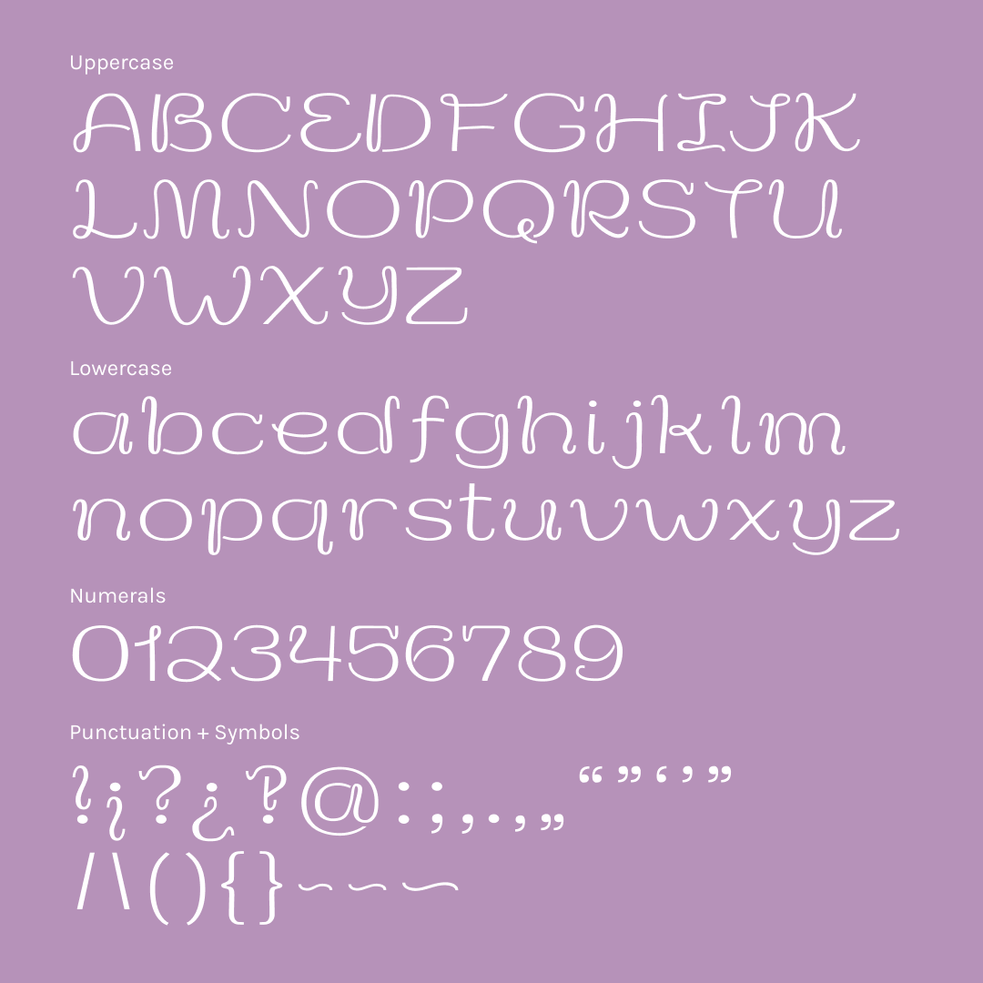
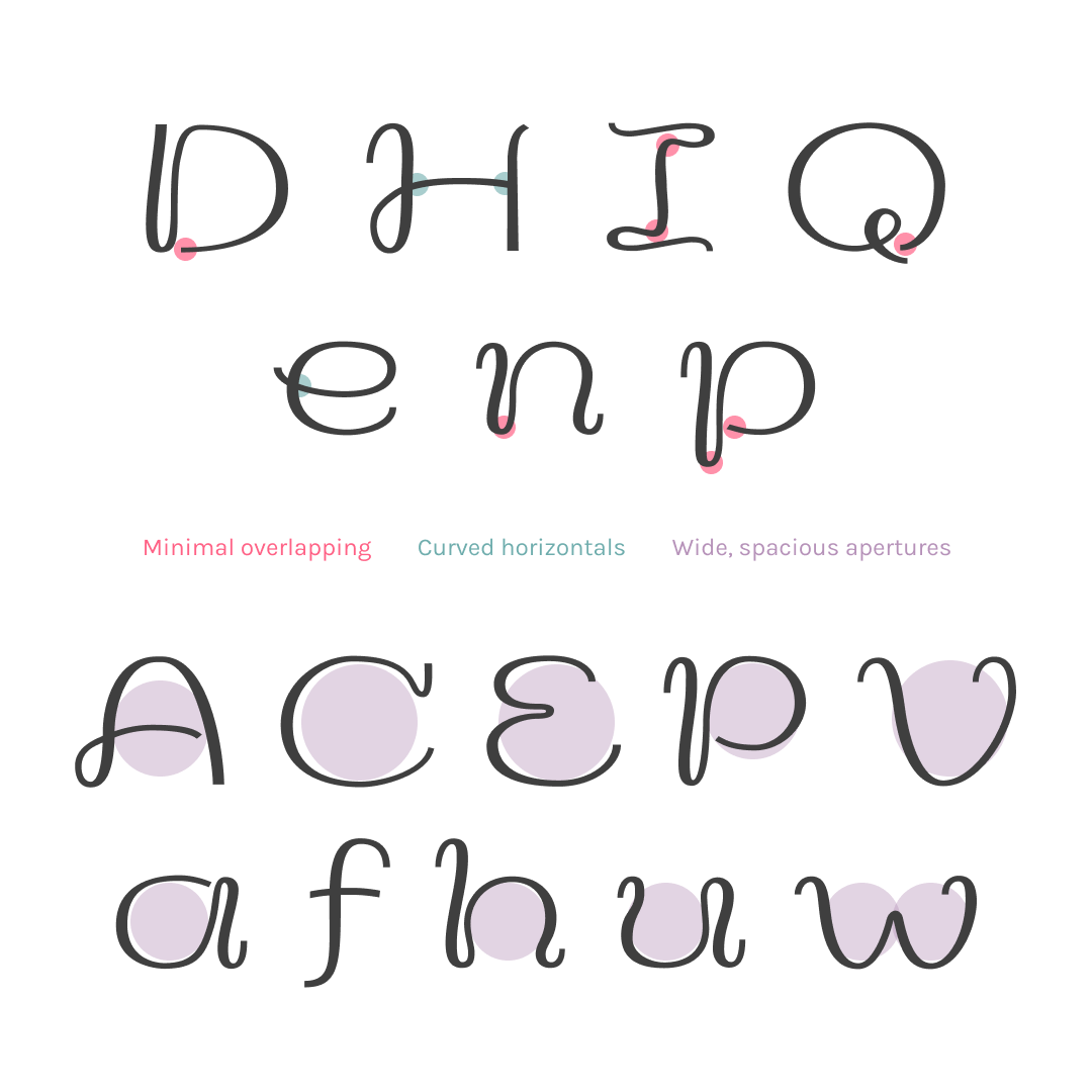
Meringue captures all the delight and swoopiness of cake lettering, packaged into a neat display typeface. It has generous curves and spacing, with minimal overlaps, as a nod to the constraints posed by frosting as a substrate and a piping bag as a writing tool. Think wide letters for easier handling, minimal stroke overlaps to decrease areas with too much frosting, broad curves made by physically moving the arm/body, and a tail formed by a baker pulling the piping bag up and away upon finishing a letter. The letter structures take inspiration from script styles and writing with a pointed nib, with wispy little entry/exit serifs.
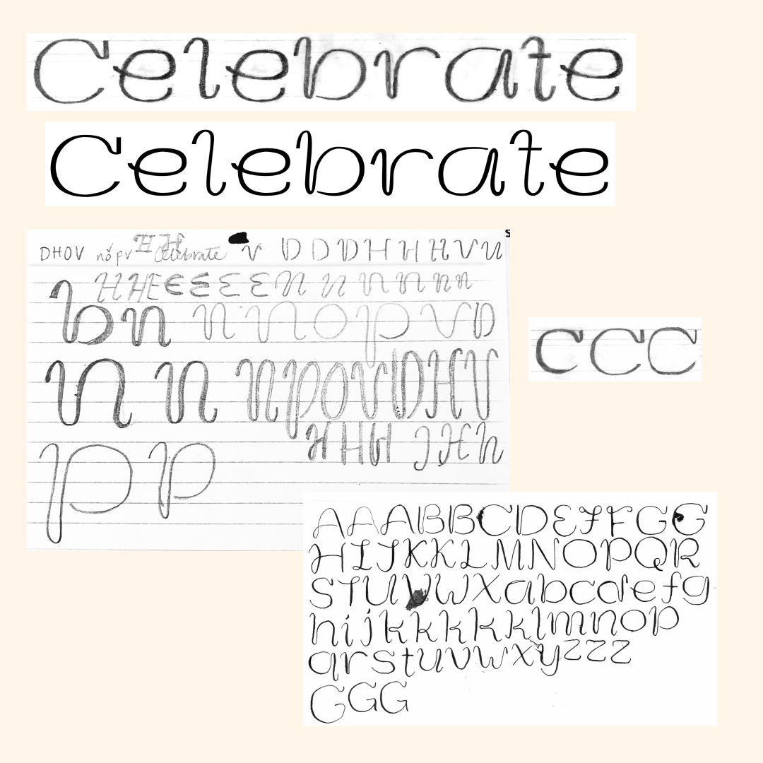
As a baker, I’ve always admired the rhythmic and beautiful textures used to decorate cakes. The tools are simple — A piping bag paired with a tip. However, the possibilities evolve with the skill and artistry of the baker. I started this typeface by finding the piping techniques I’m most drawn to. Then I started tracing them, replicating them with the pointed and flat nib pens, and drawing the forms to take inspiration from cake without needing to be as kitschy or dimensional as the real life thing. I struggled to enforce the constraints I had derived from the brief consistently throughout the letter set — Too many letters looked like an L, Certain letters lacked its expected form when its angles are rounded out into generous curves, etc. With a bit of encouragement and a return to my source material, many of these issues have been ironed out to result in a cohesive and legible typeface.
Tiffany Lo
Tiffany Lo is a graphic designer/software developer, and massive type nerd. Through the lens of type, she explores culture, history, and joy. She is a type designer-in-training, honing her craft to design type that feel human and make others feel every bit of happiness + excitement + curiosity she feels when she sees good type.


