
Type@Cooper Display Type, Summer 2021
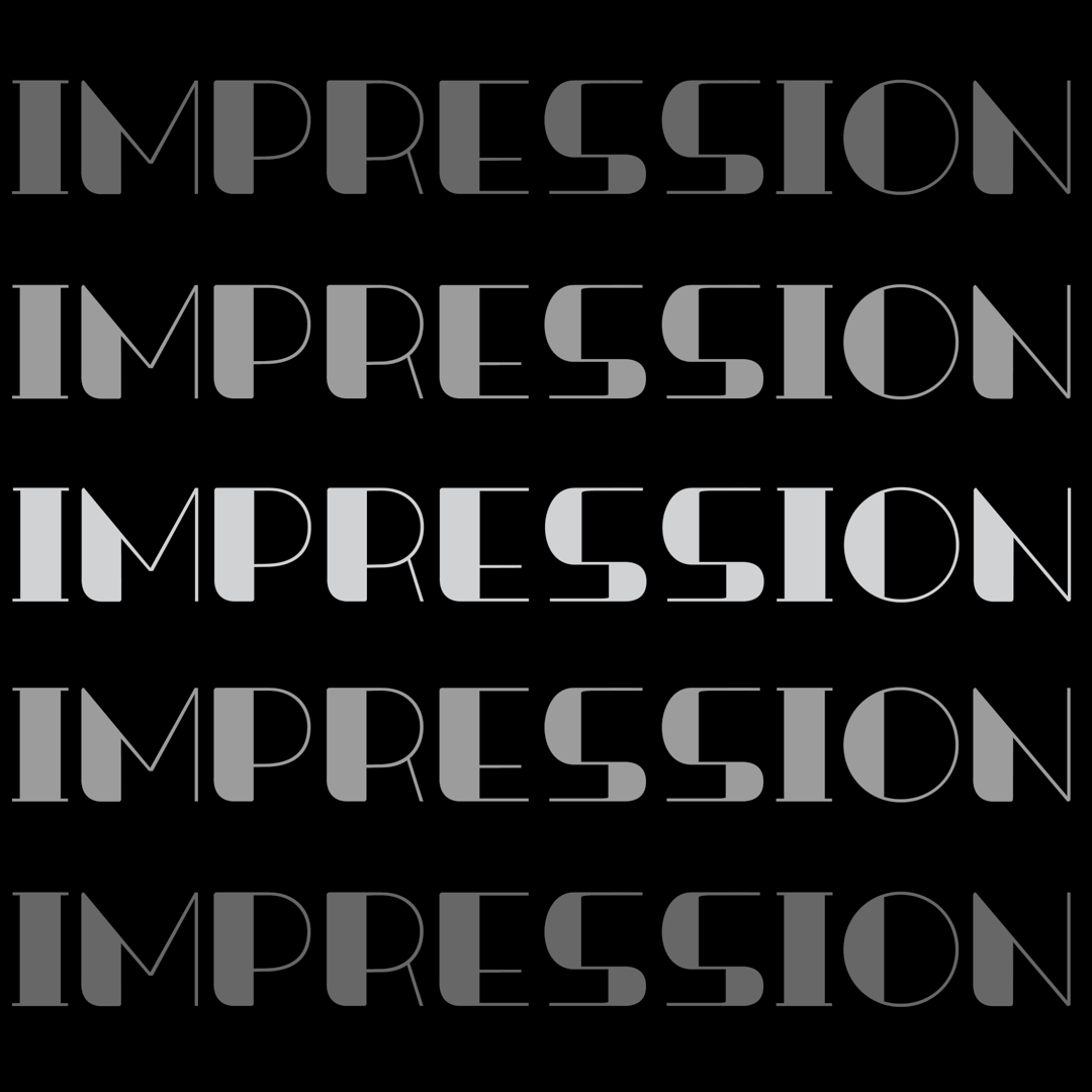
Impression
Will Yang
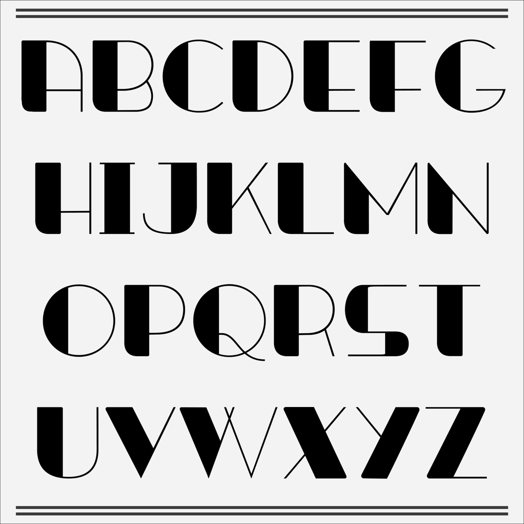
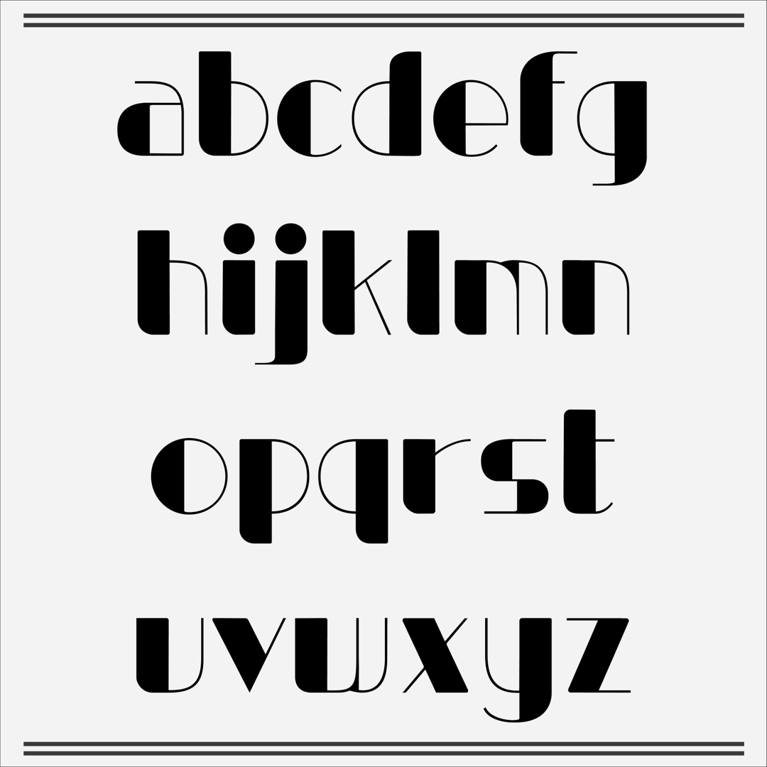
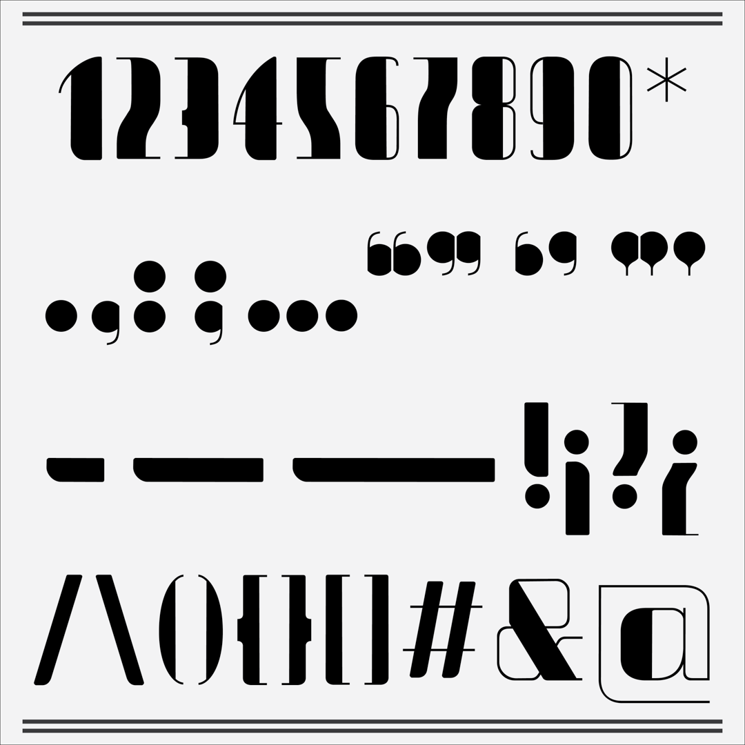
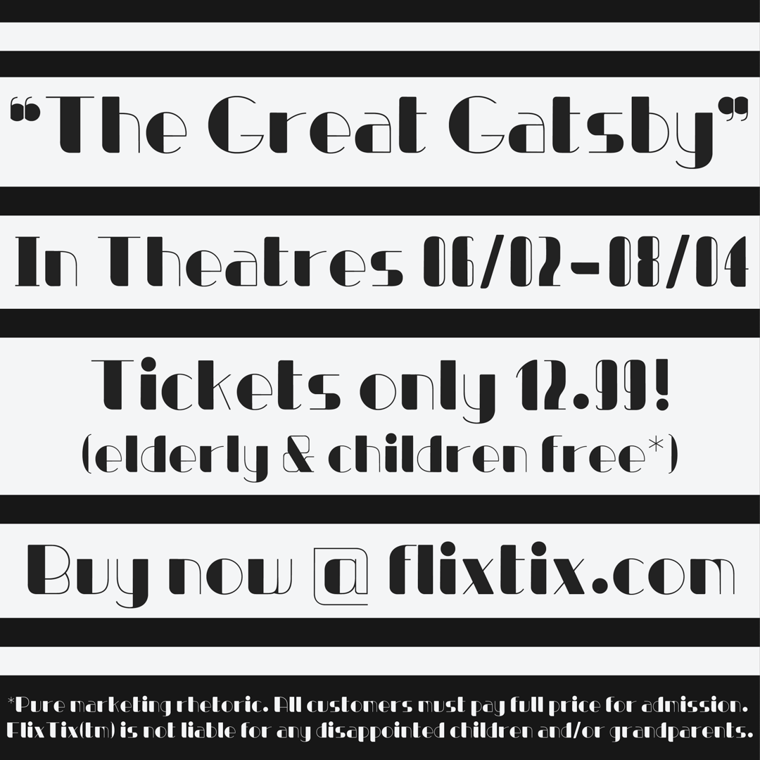
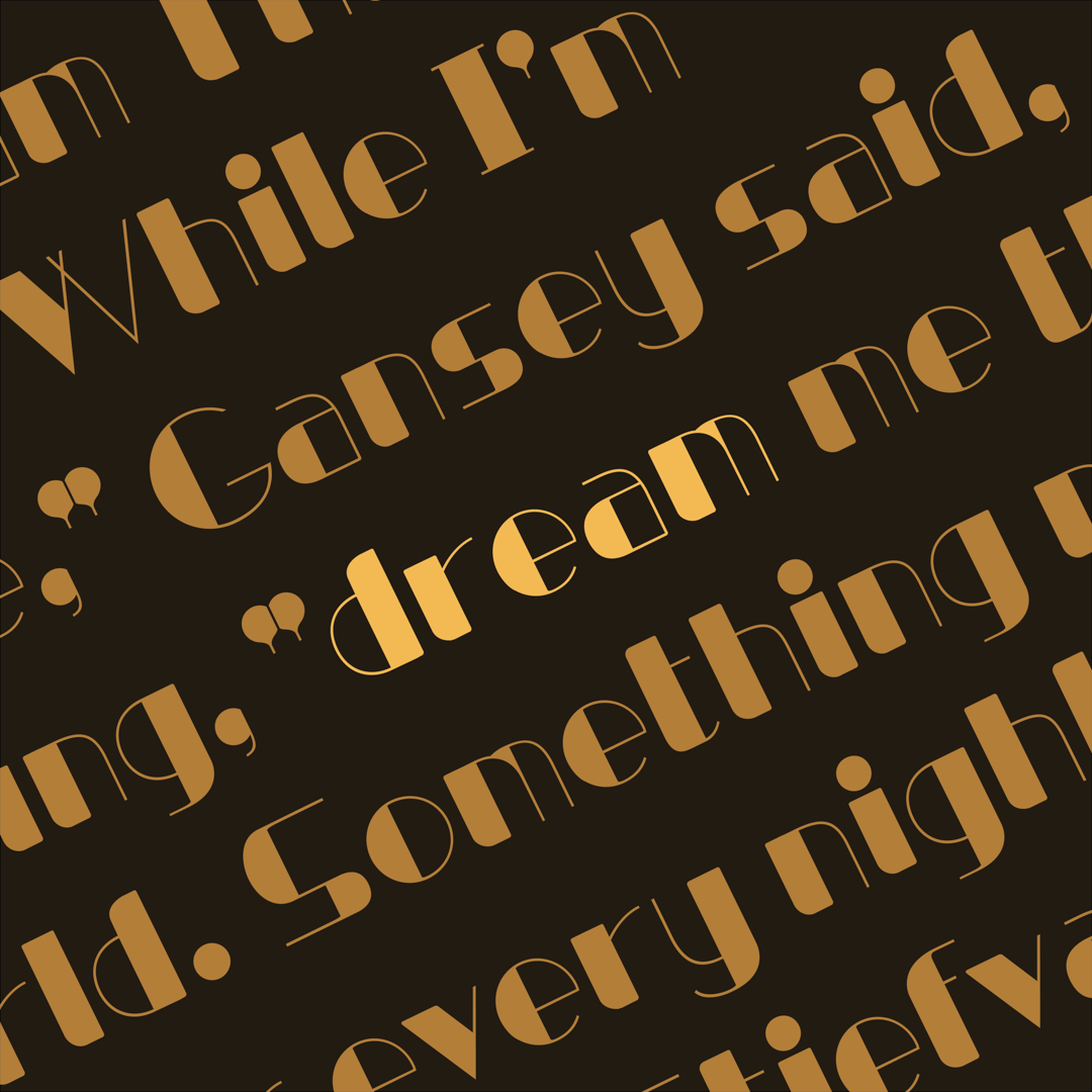
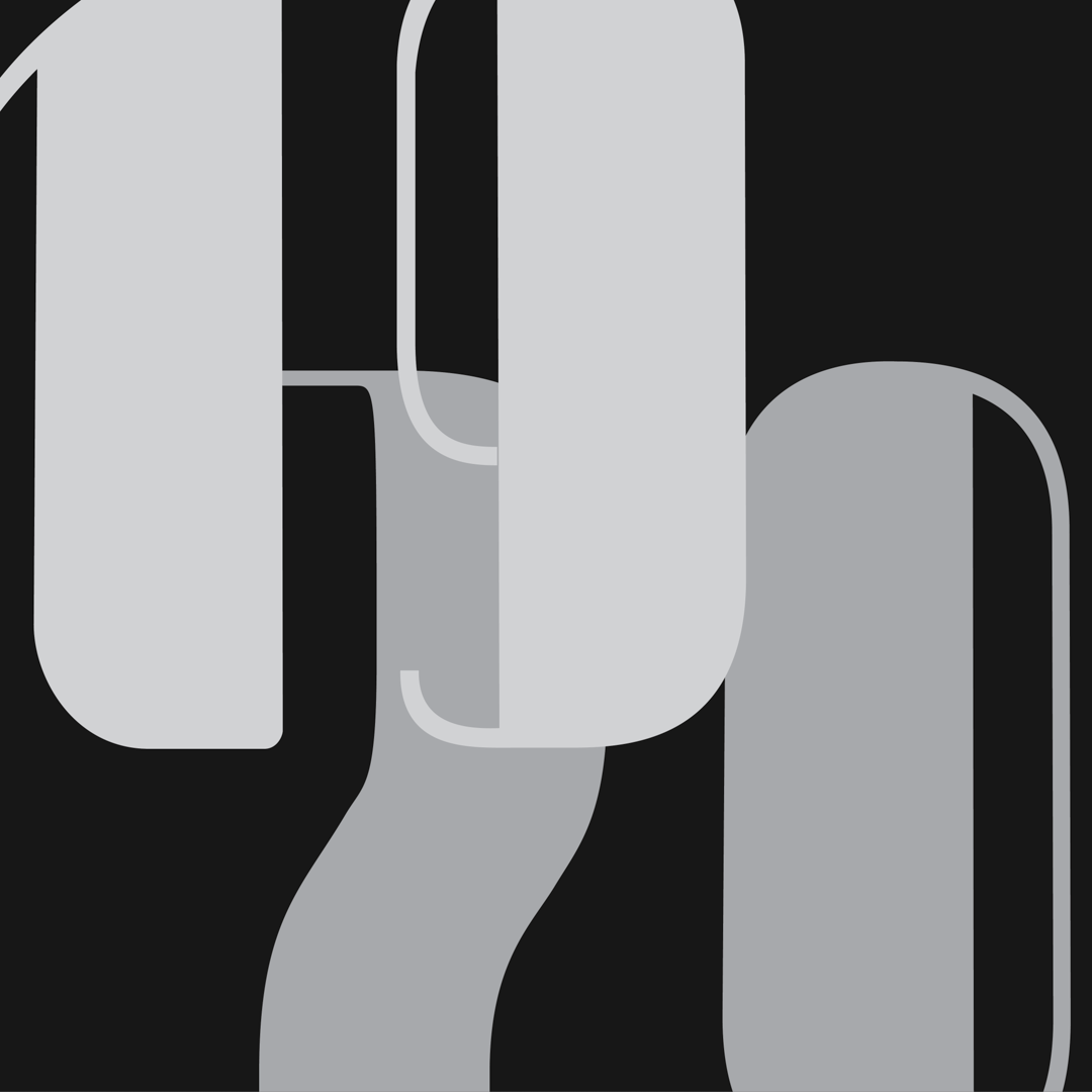
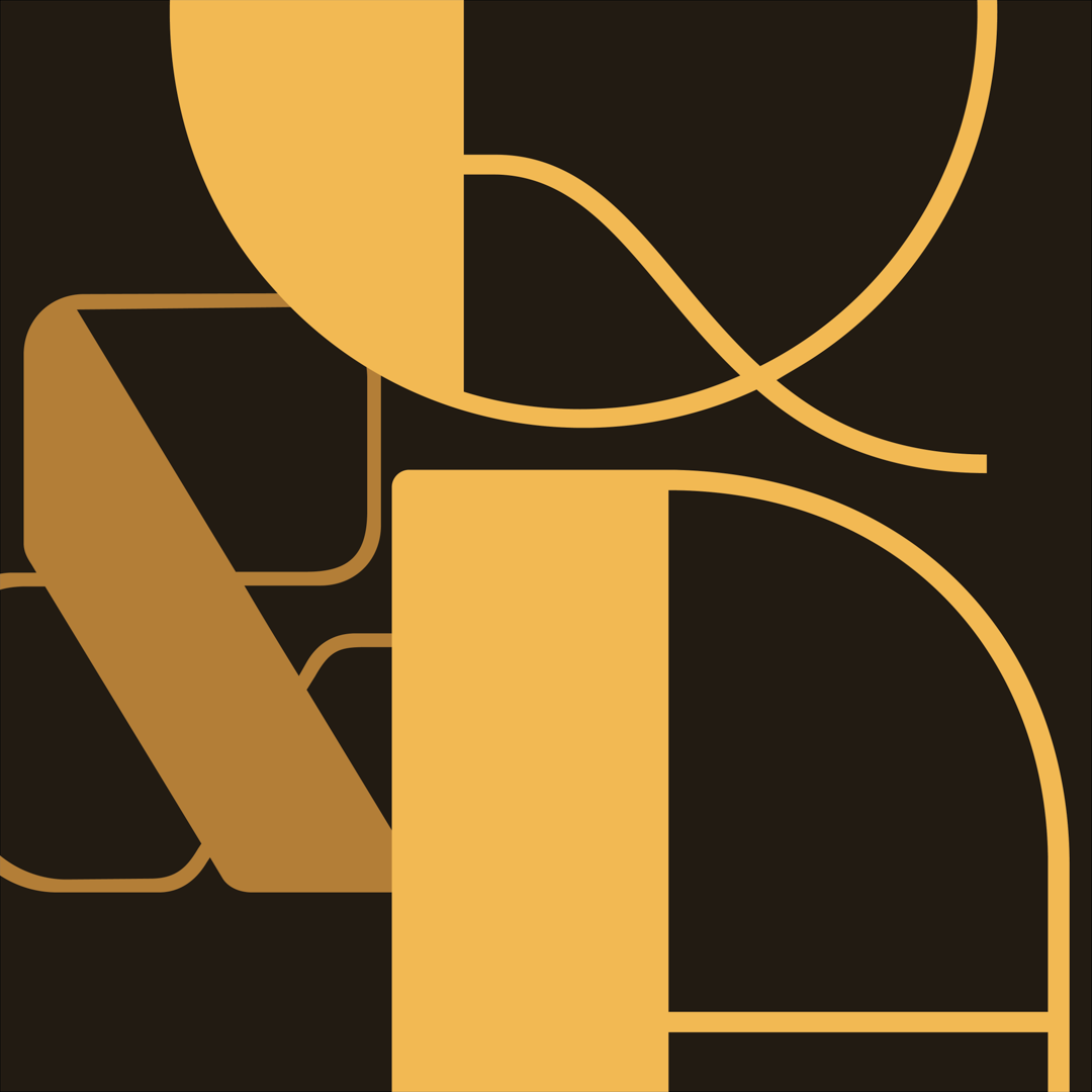
Impression is a typeface that draws from the Art Deco style of the 1920s, inspired by the stylistic forms of Electro Swing poster designs. It aims to be a clean typeface that achieves a high visual impact with its thick stems, thin strokes, and wide curves. The name “Impression” comes from the effect the typeface hopes to have on the viewer - leaving a visual imprint even after they look away. It is meant to be used for primarily digital designs in brand names, article headings, website front pages, etc.
The initial brief involved an exploration in more fluid forms based off of a needle & thread motif. Throughout the process of experimentation via hand lettering and type cooker recipes, it evolved to become more abstract and stylistically defined before settling on a sharp, high contrast presentation. It’s a direction I wouldn’t have initially explored, but became fond of as I experimented. Digitization was more straightforward in a technical sense and provided good foundational skill building for the software, but designing the letters to be distinct and readable with the highly heavy verticals and thin strokes required some deliberation. I’m happy with how the typeface turned out, and will be looking to experiment with diacritics to further improve its readability in the future.
Will Yang
Will Yang is a graphic design student from Taiwan, where he acquired a healthy appreciation for good boba and good people. He is currently studying art in Beijing, China, looking to explore fields of animation and game design. When not working, he can be found doing crafts, composing music, or staring off to somewhere five inches next to reality.


