
Type@Cooper Display Type, Summer 2020
Lilin
by Lucy Chen
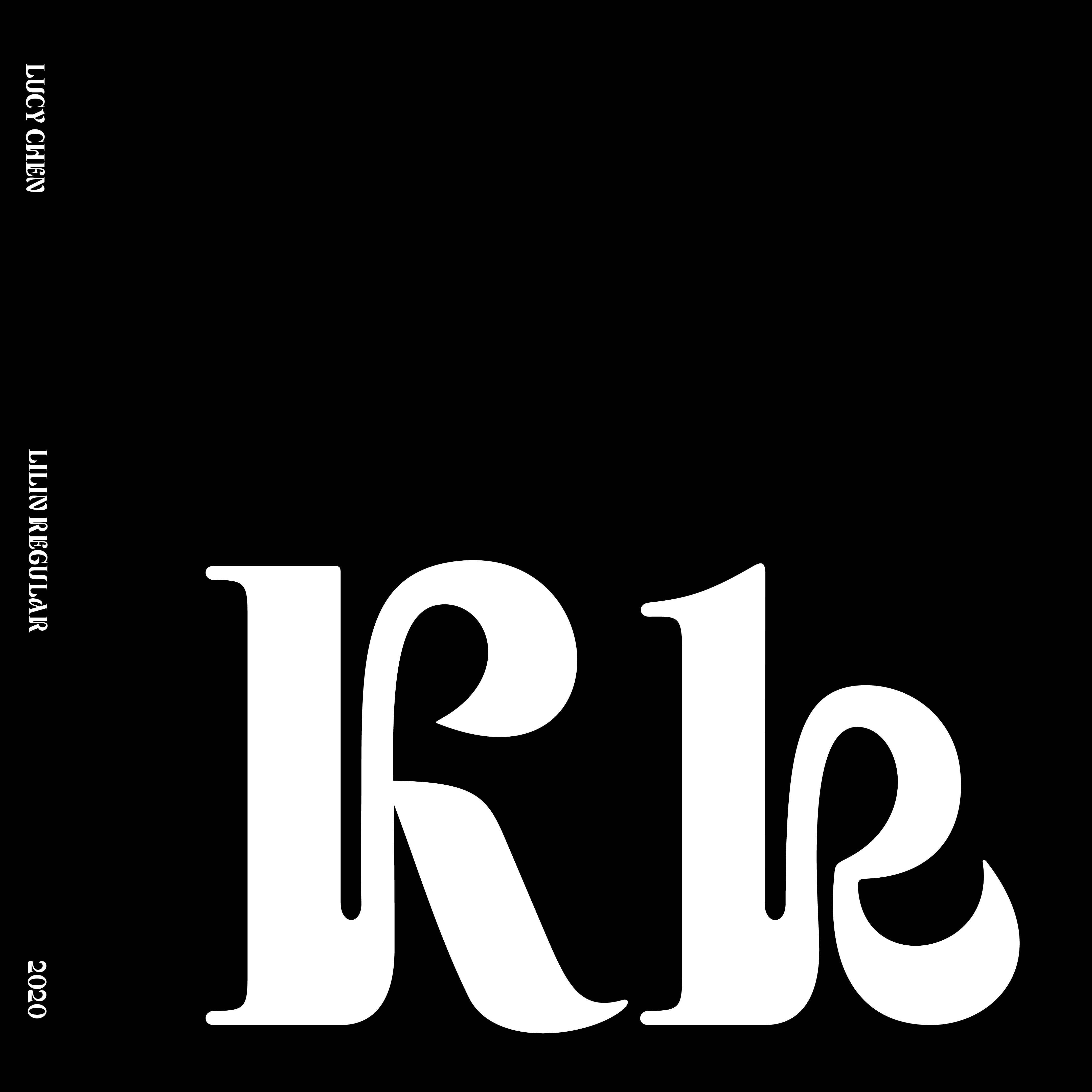
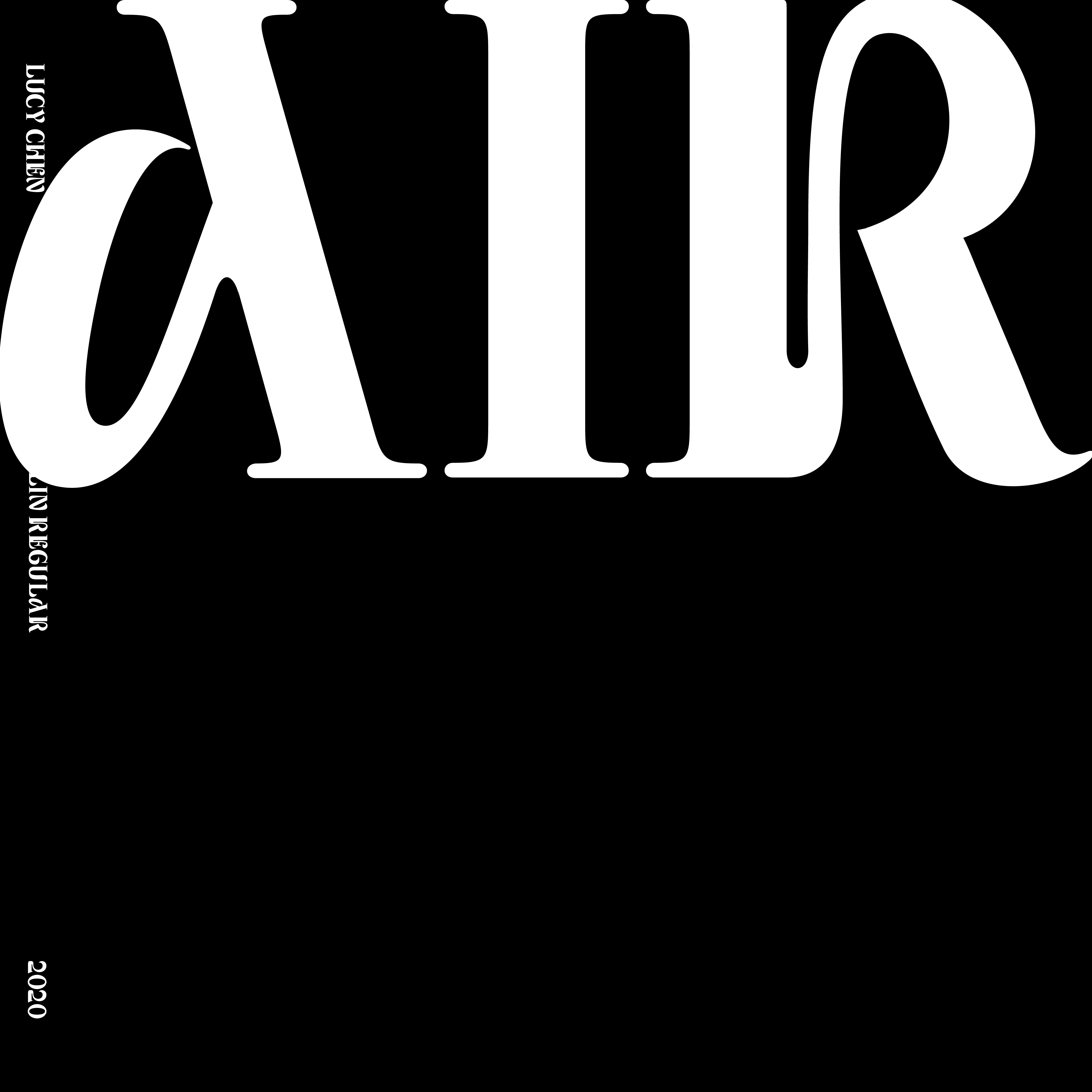
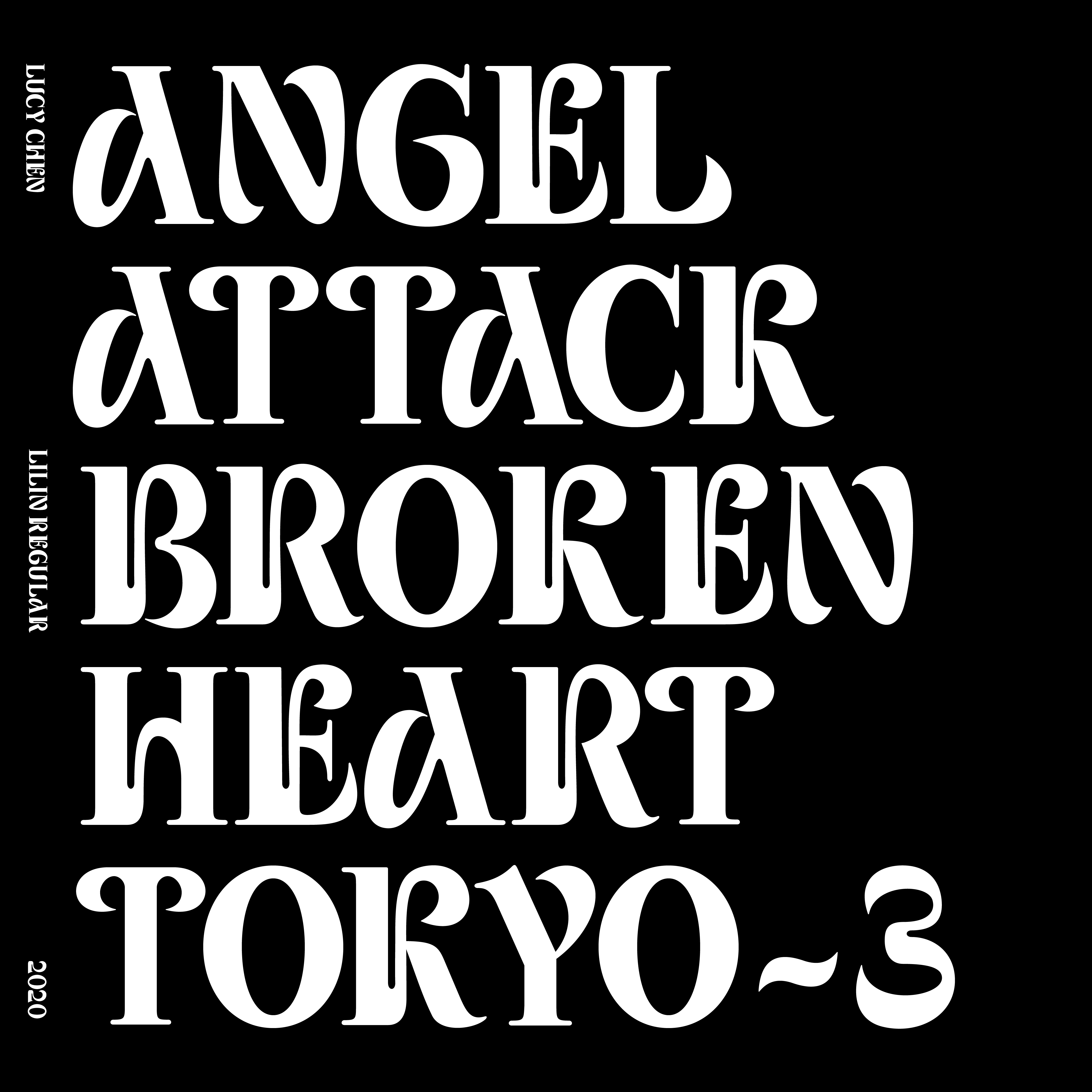
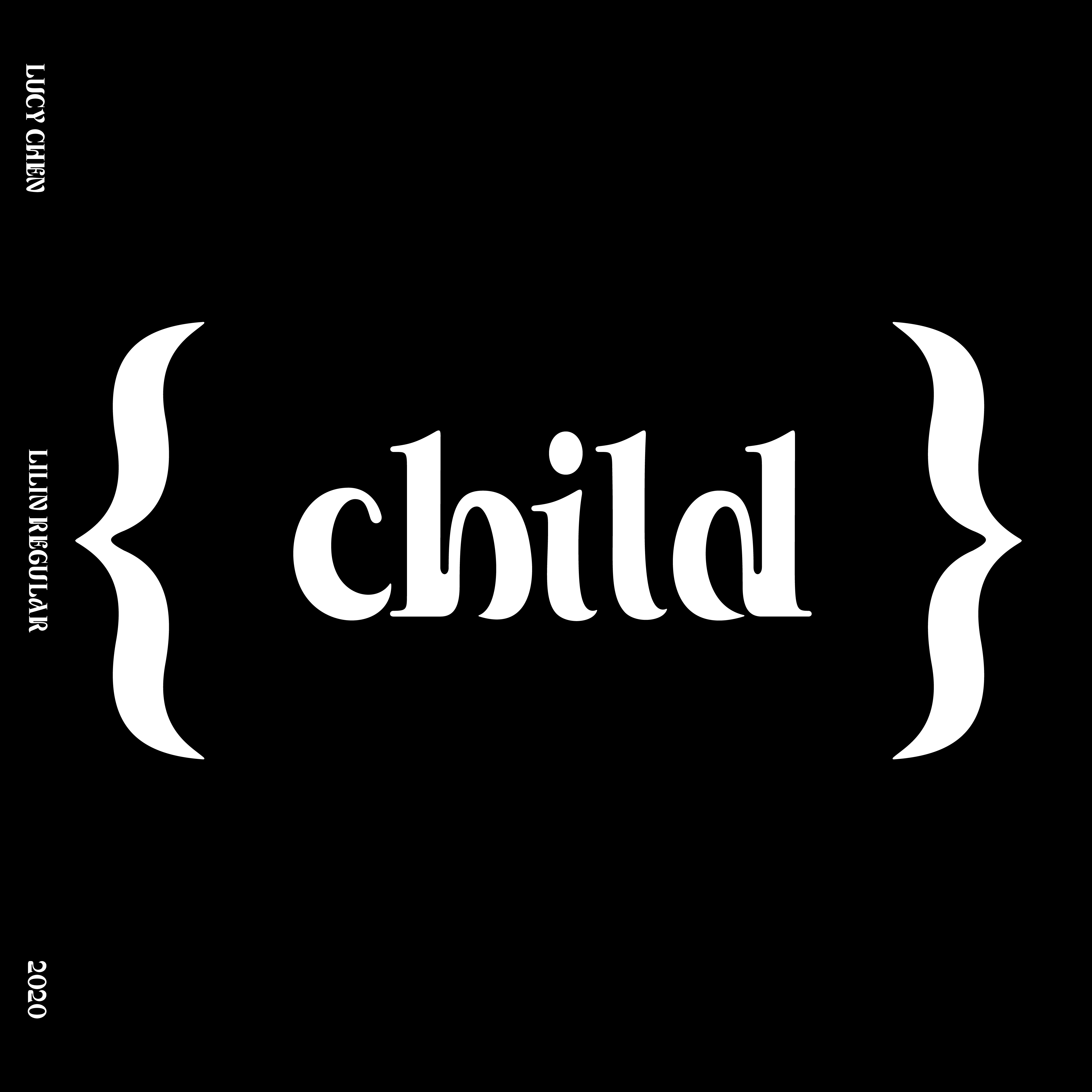
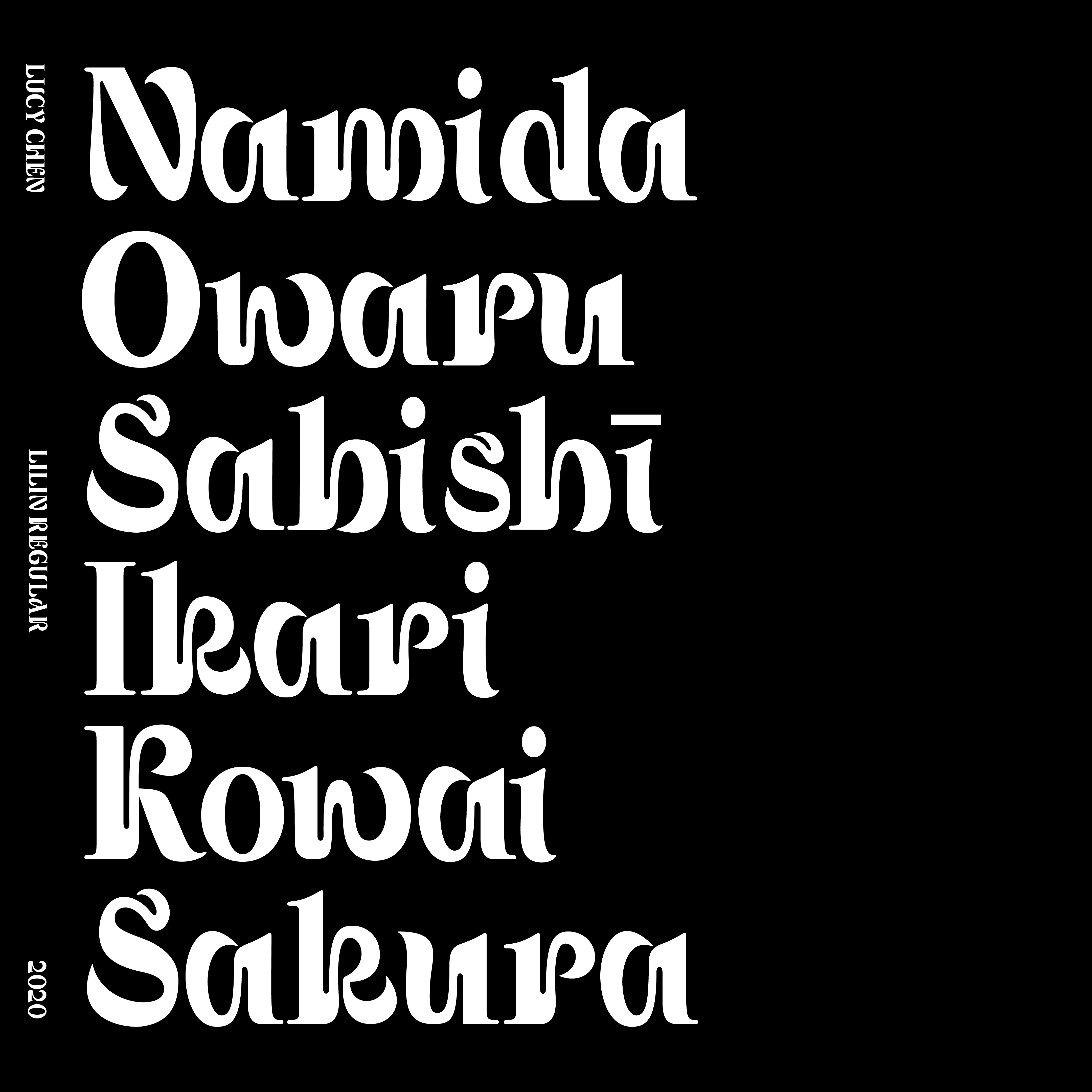
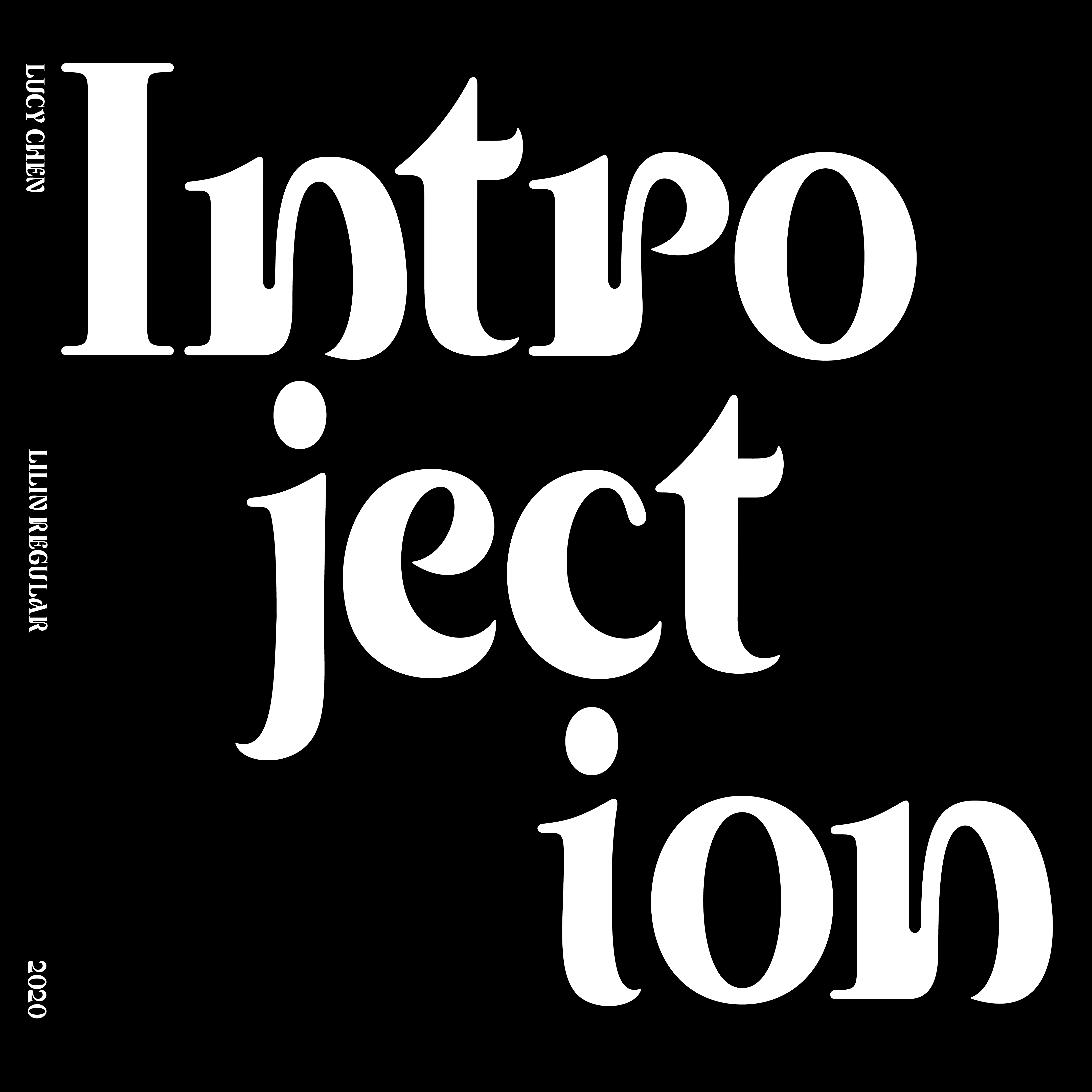
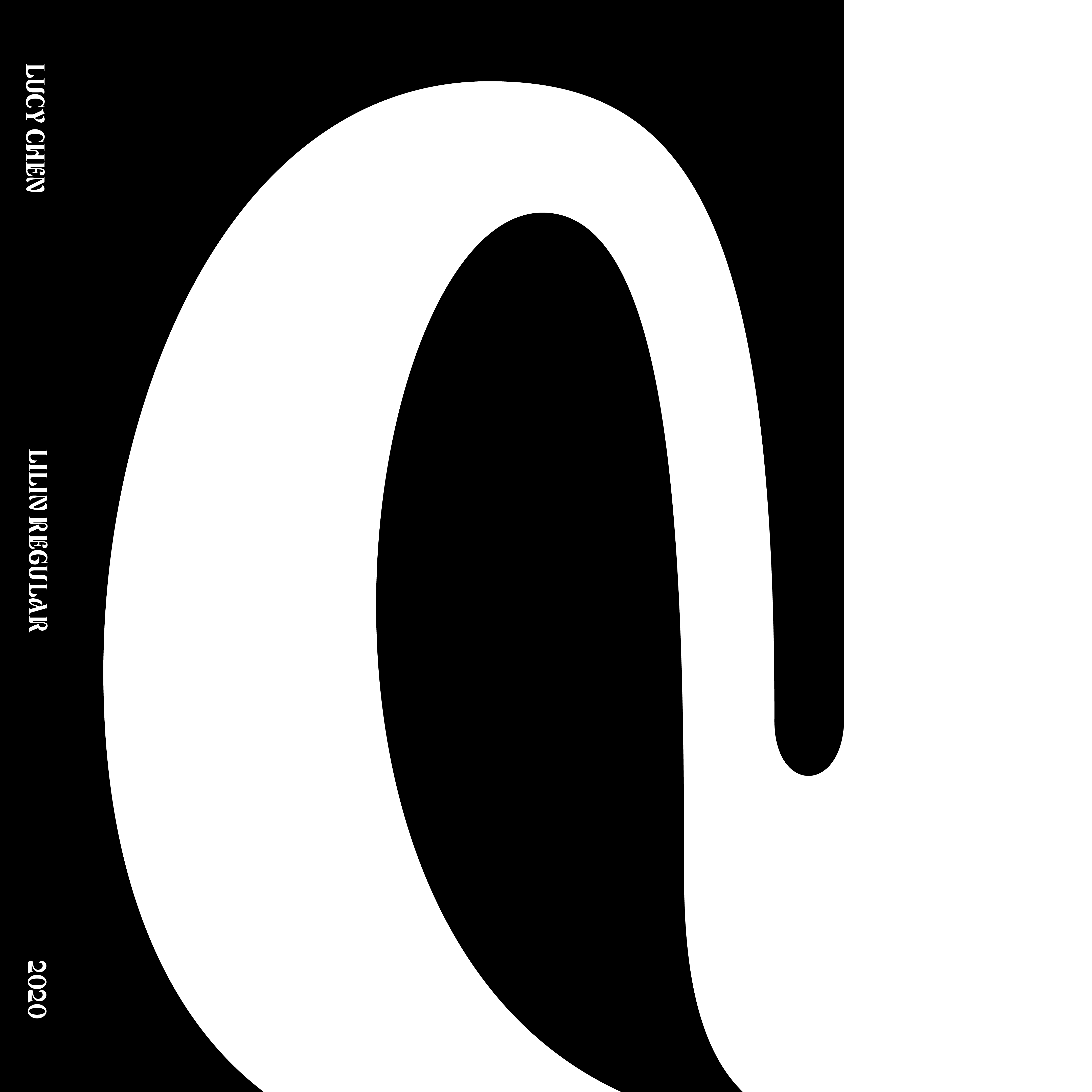
This display typeface introduces a synthesis between two typefaces (Times New Roman Condensed Bold) and (Matisse EB, hiragana font.) It was interesting to explore the connections between a transitional serif and an expression bold Japanese brush inspired typeface.
The goal was to create a modular typeface that answered the proposed brief and looked like a system. I hope the typeface would breath its’ own tone of voice and sophistication that can allow it to be used through multiple audiences and channels.
The process started with sketching and tracing on paper, figuring out where the thick and thin of the forms would be. Additionally, would be doing research and analyzing the way of writing with a brush and studying the hiragana characters.
Lucy Chen
Lucy Chen is a NYC based graphic designer, working across a wide range of formats, with a focus on branding, type design, and print. Her emphasis on design exploration and slight irreverence brings a curious voice to her work. Her experiences include working at Pentagram, Wieden+Kennedy, karlssonwilker, and Coach.


