
Type Electives Display Type, Fall 2023
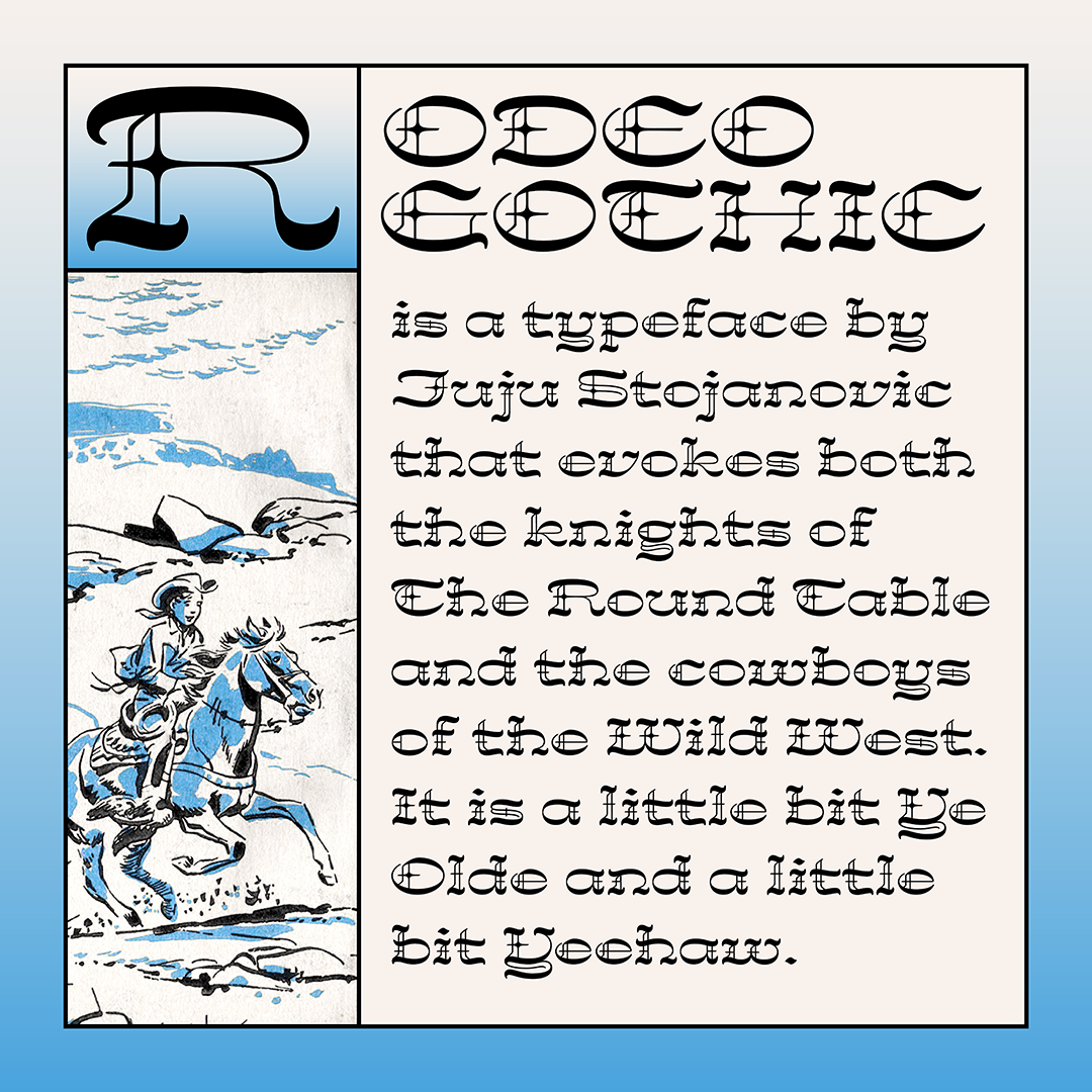
Rodeo Gothic
by Juju Stojanovic
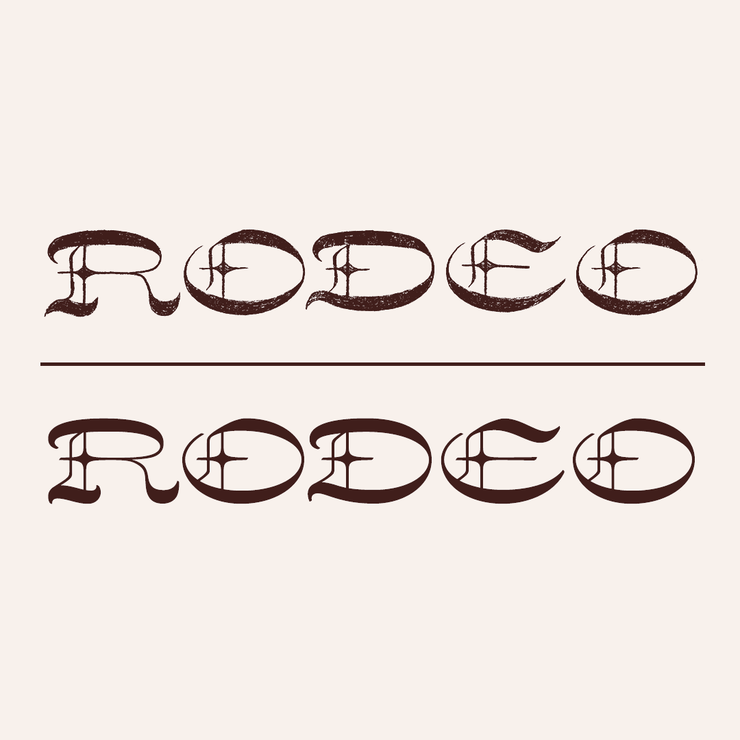
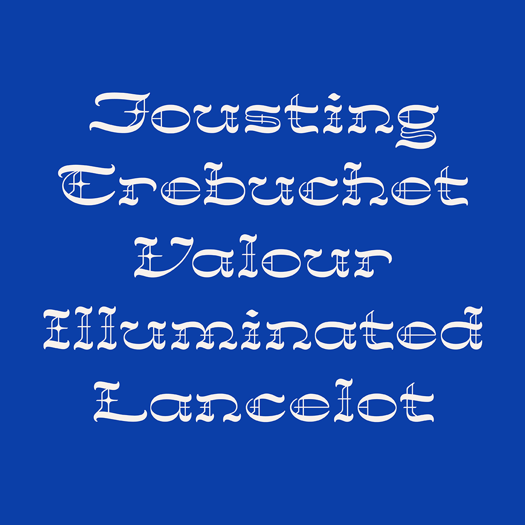
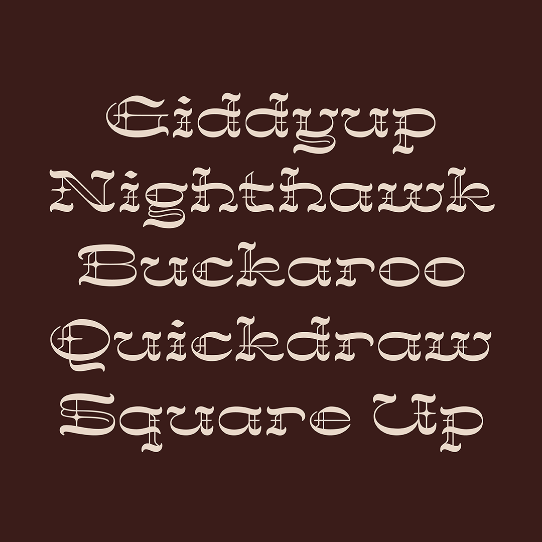
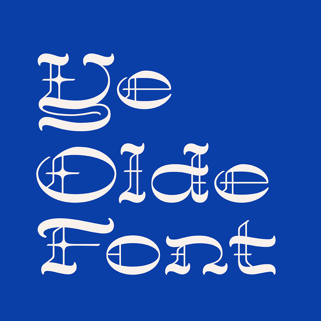
Rodeo Gothic is a display typeface that evokes both the knights of The Round Table and the cowboys of the Wild West. It’s a little bit Ye Olde and a little big Yeehaw.
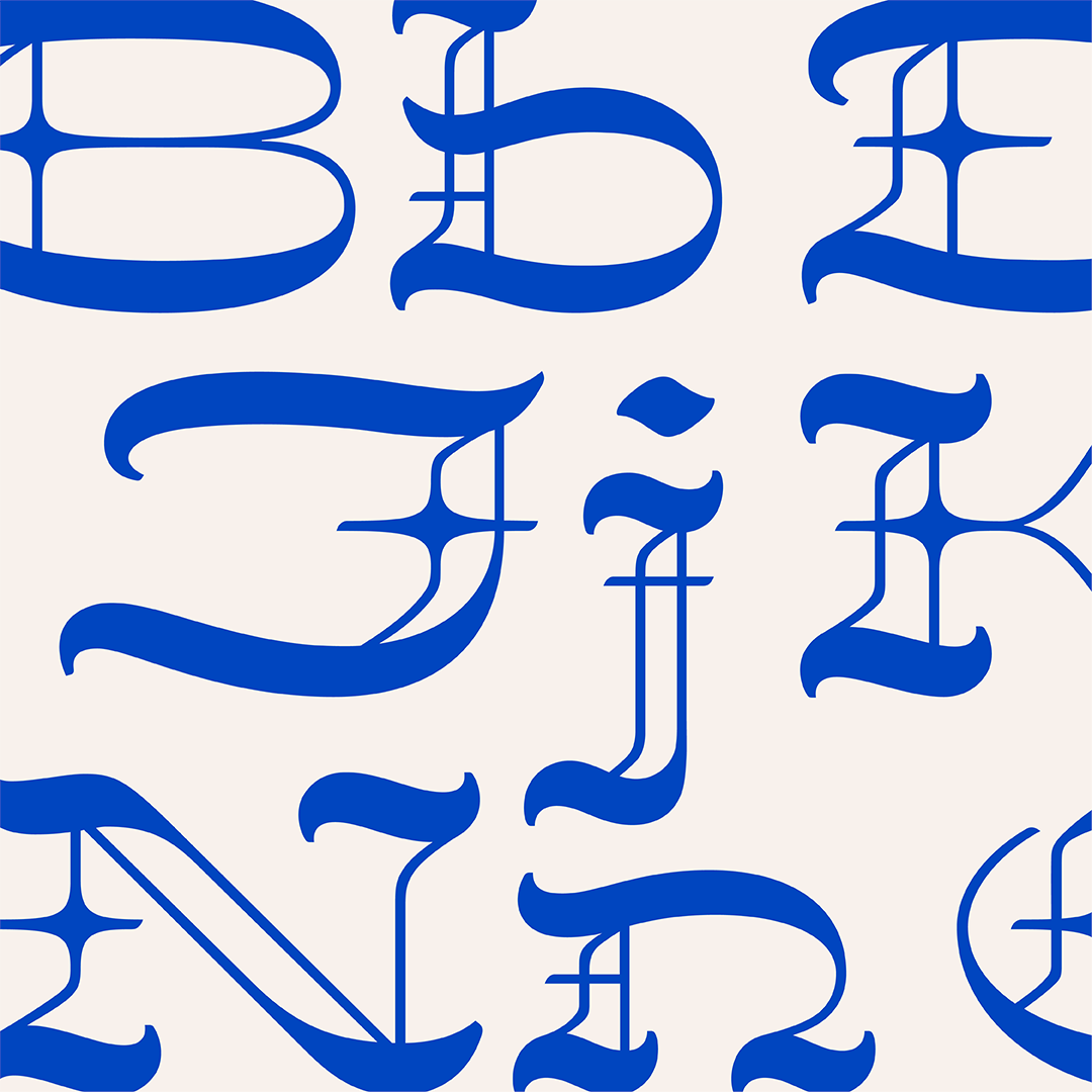
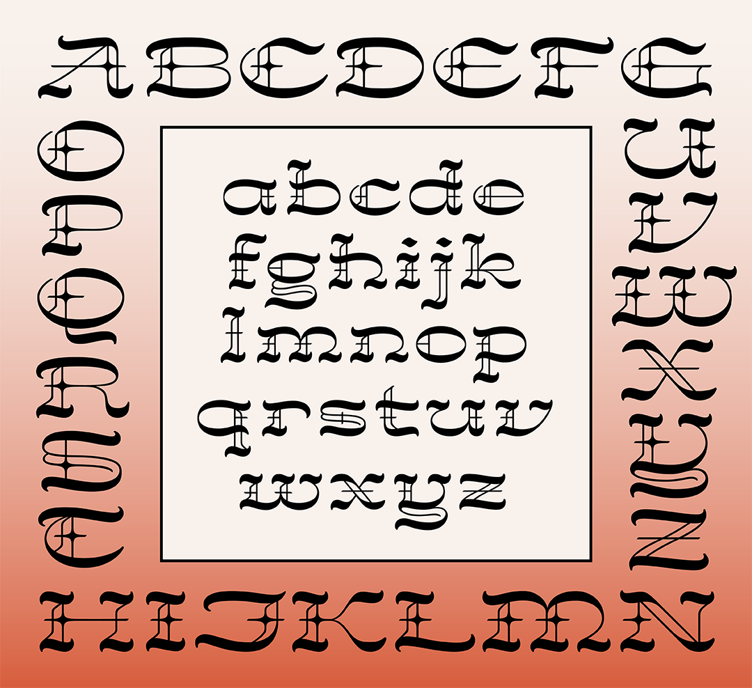
The idea for Rodeo Gothic was born out of a blackletter sketch where I realized that the small diamond ornamental strokes that are found in some blackletter capitals are similar to the sharp spurs that are found protruding from the vertical centers of some Western typefaces. I loved the idea of mashing up these two highly distinct styles for something very unique that also doesn’t take itself too seriously.
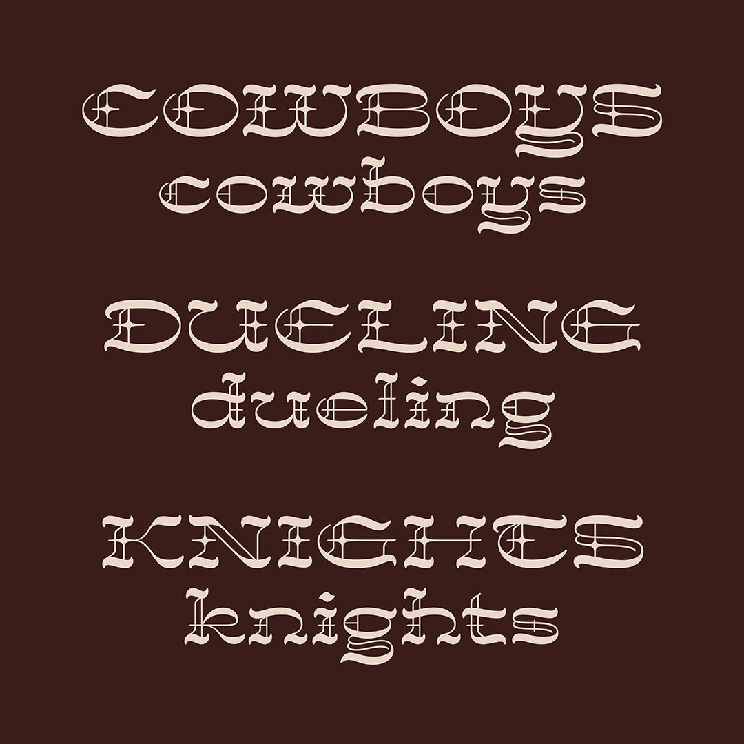
In exploring how to approach this unlikely pairing, I knew that I wanted to do more than draw some Western-like type with a few extra blackletter-y flourishes. I decided to loosely base the construction of the letterforms off of actual blackletter construction while giving it the horizontal stress of Western type.
Additionally, the forms of Rodeo Gothic are inspired by various Western and Medieval visual motifs such as lassos, spurs, whistling wind, illuminated manuscripts, and stained glass.”
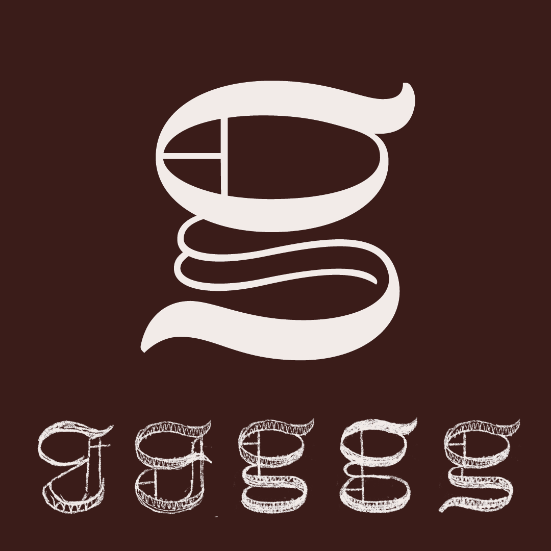
One of the greatest challenges with designing Rodeo Gothic was the short descenders and how to fit the necessary strokes into such a short vertical space. The lowercase g was an especially tricky puzzle to solve.
Juju Stojanovic
Juju’s multidisciplinary background as a professional ballet dancer and math student fuels her approach to work in graphic design, type design, and creative coding. She is currently pursuing a BS in Communication Design at the University of Cincinnati’s College of Design, Architecture, Art, and Planning (DAAP) until 2026.


