
Type Electives Display Type, Spring 2023
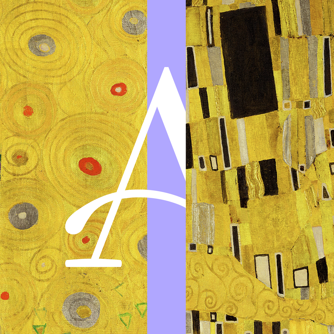
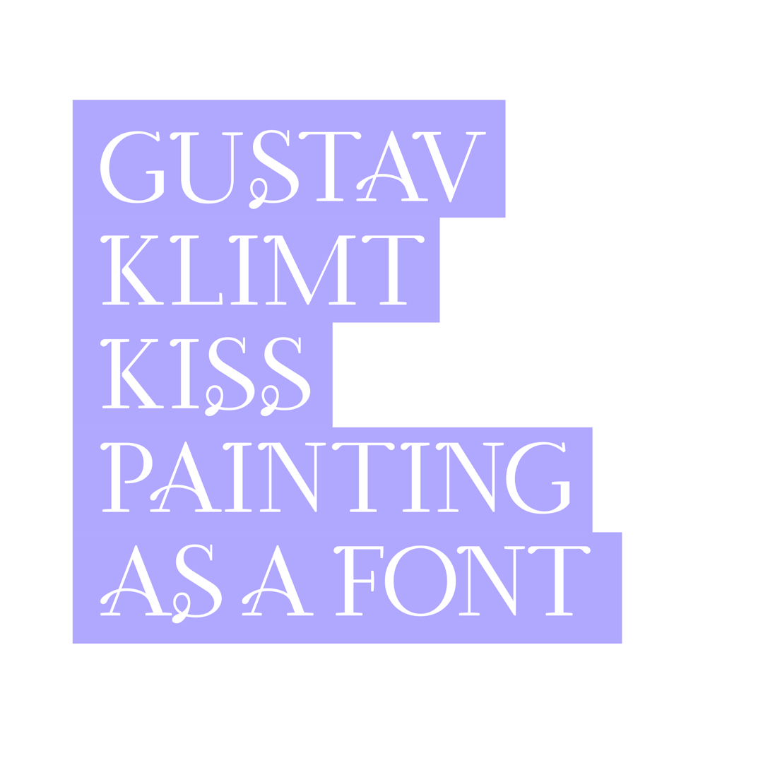
GUSTAVKISS
by Shahrzad Akbari
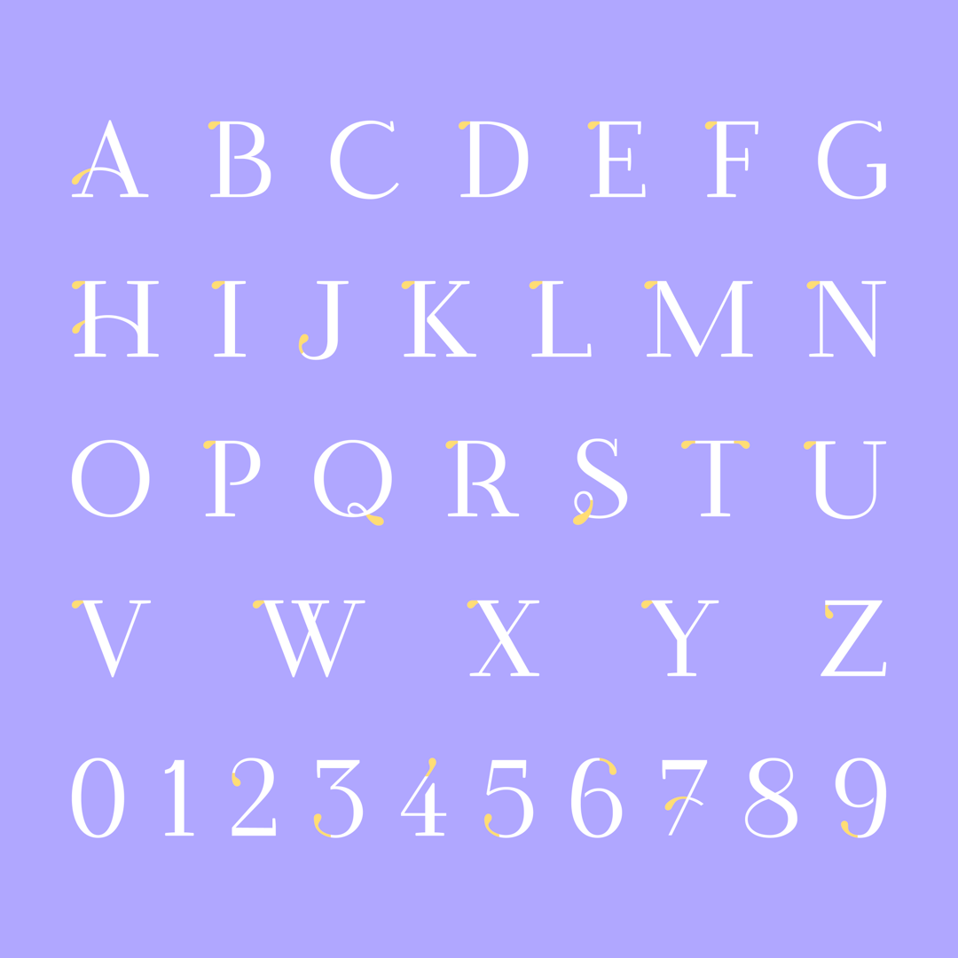
My typeface is based on ““The Kiss”” Painting by Gustav Klimt, which I’m so obsessed with.There are analyzes of this painting that I want my typeface to be the same. A combination of this couple. Straight and serious lines alongside with round lines and tender feelings. Together in a delightful harmony. You can use this typeface where you want to express a little of both of these feelings. It’s for titles. While it’s currently all-caps, lowercase letters are on the horizon.
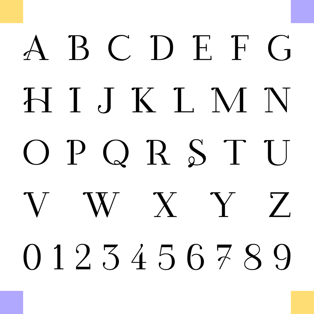
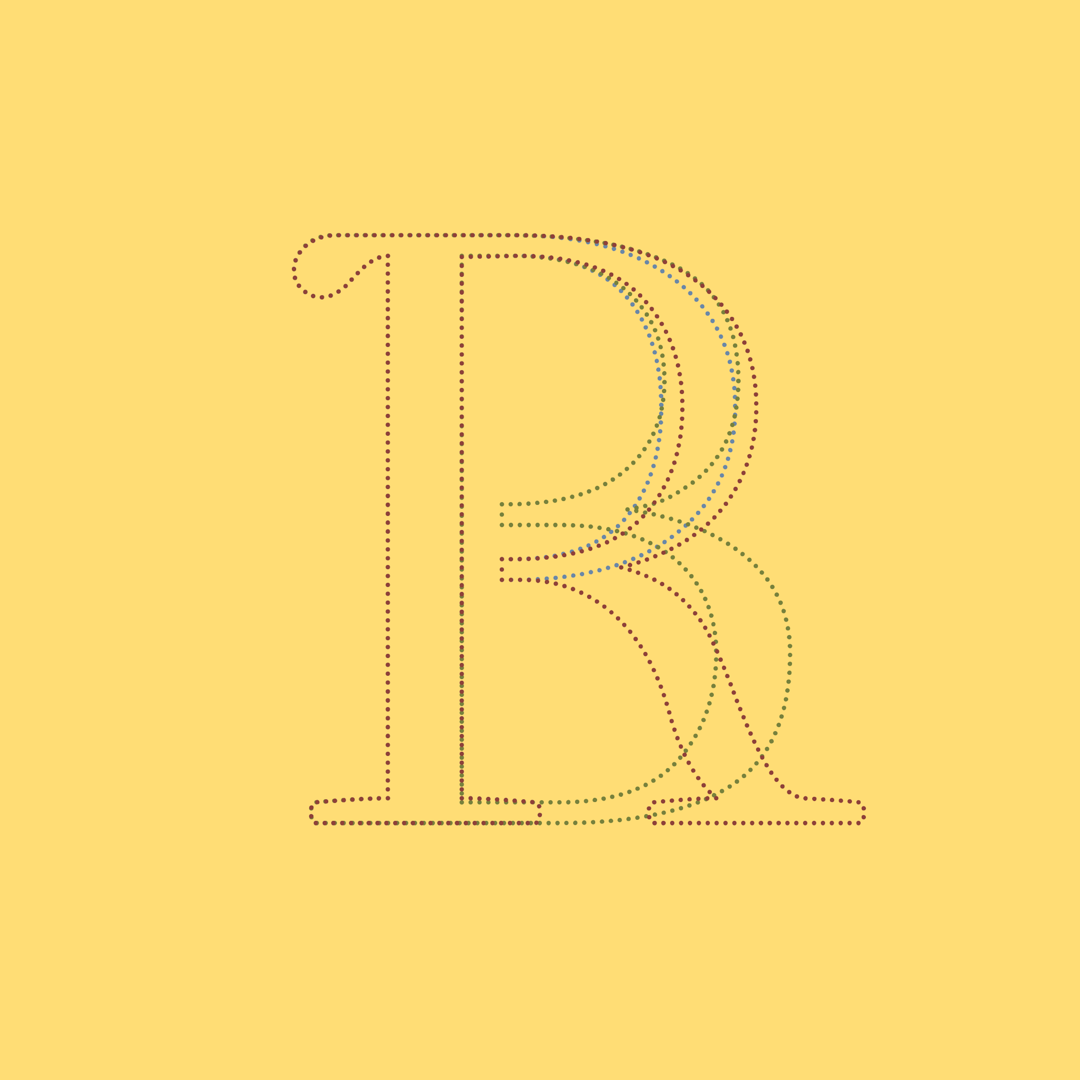
In the design process, I decided to implement the intricate intimacy of the couple in the painting, in my typeface. By daringly placing distance where none should exist, within the letters of P, B, R and the digits of 6 and 9, I conveyed the true absence of distance between two enamored souls.


Shahrzad Akbari
Based in Tehran, Iran, I’m an ambitious and passionate font engineer obsessed with diving deep into the world of fonts. I’m constantly seeking to push boundaries and create innovative and inspiring works. My goal is to leave a mark on the world of type by doing great things.


