
Type@Cooper Display Type, Fall 2020
Xóchitl
Tamara Segura
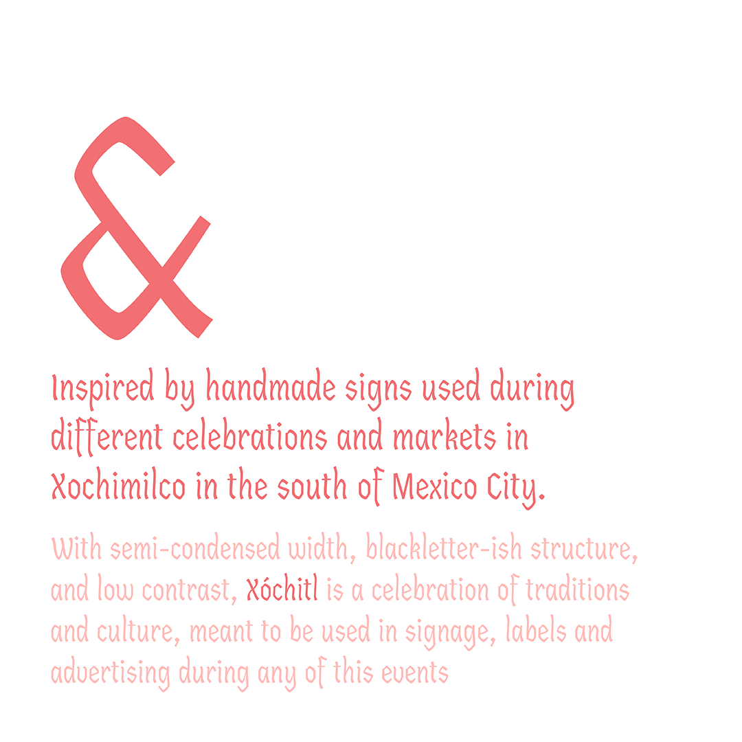
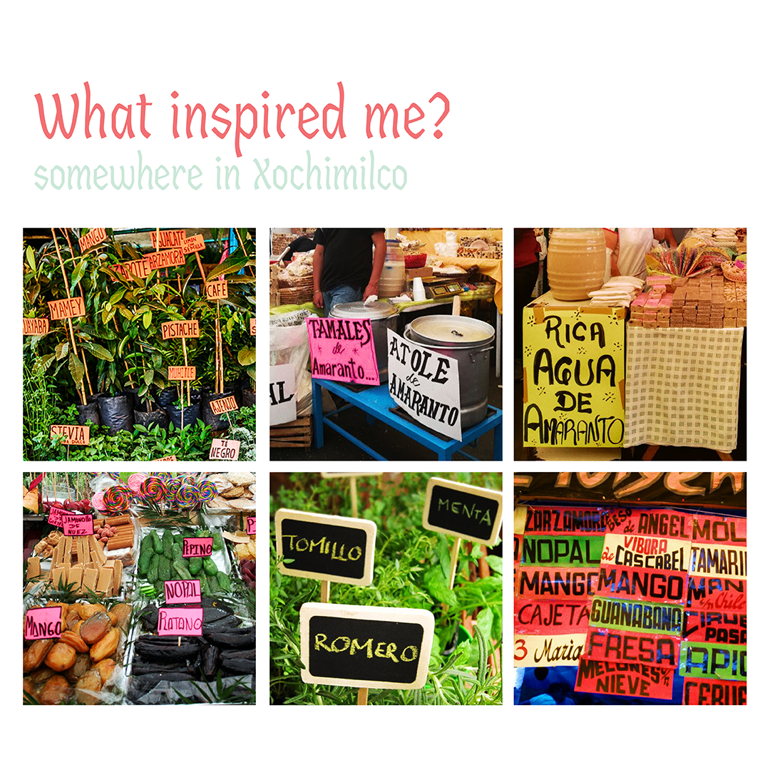
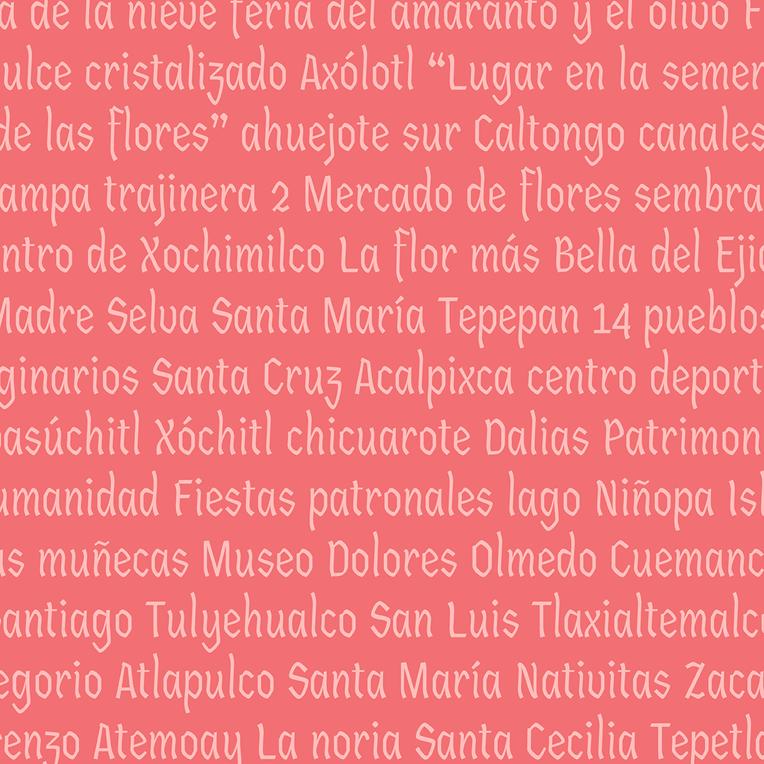
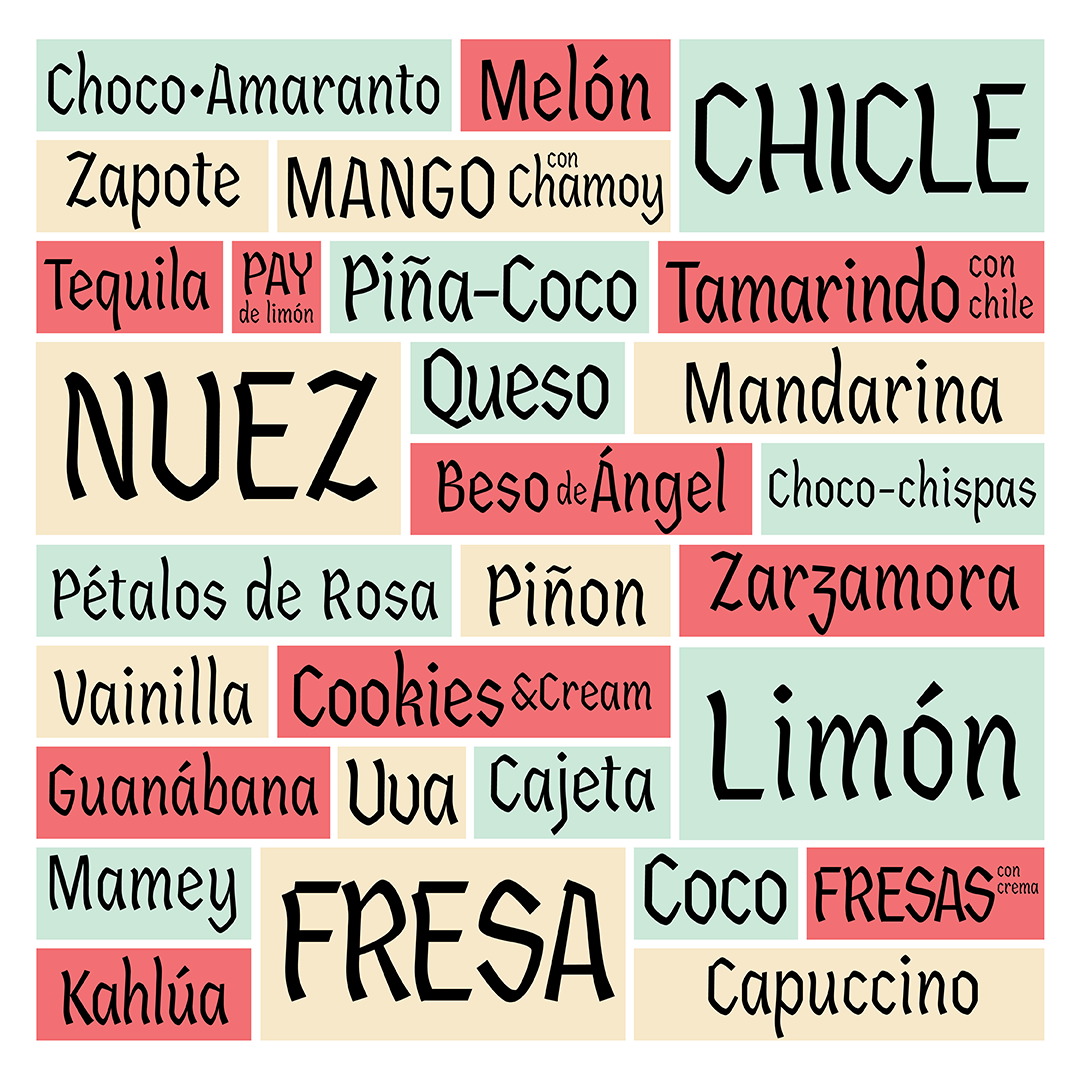
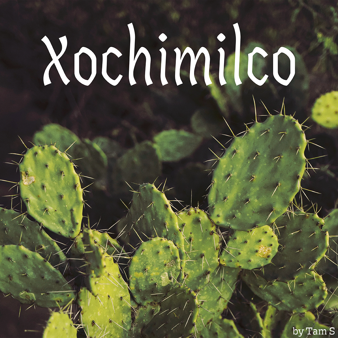
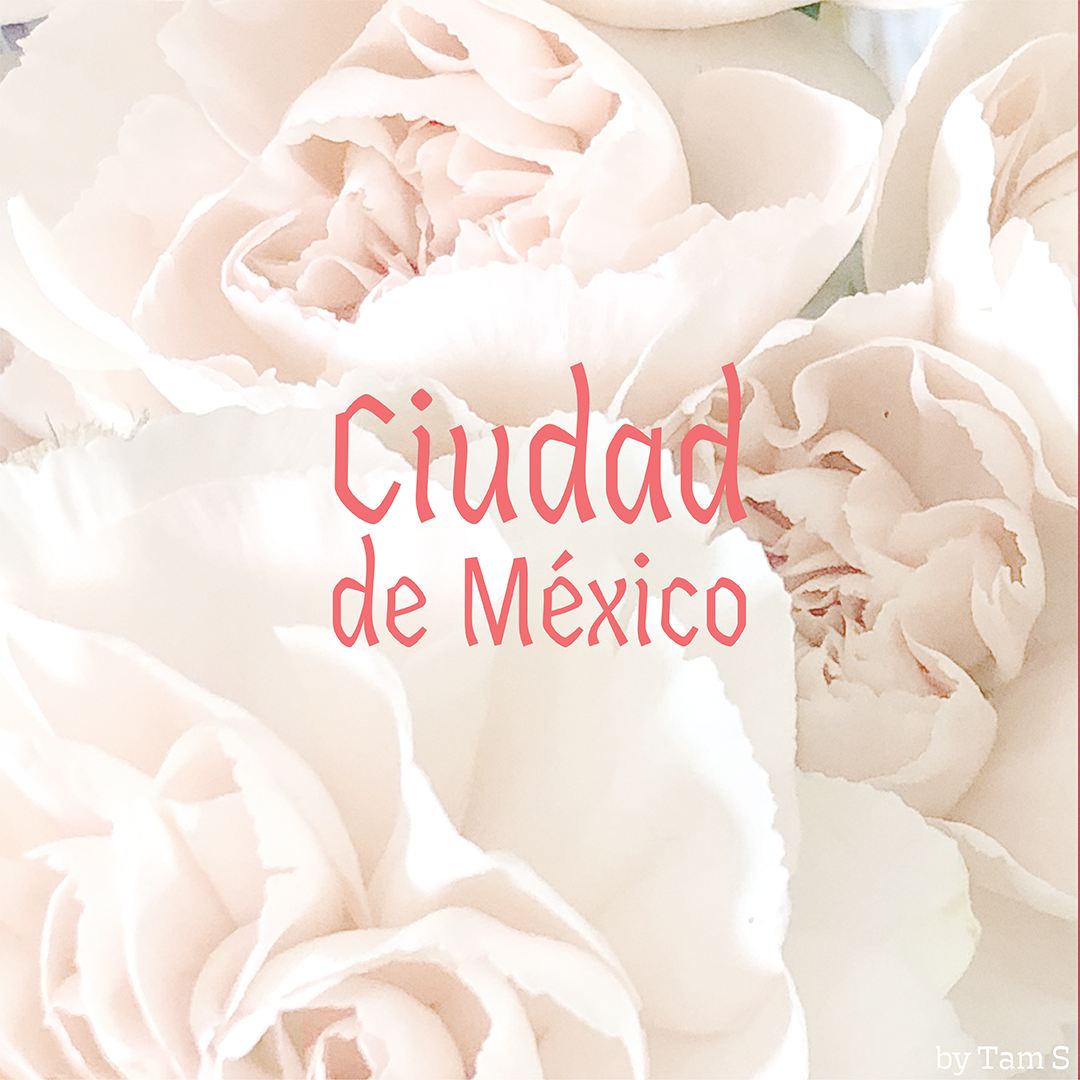
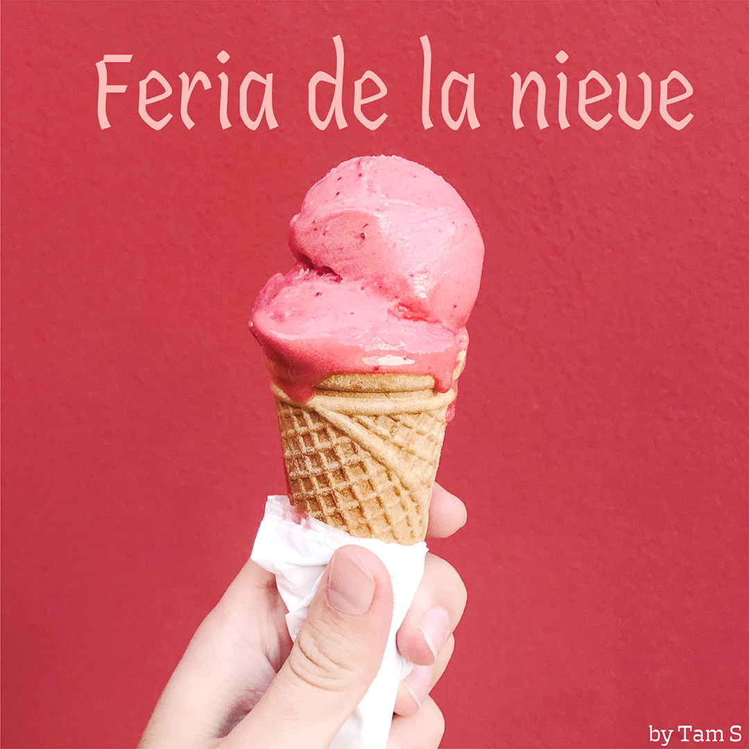
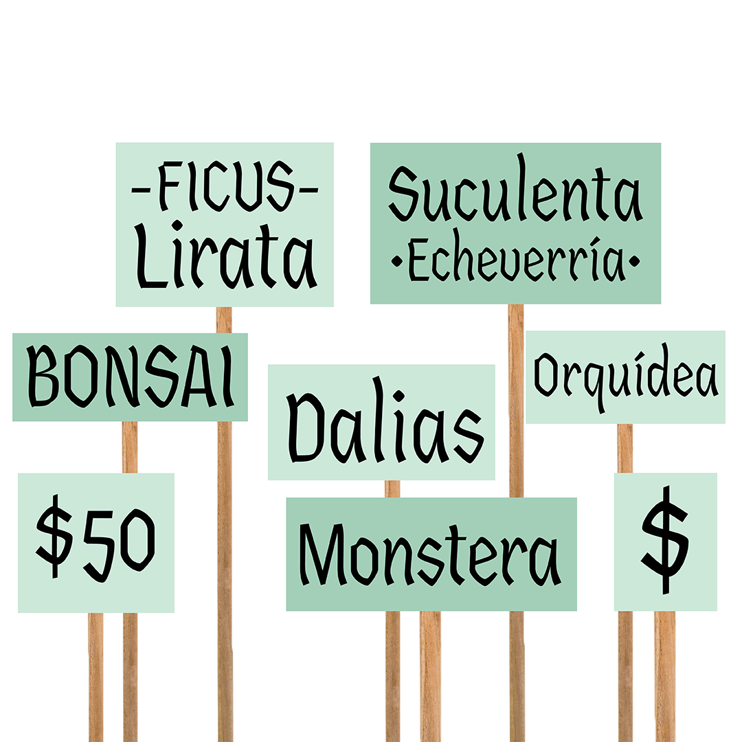
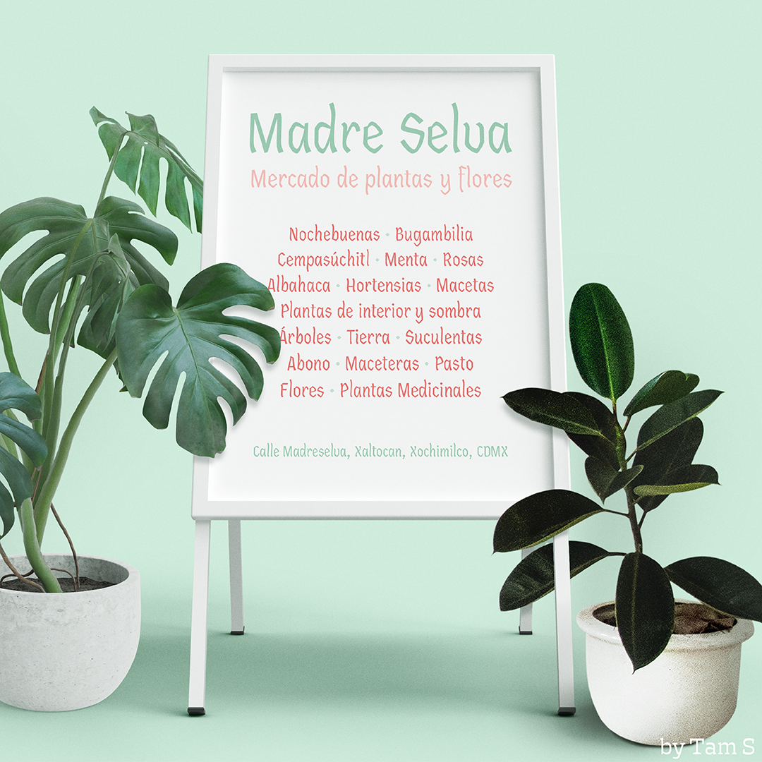
«Xóchitl» was inspired by handmade signs used during fairs and celebrations that happen in Xochimilco, Mexico City. These signs are hand-drawn by people to label flowers in the markets, ice cream and traditional candy during fairs. The words they label come in a whole range of different lengths, sometimes having to fit in a same size cardboard, or other times they have to adjust to the cardboard size they are able to find. This project was born looking for readability at different sizes without losing the handmade or the cultural feeling they traditionally have. With a special focus on highlighting the strength these letters have and being recognizable.
The conceptualization of this typeface was a tough one, I started by synthesizing some of the shapes I found during the research, set down the most important parameters in order to achieve the goal I wanted, then I started the sketching process, I tried a ton of different styles and skeletons, looking for one that really showed the concept I wanted to communicate. My goal is to develop a variable width axis, so the concept of maximum use of the space where it will be applied is even more evident.
Tamara Segura
From Mexico City, Tamara is a letter, branding and graphic designer. She is developing her skills and education on Type Design so in the near future she will be able to design letters on a full time basis.


