
Type@Cooper Display Type, Summer 2020
Hibernating
by Deanna Laney
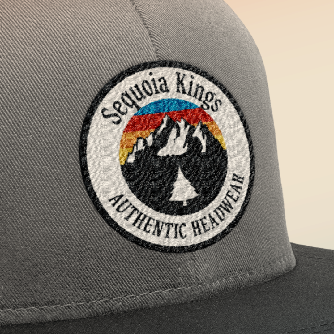
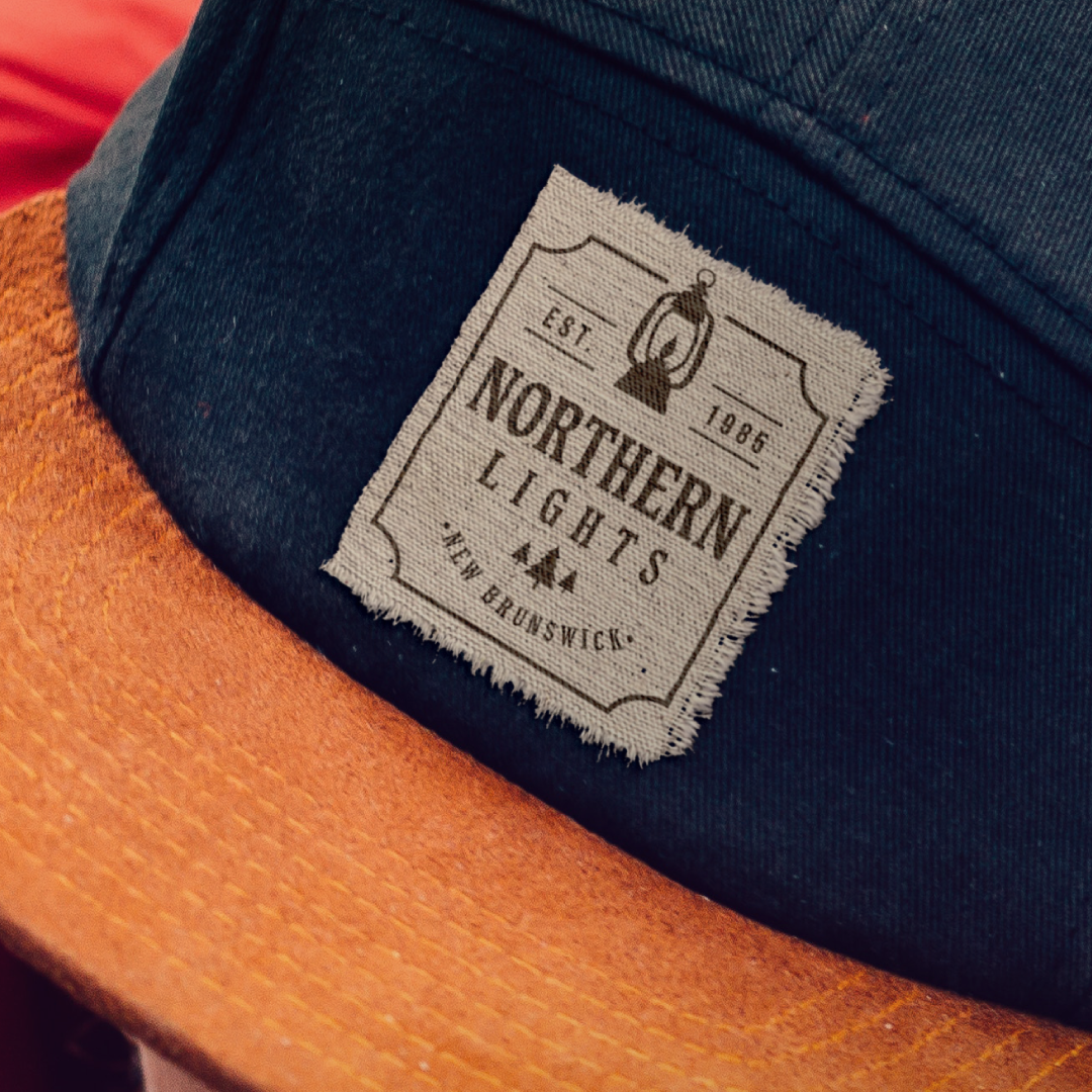
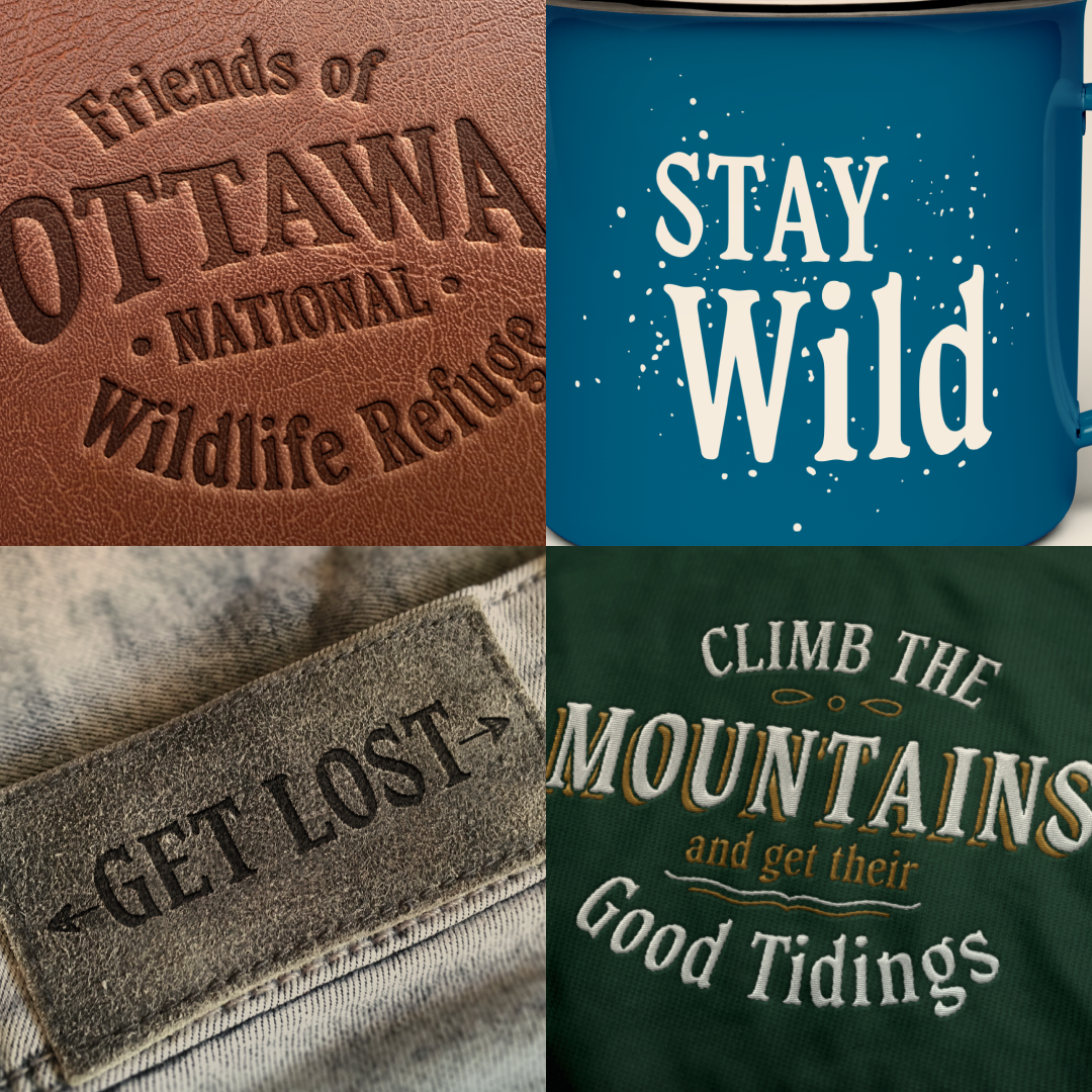
The design brief I came up with was to create a typeface suitable for multiple application techniques on apparel items, focusing specifically on the outdoor apparel market. As an imposed criterion, I challenged myself to somehow incorporate a visual element of the physical spaces seen in outdoor environments. The typefaces often used in this space tend to have either a hand-drawn quality to them, or a highly crafted, somewhat ornate, yet casual quality. Right away I made the decision that I wanted to do a condensed design with “not too high” contrast in order to provide the versatility I would want in a font for this purpose—allowing for more letters in a smaller space without losing too much detail when reproduced in various methods such as embroidery or embossing.
The visual element I was inspired by was the bark from trees that I remembered encountering on a hiking trip in Sequoia National Park, which I later discovered was a ponderosa pine. “The bark of a ponderosa pine… has large, deep furrows and grooves that divide the surface of the trunk into a series of scales that fit together like the pieces of an intricate natural jigsaw puzzle,” (Montana Public Radio). I was captivated by these interlocking shapes of soft curves and sharp corners, and I used this as a starting point for the shapes of the serifs. What I ended up with was a sort of flat-brush, translation-based serif typeface with subtle features of the bark-scale DNA. I do believe it fits in the visual landscape of the green, nature-loving side of the outdoor apparel market, and, while untested, based on my experience, it should execute well at most sizes of embroidery and other application methods. While it is certainly not finished, for the scope of this class, I am happy with the result of my first completed typeface!
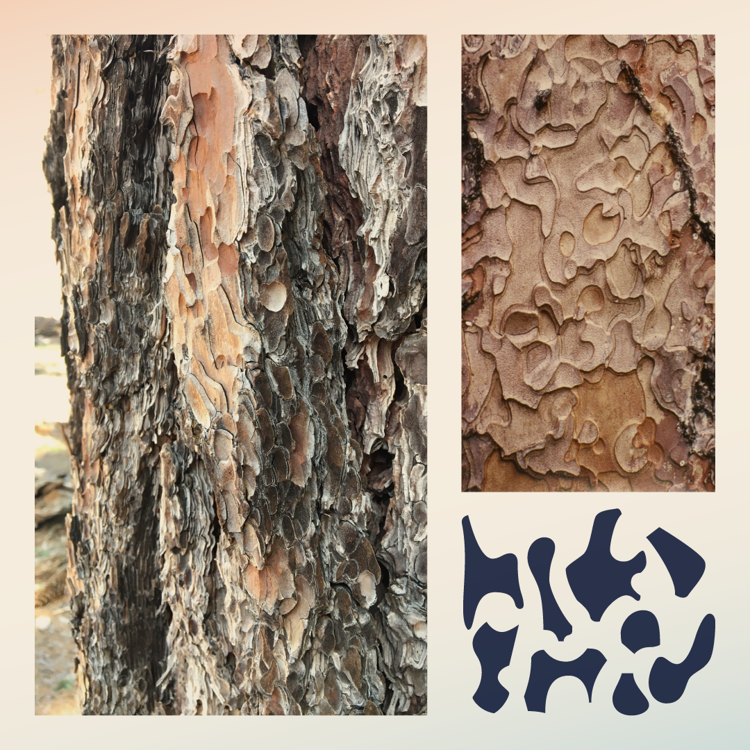
My crafting process started with using photos of ponderosa pine bark and tracing some of the shapes that stood out to me. I initially started with two approaches: one, finding and molding letterforms out of the organic shapes that were already present in the bark, and the other was taking some of the shapes that I’d traced and using them as serifs. Neither one on their own was really successful. The organic found letterforms didn’t suit the needs of a usable typeface, and the pieced-together serifs didn’t capture the look I was going for. However, the latter did give me a good starting point. So instead of doing a glued-on serif approach that looked more Tuscan than anything, I integrated the shapes into the actual formation of the stroke, as if a bit of tree-bark was part of the pen.
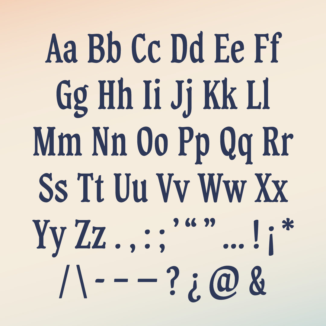
For reference in shaping the rest of the letterforms, I used a flat brush to sample all sorts of stroke and terminal shapes. After crafting the initial ‘n’ and ‘o’ I was happy with, the rest was just a long series of mostly digital evolution and some sketching, always referring back to the bark shapes and brush strokes, while following the guidance I received in class. I never could have gotten this far without Juan’s feedback and encouragement from my classmates—it’s too easy to design in a bubble and have no idea if what I’m sinking hours of my life into is actually worth making, so indications that at least a few people actually like what I’m doing is pretty cool!

Deanna Laney
Deanna Laney is a graphic designer dabbling in type design, hoping to make it a larger part of her career someday. She has been accustomed to the life of an in-house designer for nearly a decade but has recently gone freelance since uprooting from her home state of Ohio and moving to Korea. Currently, she is enjoying the transition to working remotely from the other side of the world, as well as the opportunity the move has provided to feed her brain and learn new skills, which, as of late, has included coding, 3D modeling, and now font-making!


