
Type Electives Display Type, Fall 2025
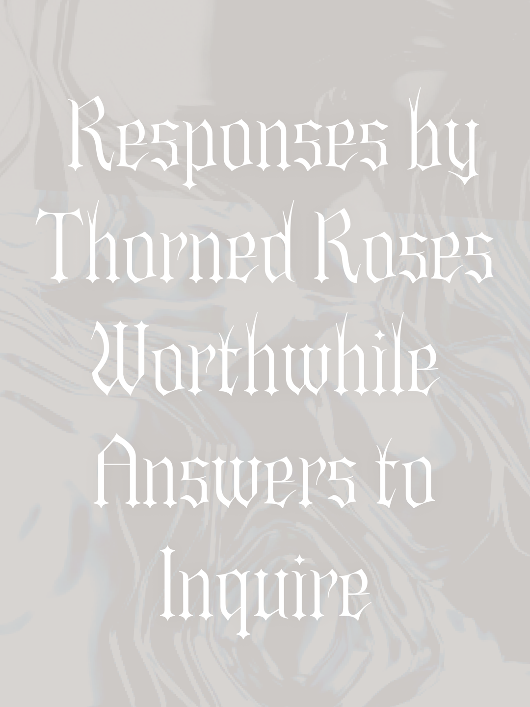
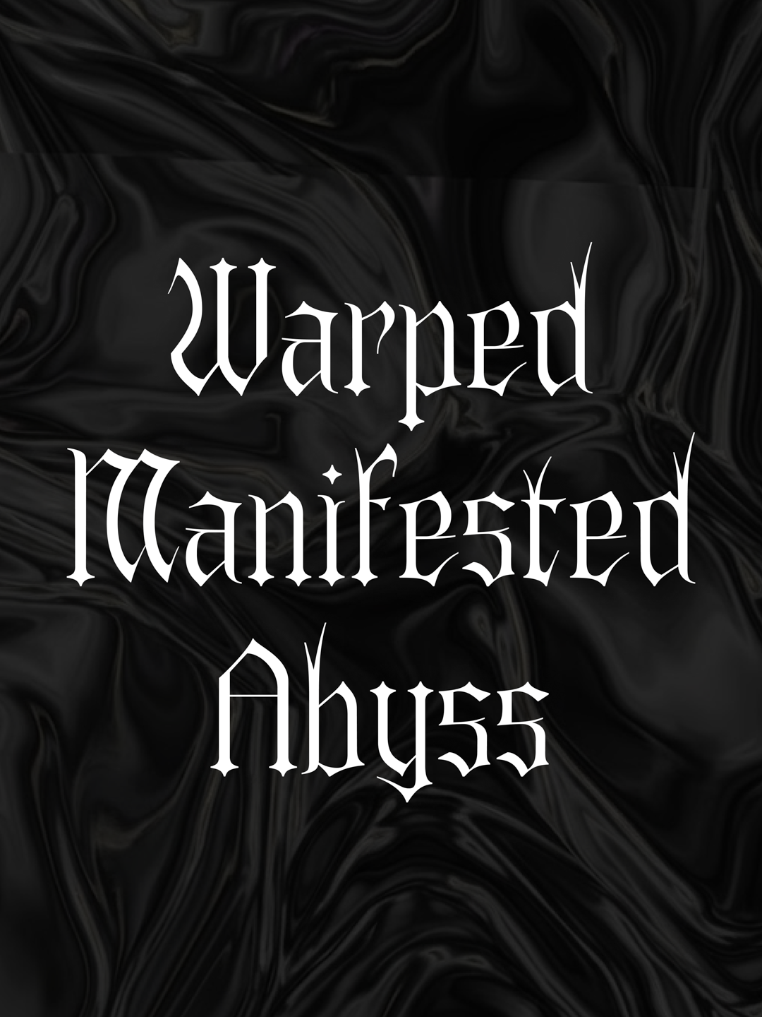
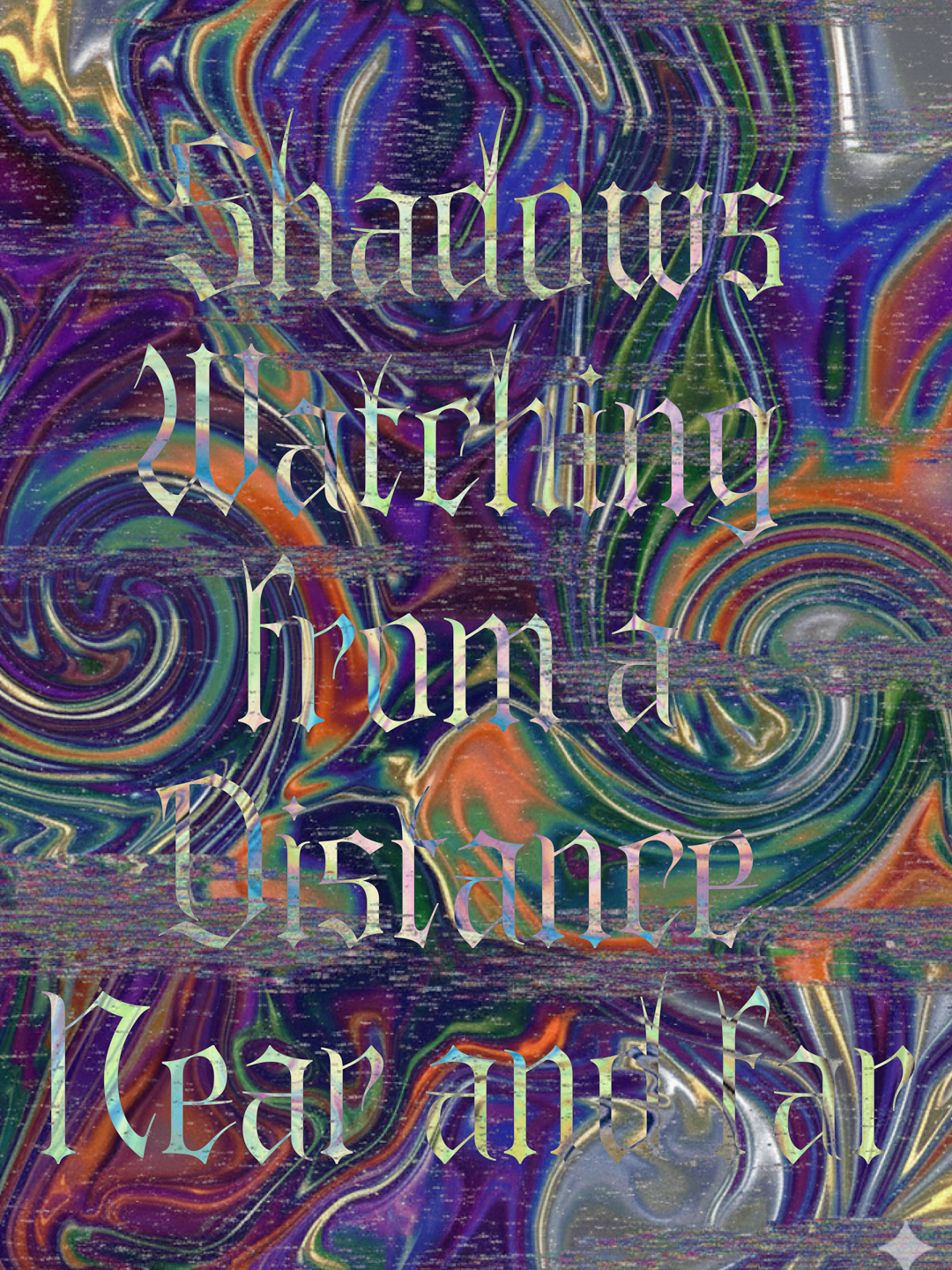
Tremble
by Alex Cheng
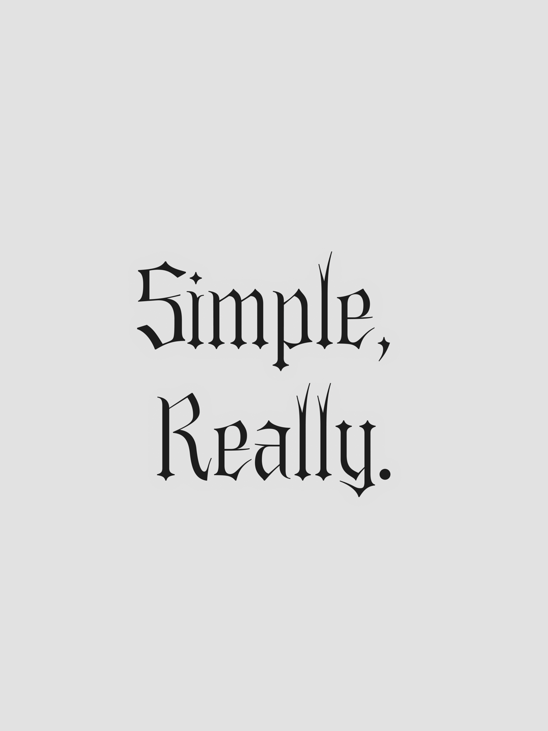
Tremble is a fraktur-inspired serif purposed to be a hazard to the eyes. It was birthed as a result of the question: How can I make something sharp enough to puncture the cornea? Perhaps it has not truly achieved its goal at its present form, perhaps it needs a whetstone and a few months. Regardless, its existence serves as a seed to depict the idea of sharpness.
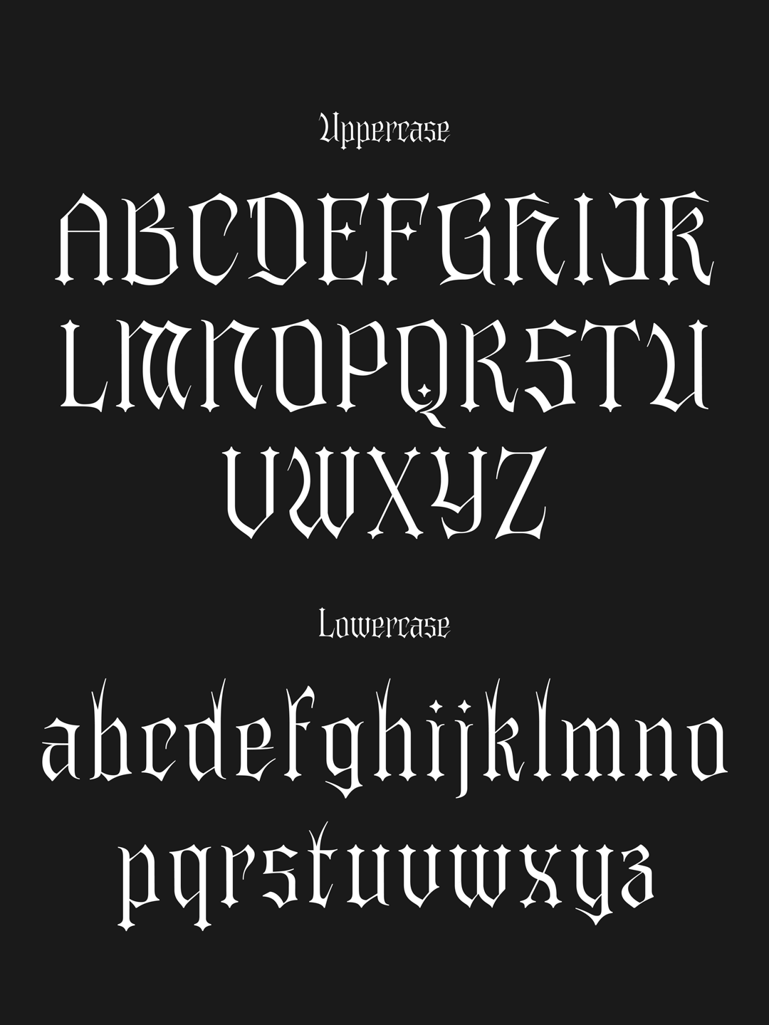
The name started originally as “el gato”, using the cats’ claws as inspiration for some of the curved forms, but ultimately, what you should feel is a trembling. First sketches were pretty unrefined and do not deserve the light of day. The version here today is early, and will be built out further soon!
Alex Cheng
I’m a graphic designer turned UX designer turned type designer currently working on more experimental typography. Type design scratches the itch of detail and minutiae and also the satisfaction of systematizing a set. Send an email if you want to connect!


