
Type Electives Display Type, Fall 2024
Fatty
by Huy Le
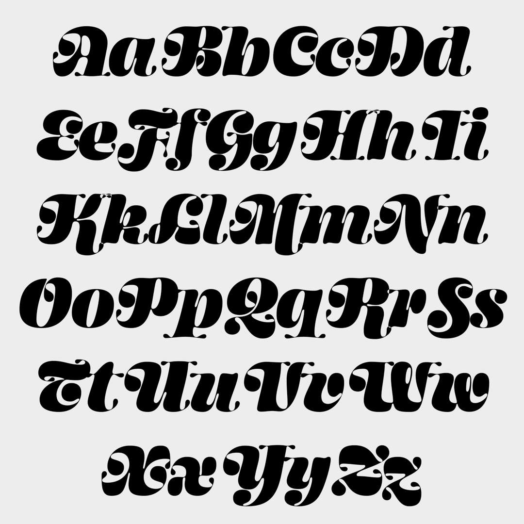
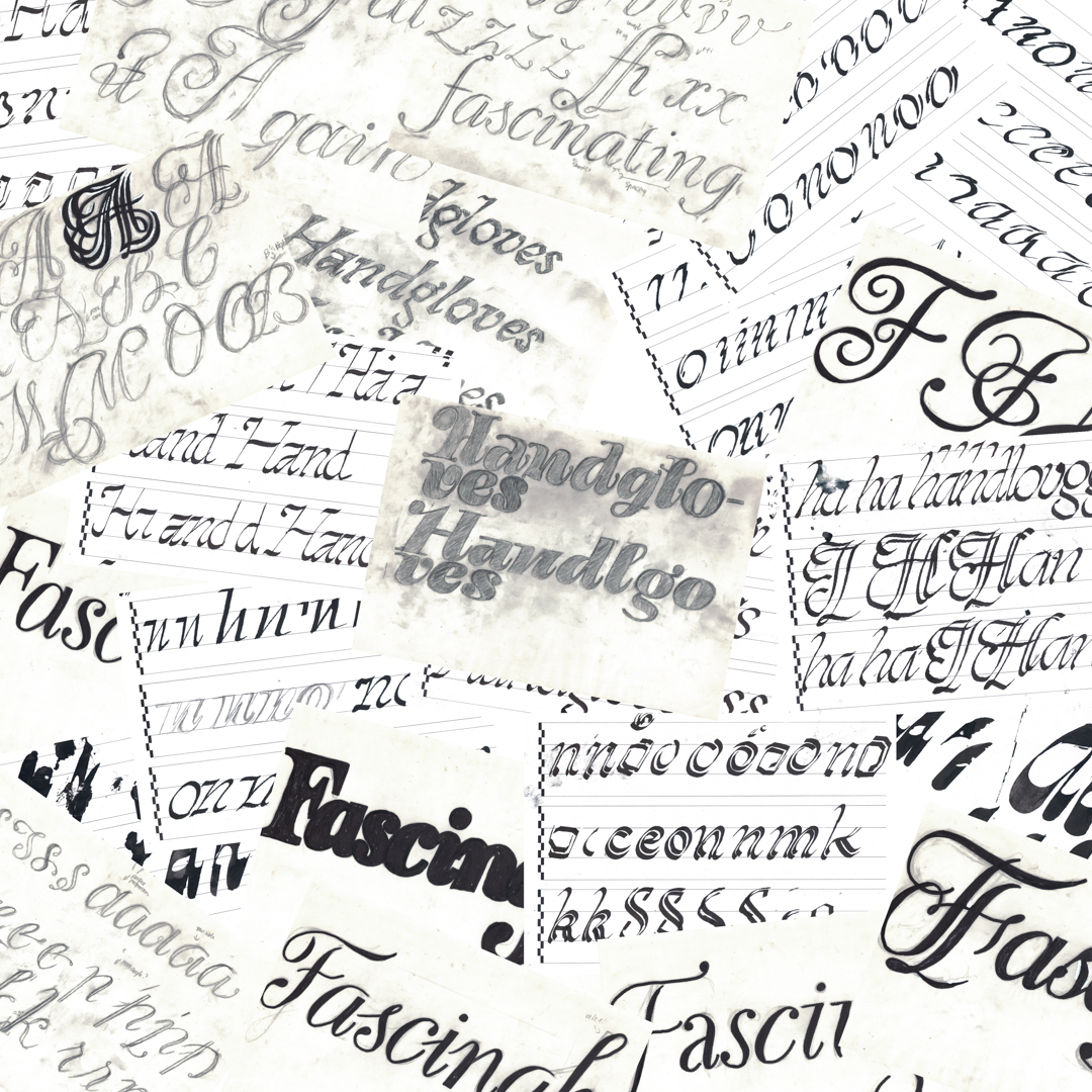
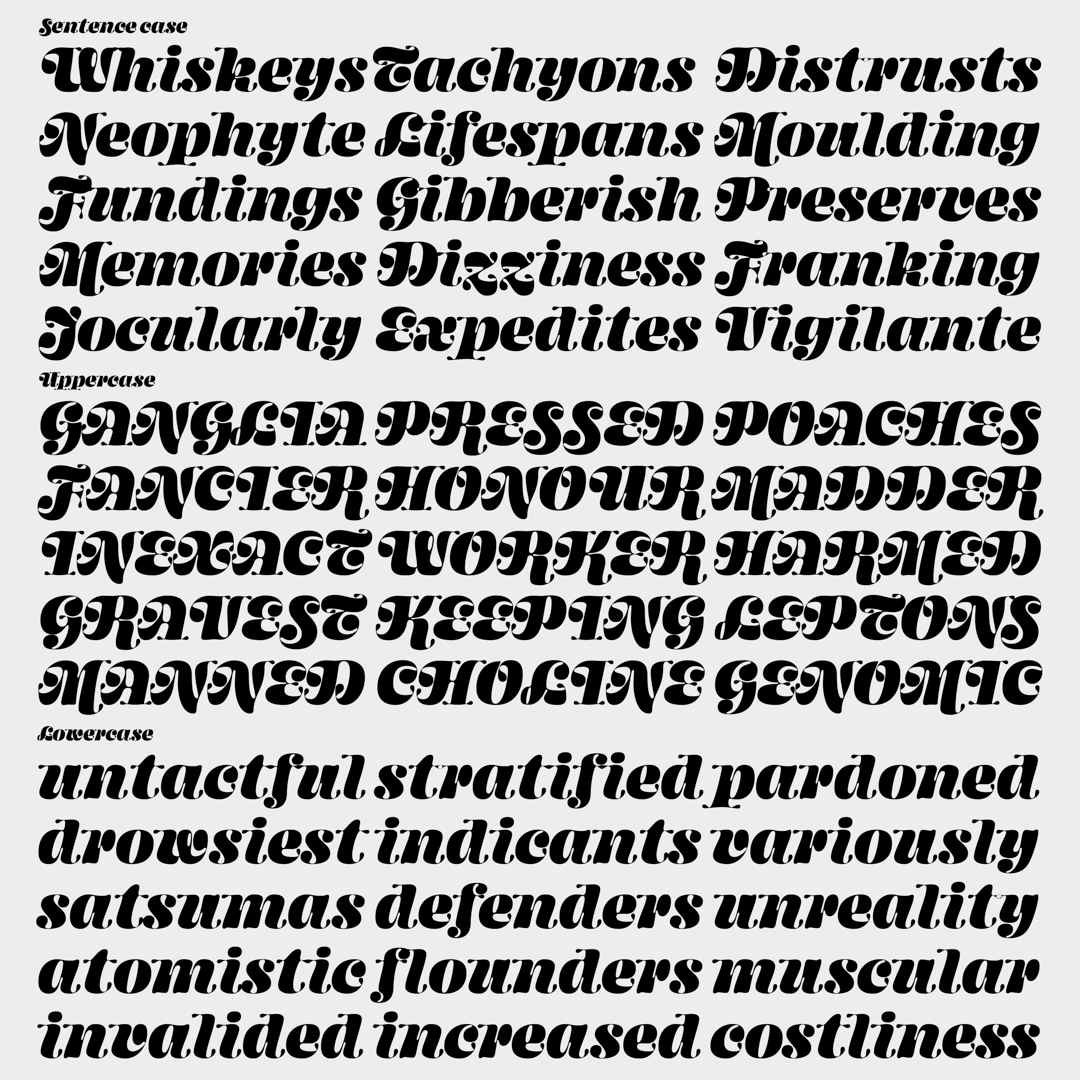
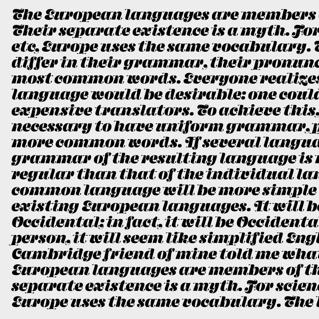
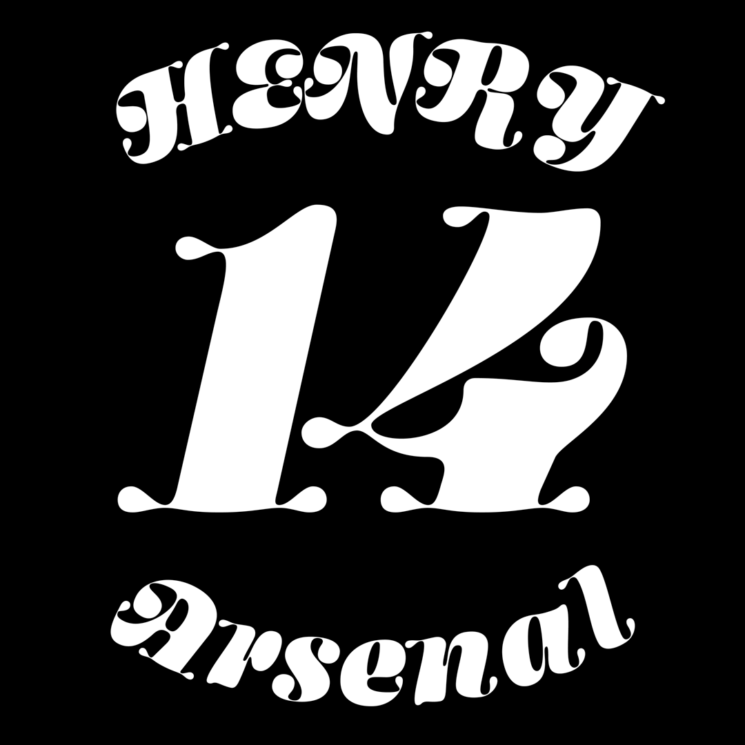
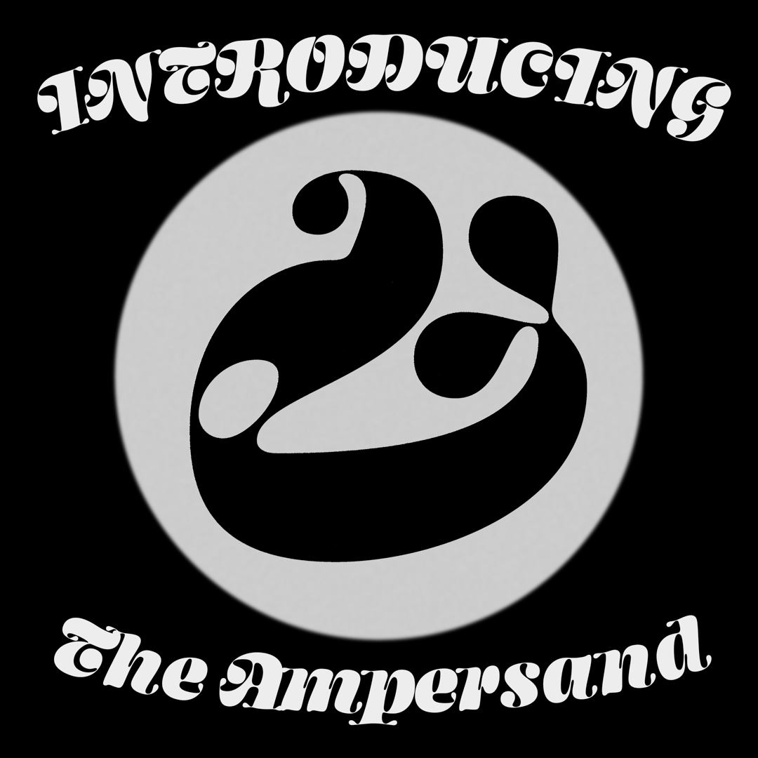
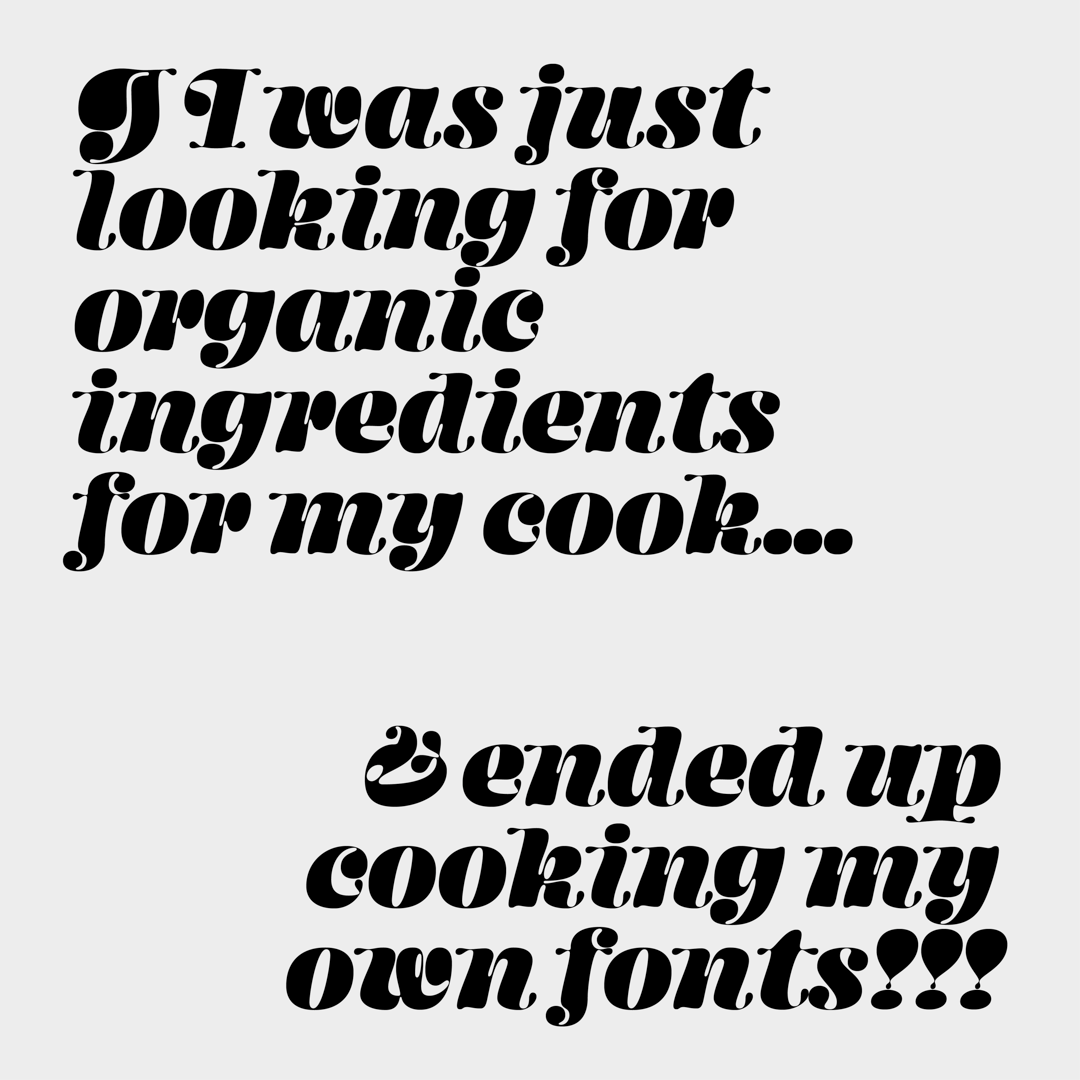
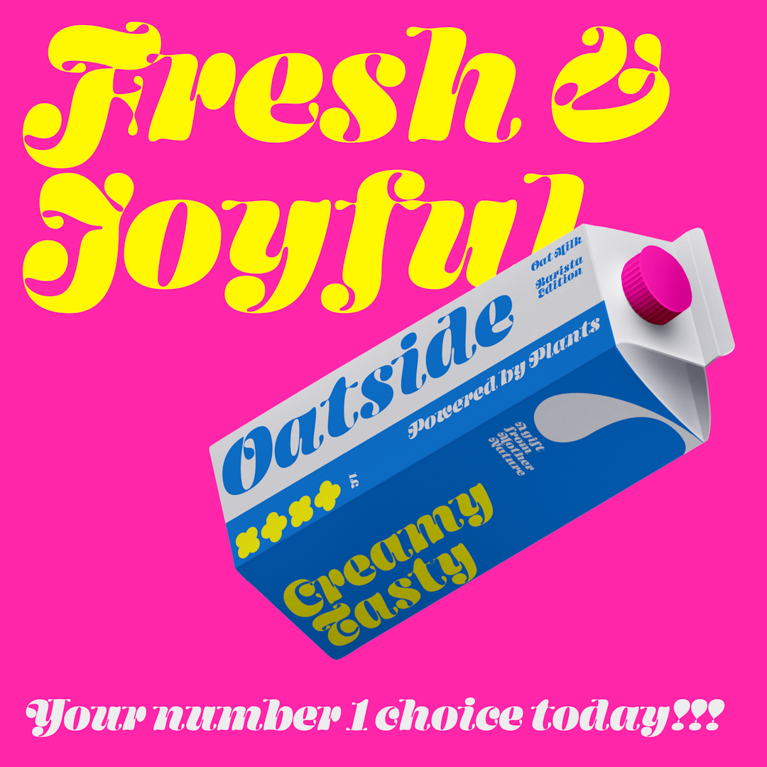
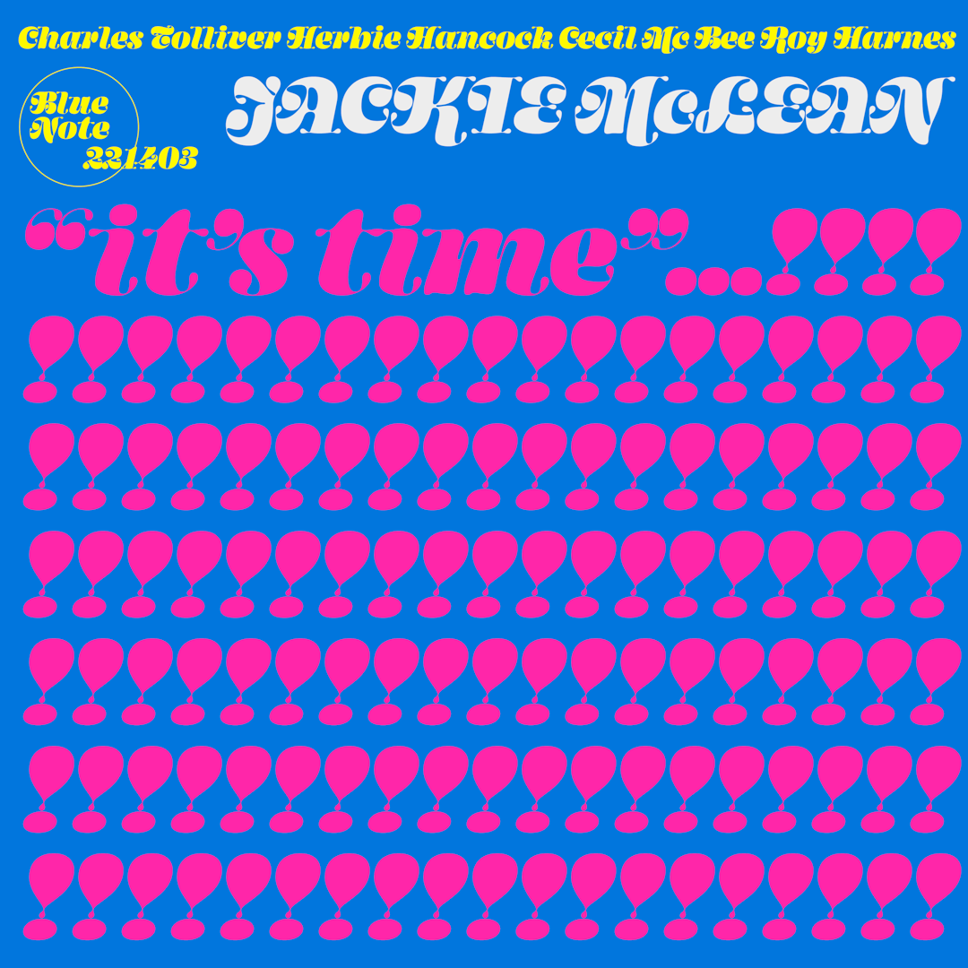
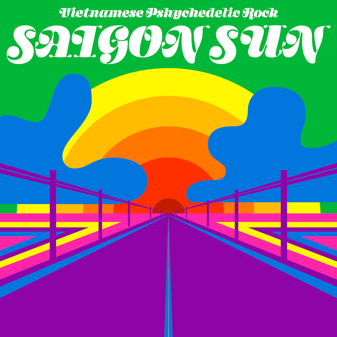
Fatty is inspired by Huy’s appreciation for ball terminals. Alongside the “field” of ball terminals, the typeface’s uppercase set is designed to be pushed to the extreme. By studying forms from 1800s–1900s calligraphy and specimen books, the caps reveal a strong connection to cursive forms with swashes. Overall, the combination results in an ultra-organic typeface that contains many unexpected forms.
Huy Le
Huy Lê is a Type Designer who loves type. Because he’s always researching letterforms, there’s usually a little bit of the past mixed into whatever he’s working on. He’s really passionate about fonts and letters, so feel free to reach out to him on Instagram if you need anything!


