
Type Electives Display Type, Fall 2025
Lourane
by Khiêm Nguyễn
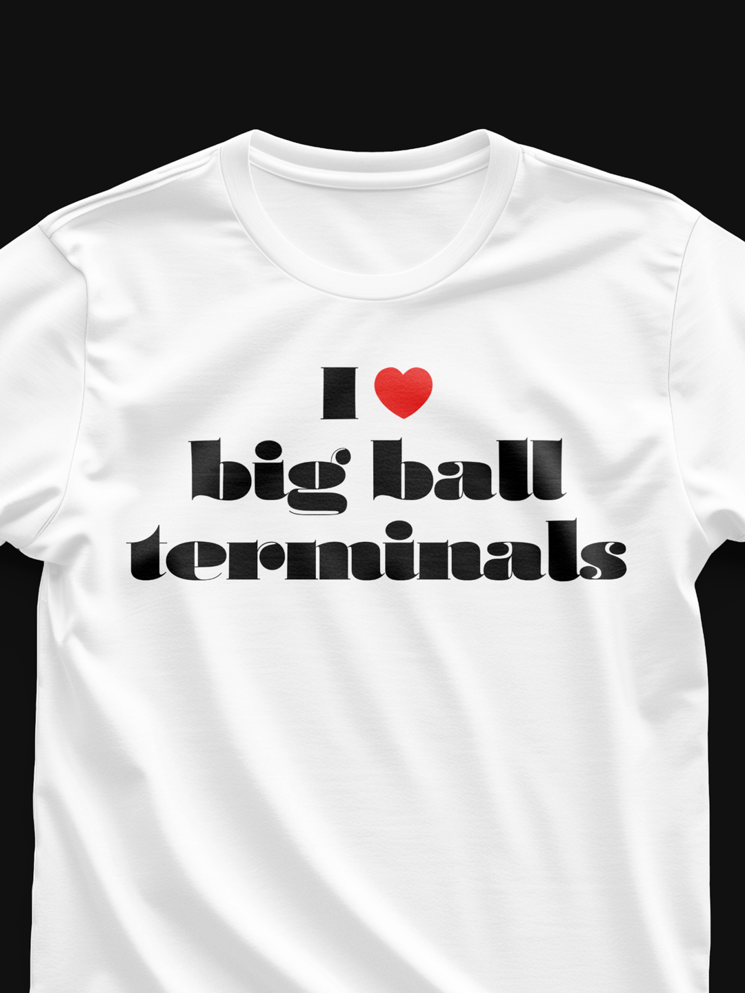
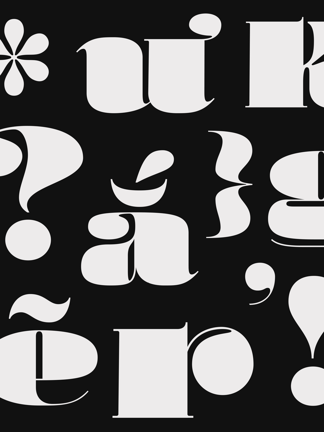
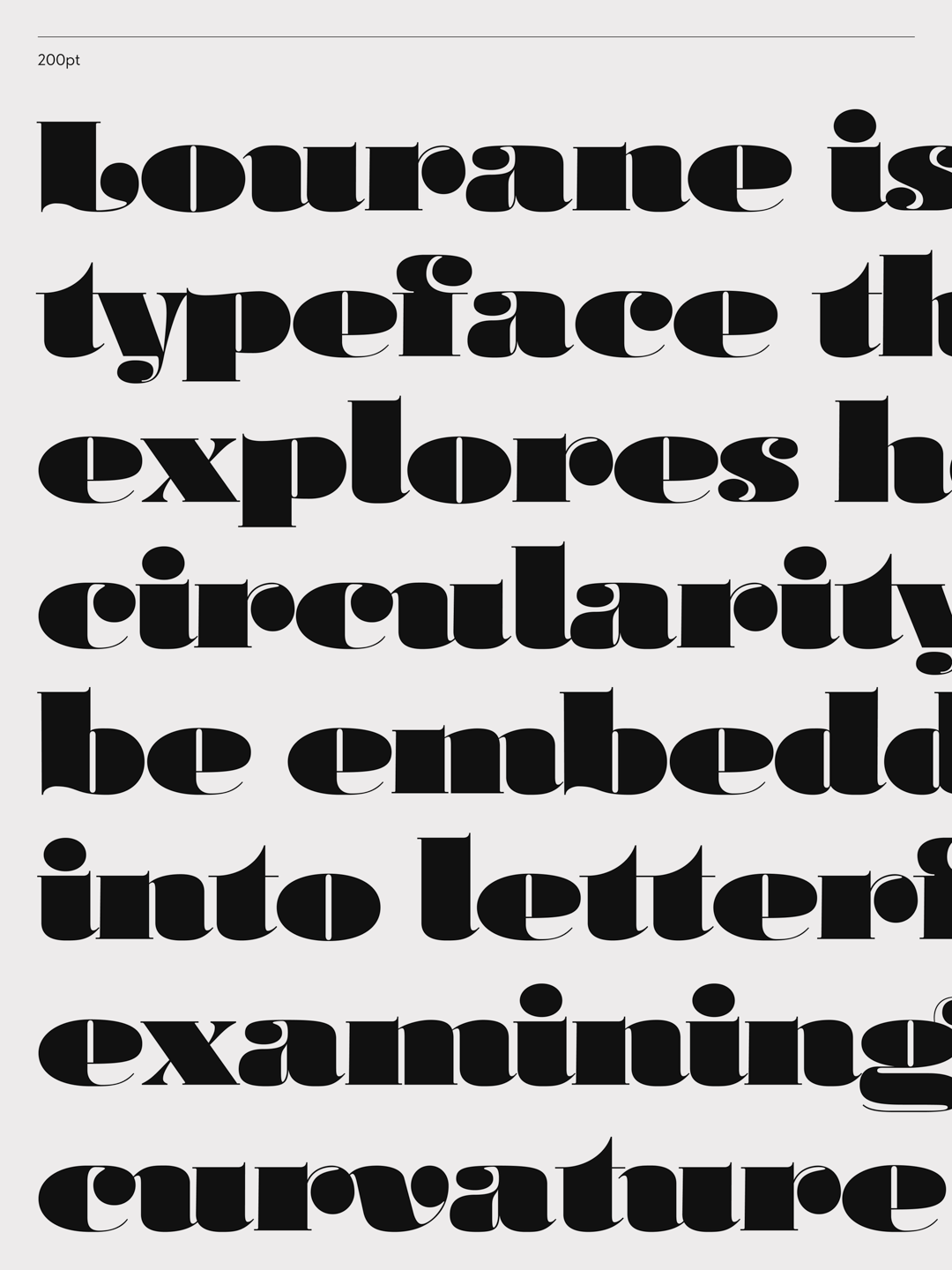
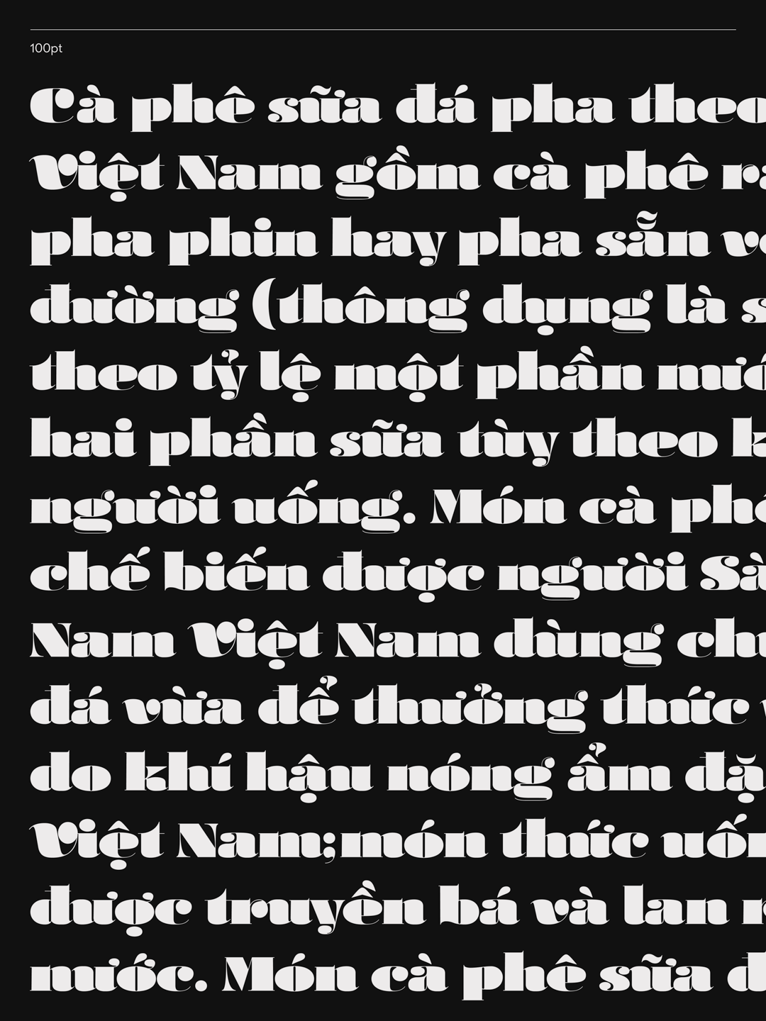
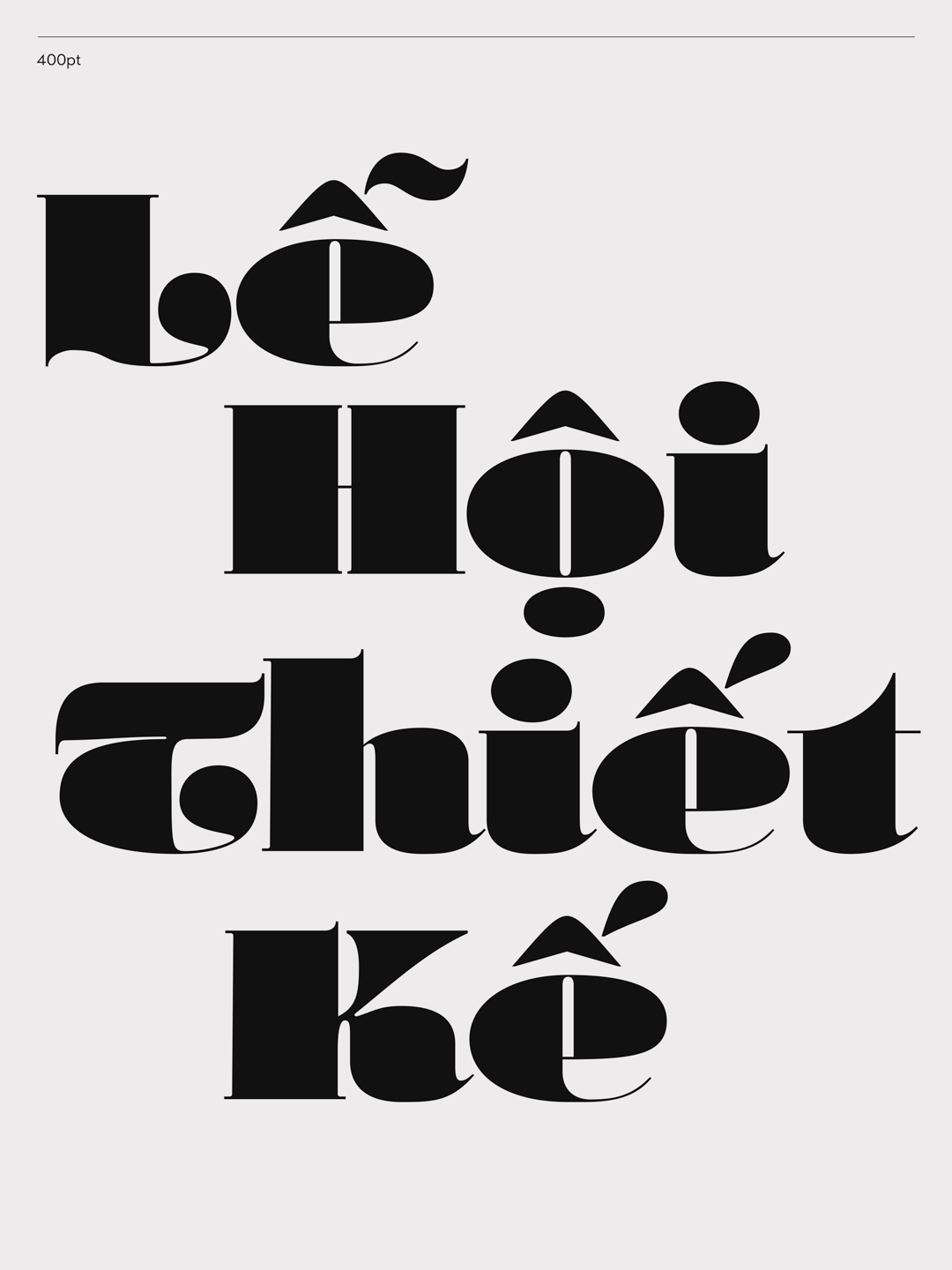
Lourane is an experimental typographic approach that investigates extremes of weight, width, terminals, and scale. Developing from calligraphic fundamentals, it incorporates curvature and rounded forms to build its own distinctive character. The result is a fun, wobbly, and unexpected typeface that works best at large display sizes.
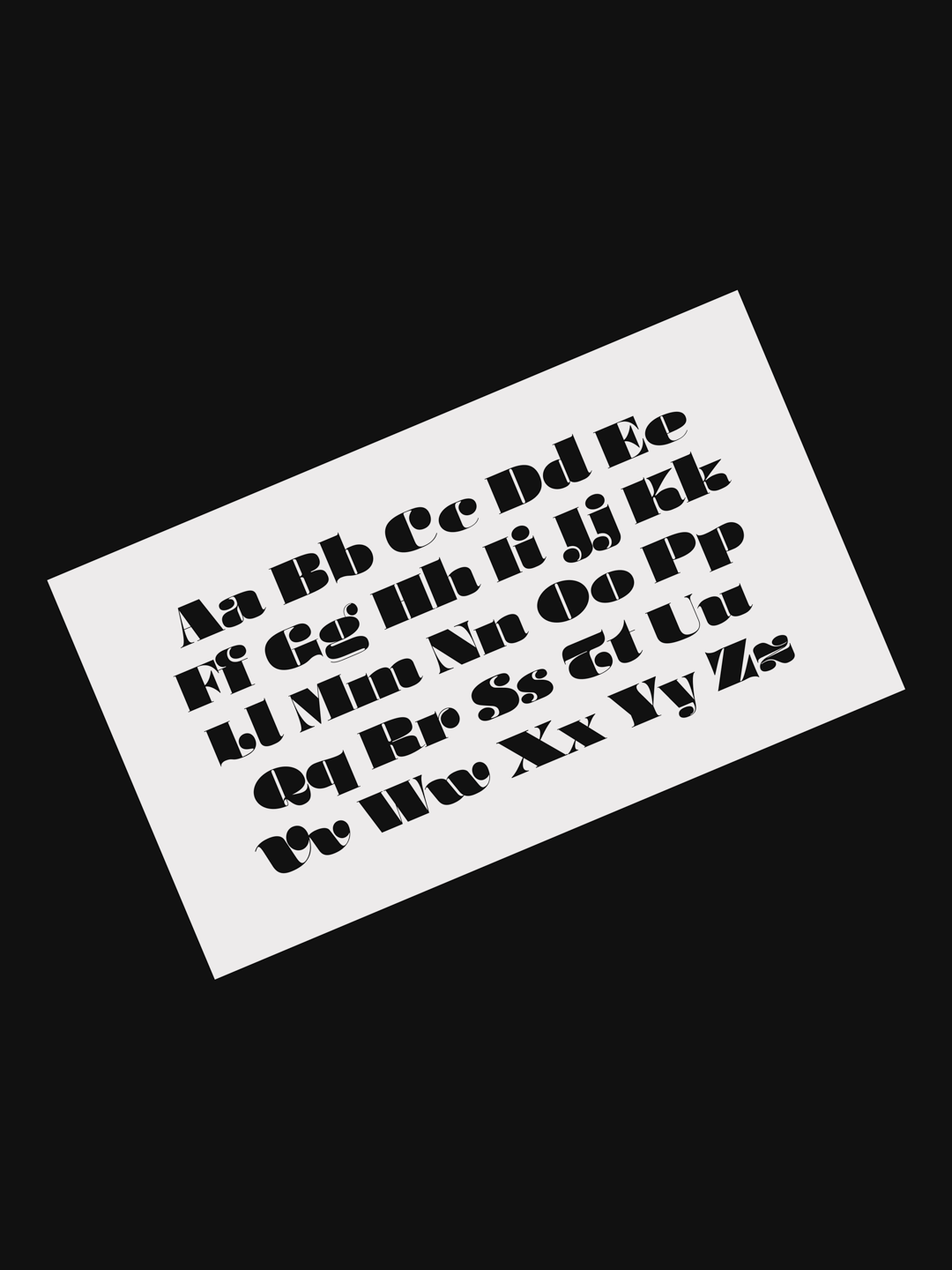
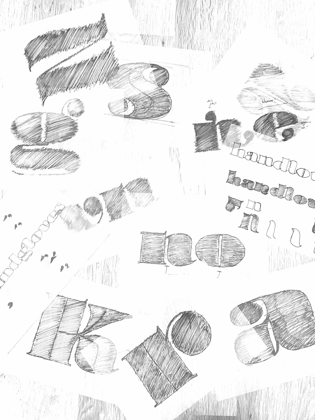
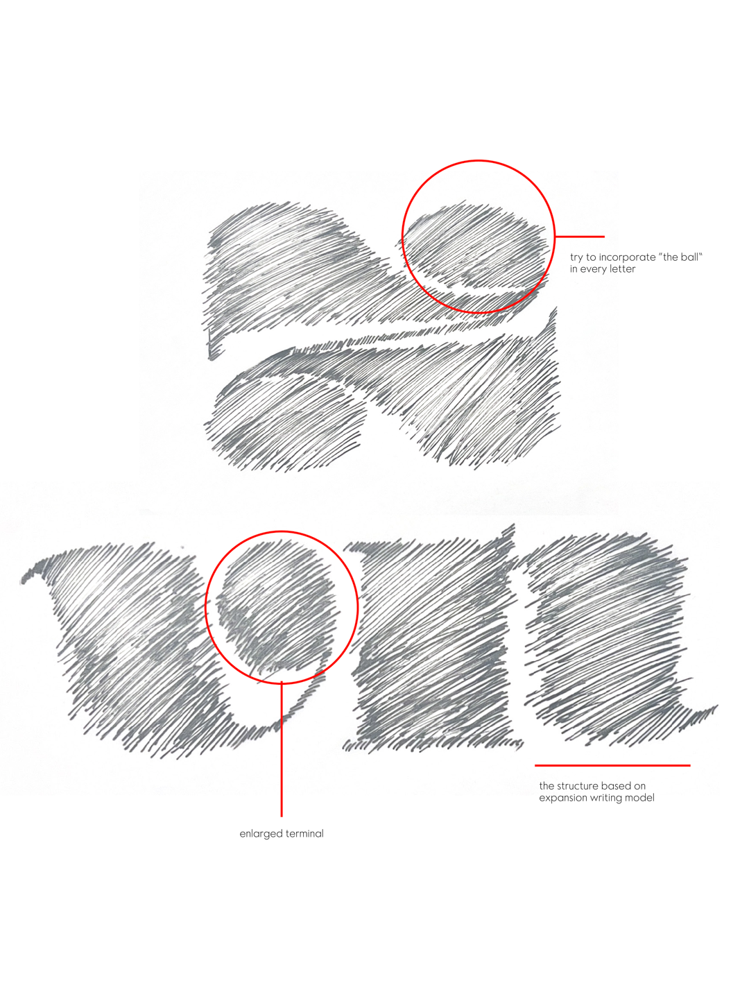
The brief was developed with quite an obsession with terminals and how to make them interesting. I looked at some Vietnamese old print covers and some wood type from 20th century, where i got the idea to challenges with some conventions formats. I’ve started with building a expansion calligraphy base, then make the terminals (VERY) big, then the width, weight, contrast. Overall, I’ve tried to test the limits of letterforms while maintain rhythm of the typeface. It has been a challenging process, but I’ve learnt so much this way.
Khiêm Nguyễn
Khiêm is a Vietnamese graphic designer based between Hanoi and Bristol. He works with brands, publications, typography, and people. His practice is centralized around three pillars: typography - culture - technology, and he loves to explore how to incorporate these elements together.


