
Type Electives Display Type, Fall 2024
Sake
by Marcus Soniat
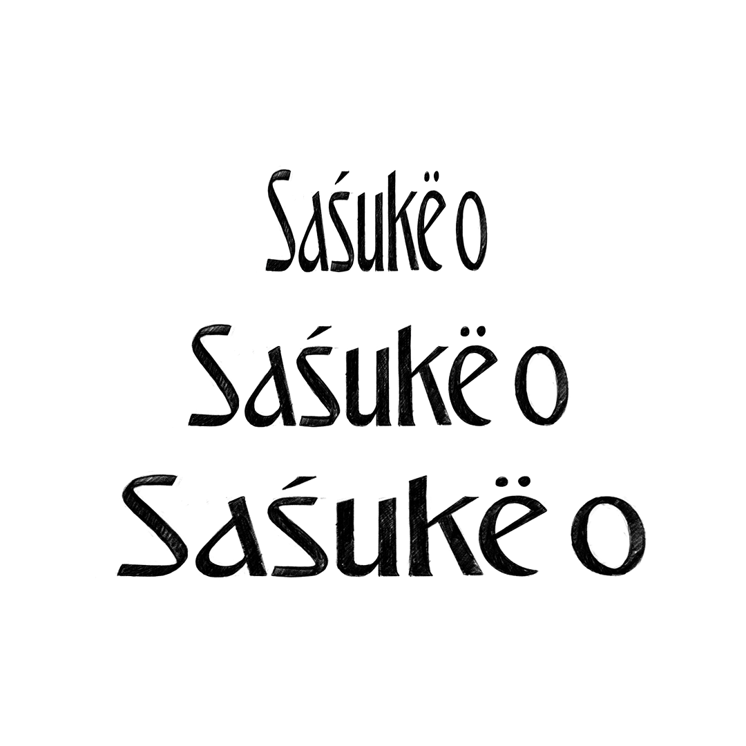
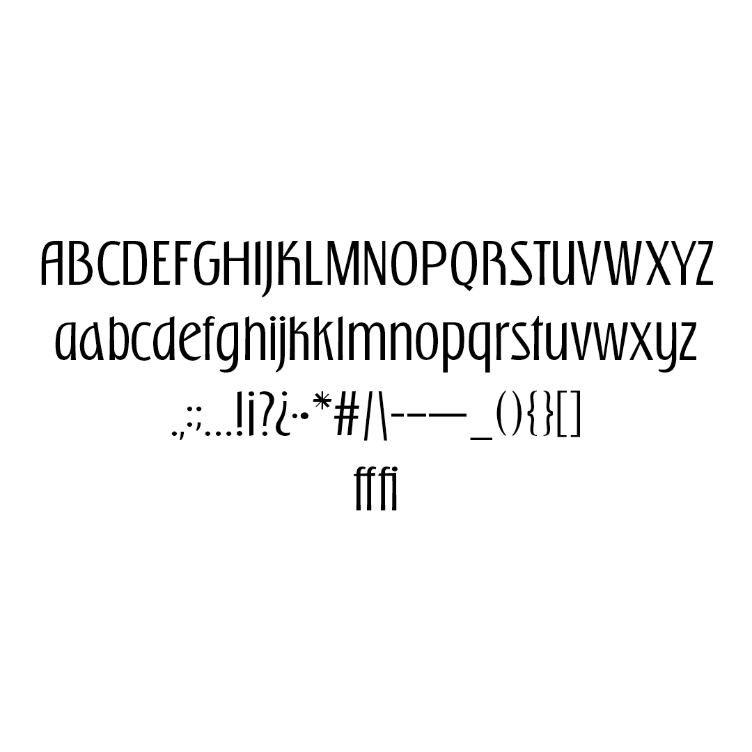
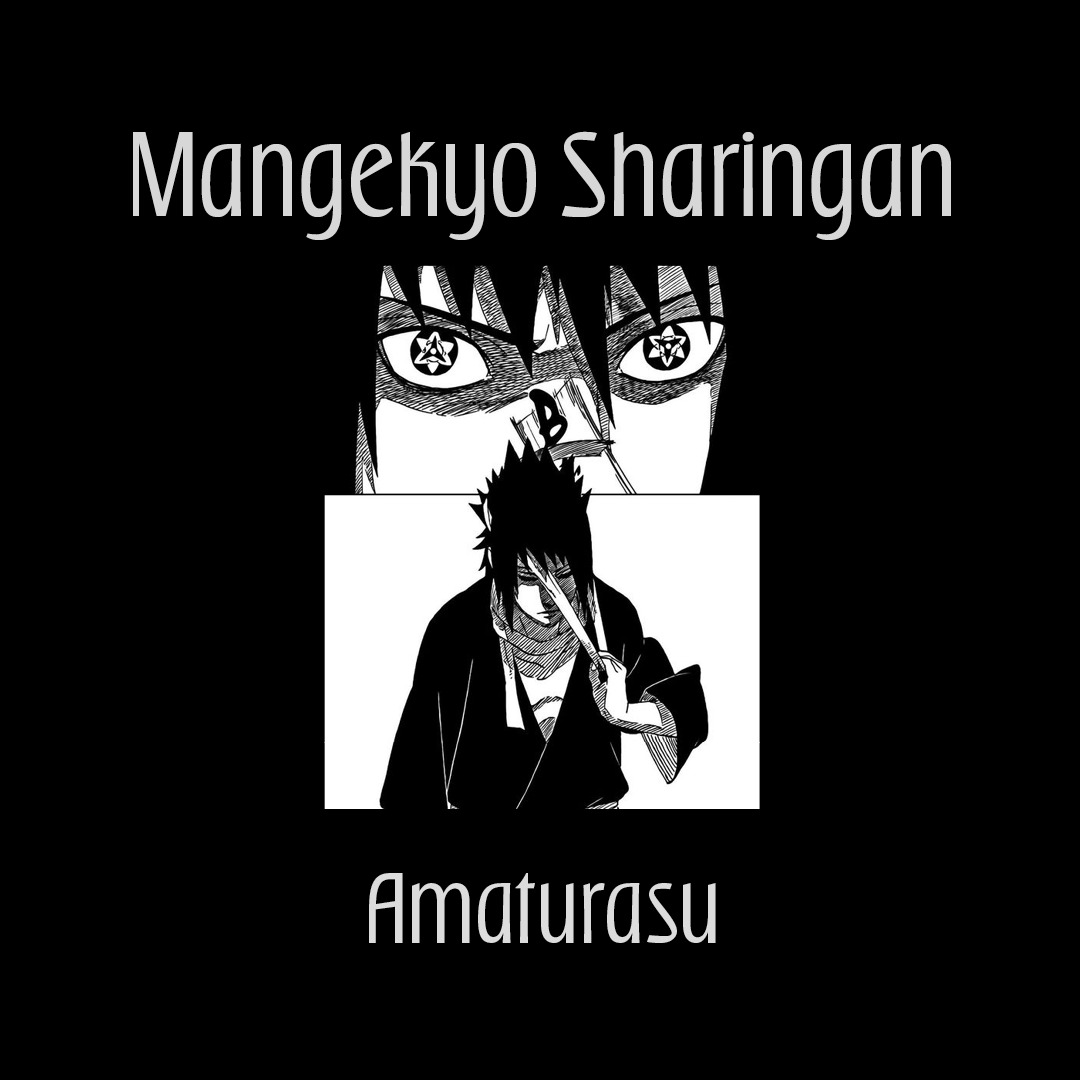
Manga has played a huge role in my imagination growing up. Ultimately, I wanted to produce a font that was a love letter to those memories. Sake is a condensed sans serif that takes inspiration from ninjas within the context of manga, particularly from the Naruto series. I chose this series because it was one of my first introductions into manga. I fell in love with the art and characters and how cool they portrayed no matter the circumstance.
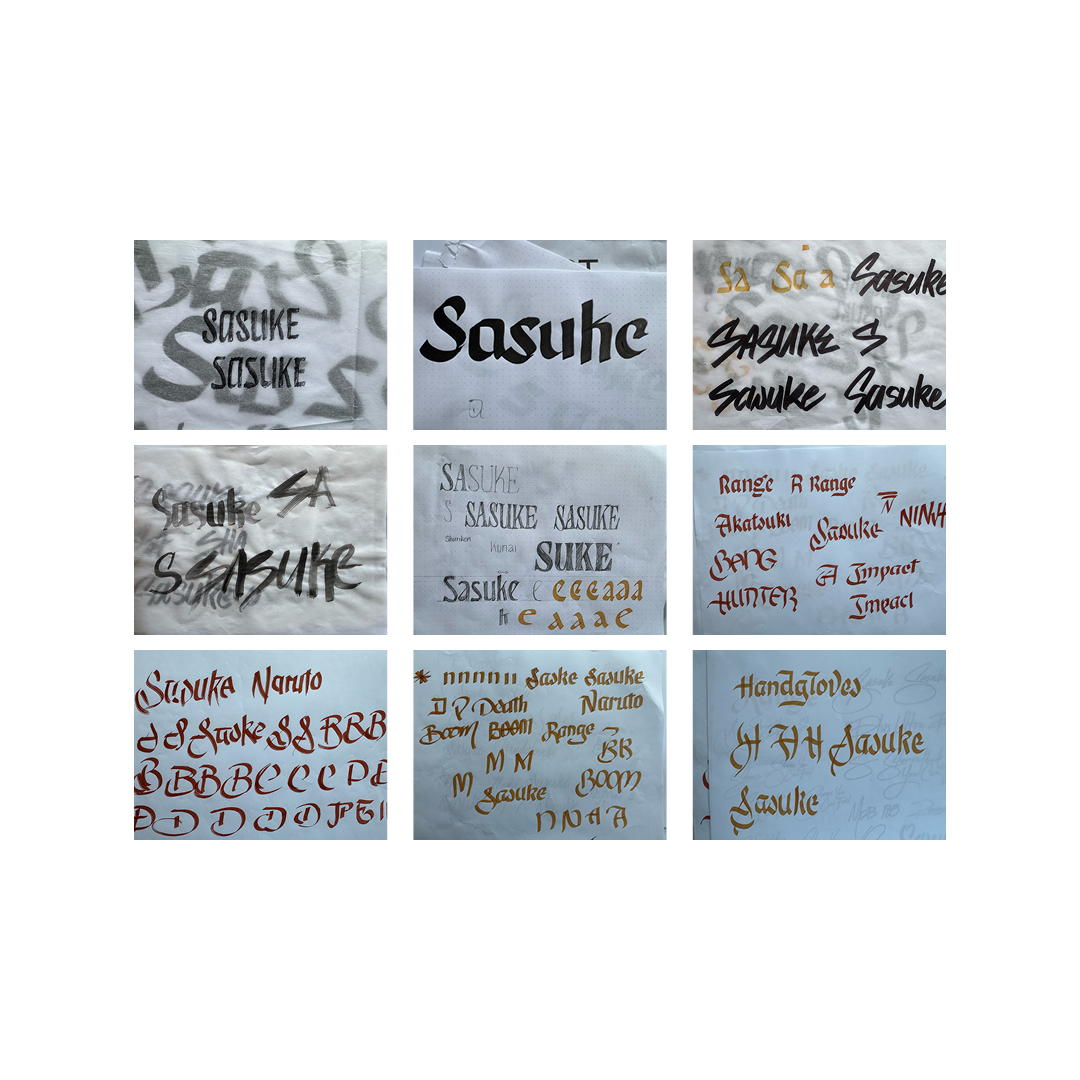
I tried various calligraphic expressions. My sketches in the beginning were very stylized without much direction. My break through came when I focused on reading manga and the letter forms that kept popping up within that context. That helped me refine my brief for the font the most.


Marcus Soniat
I’m an African American lettering artist situated in the southern part of USA; Louisiana. I grew up loving thing that were not cool in the past, but are kind of cool now; i was a nerd. As an adult I’m using my creativity to dive back into my inner child and pick up where I left.


