
Type Electives Display Type, Fall 2025
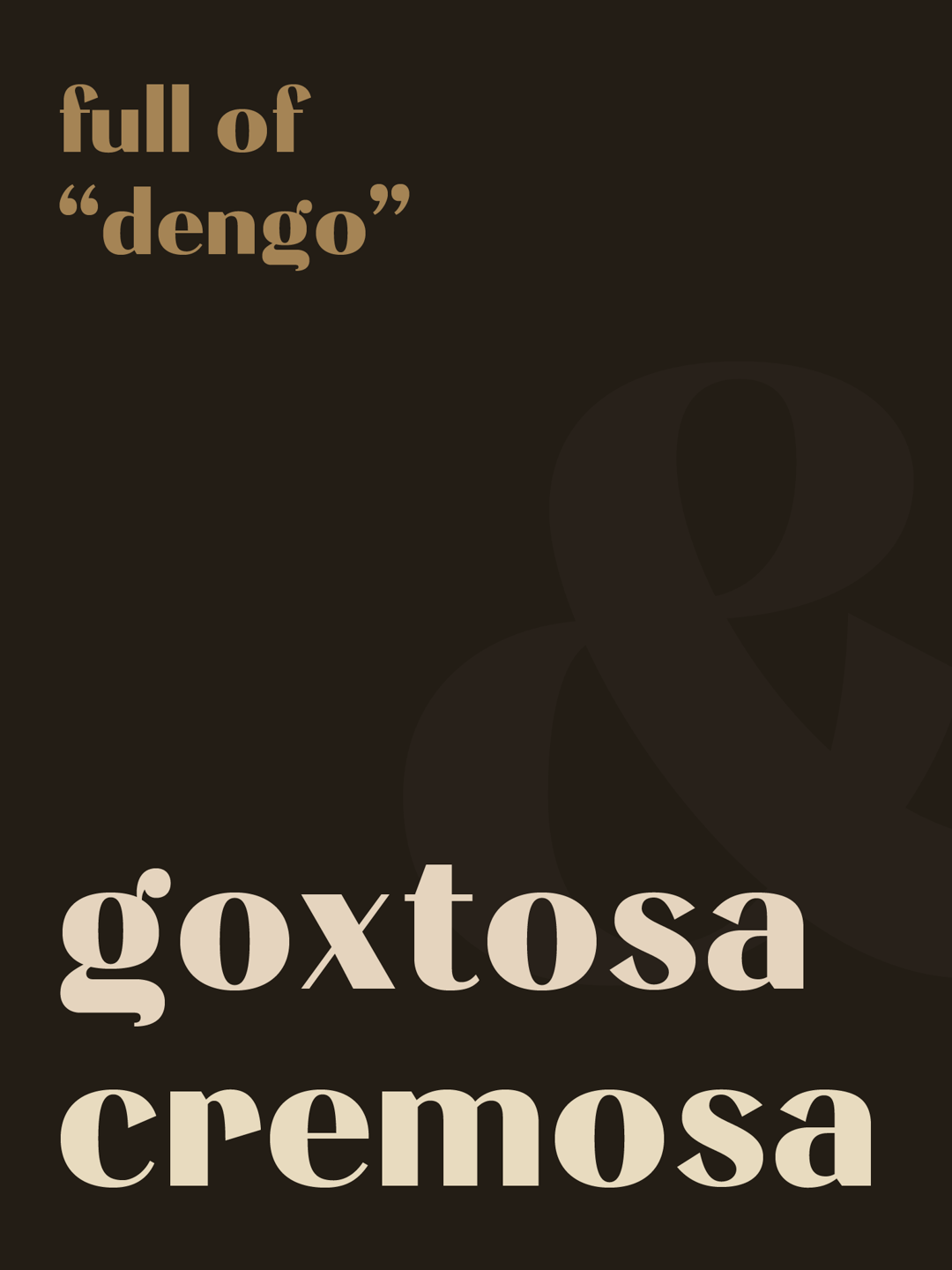
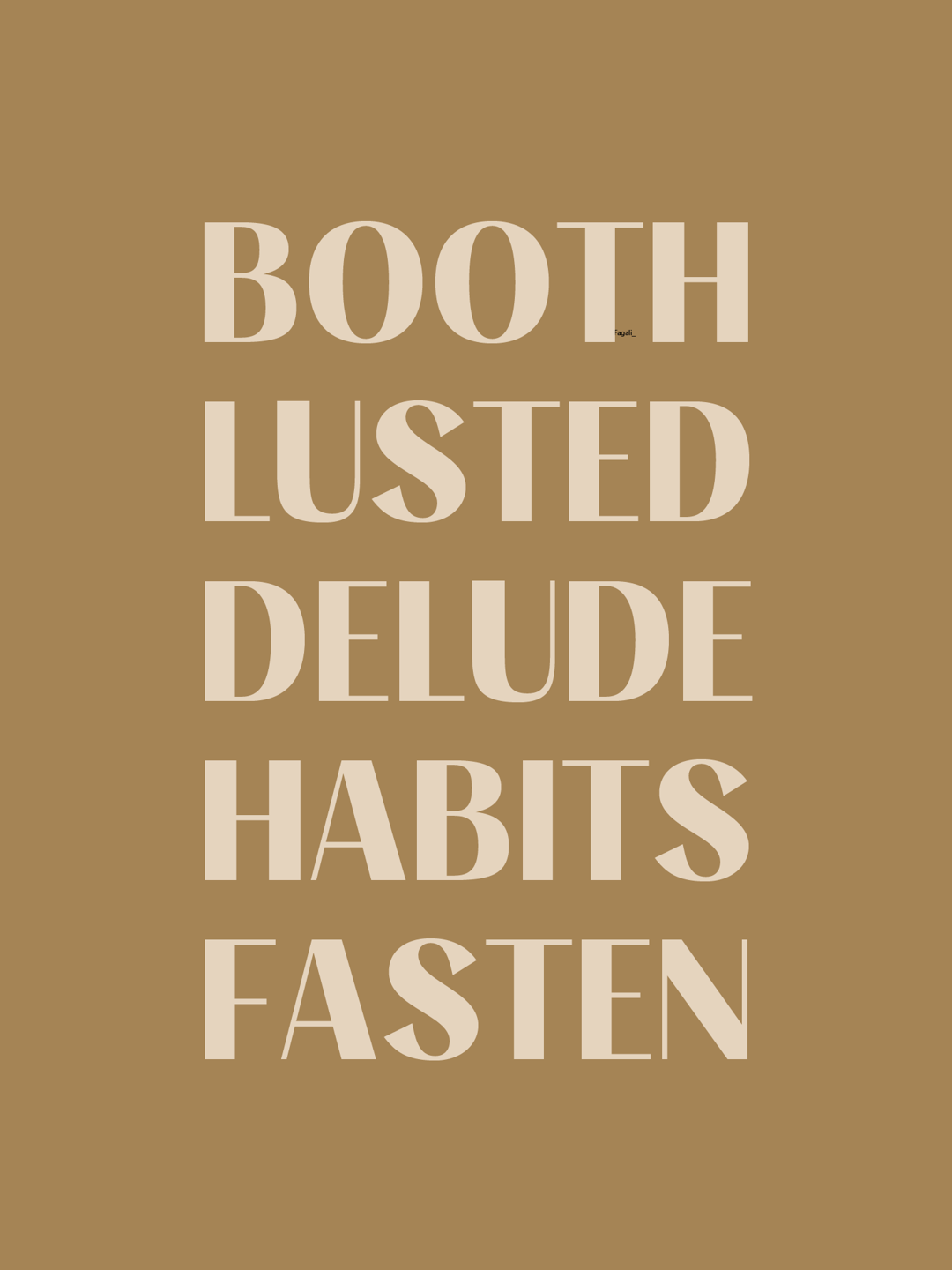
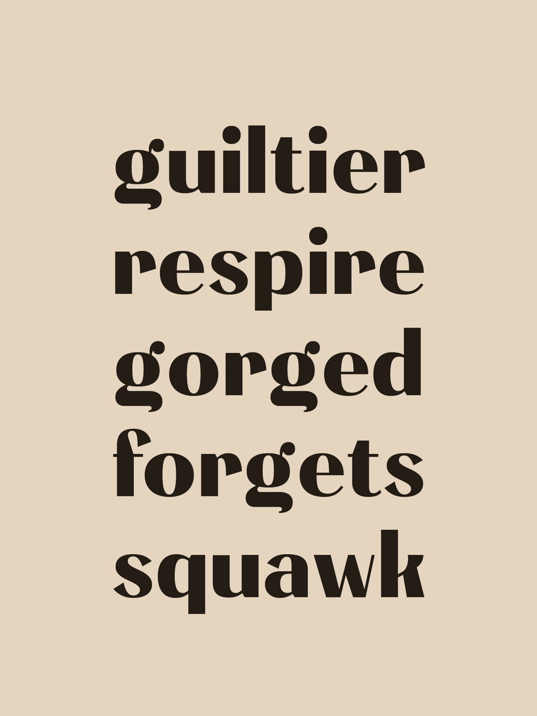
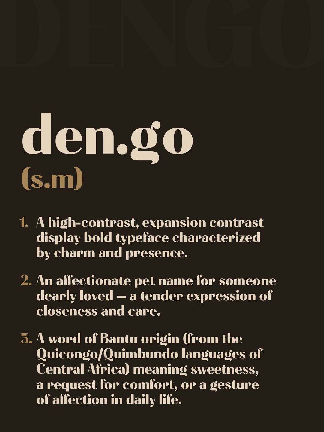
Dengo
by Ícaro Fagali
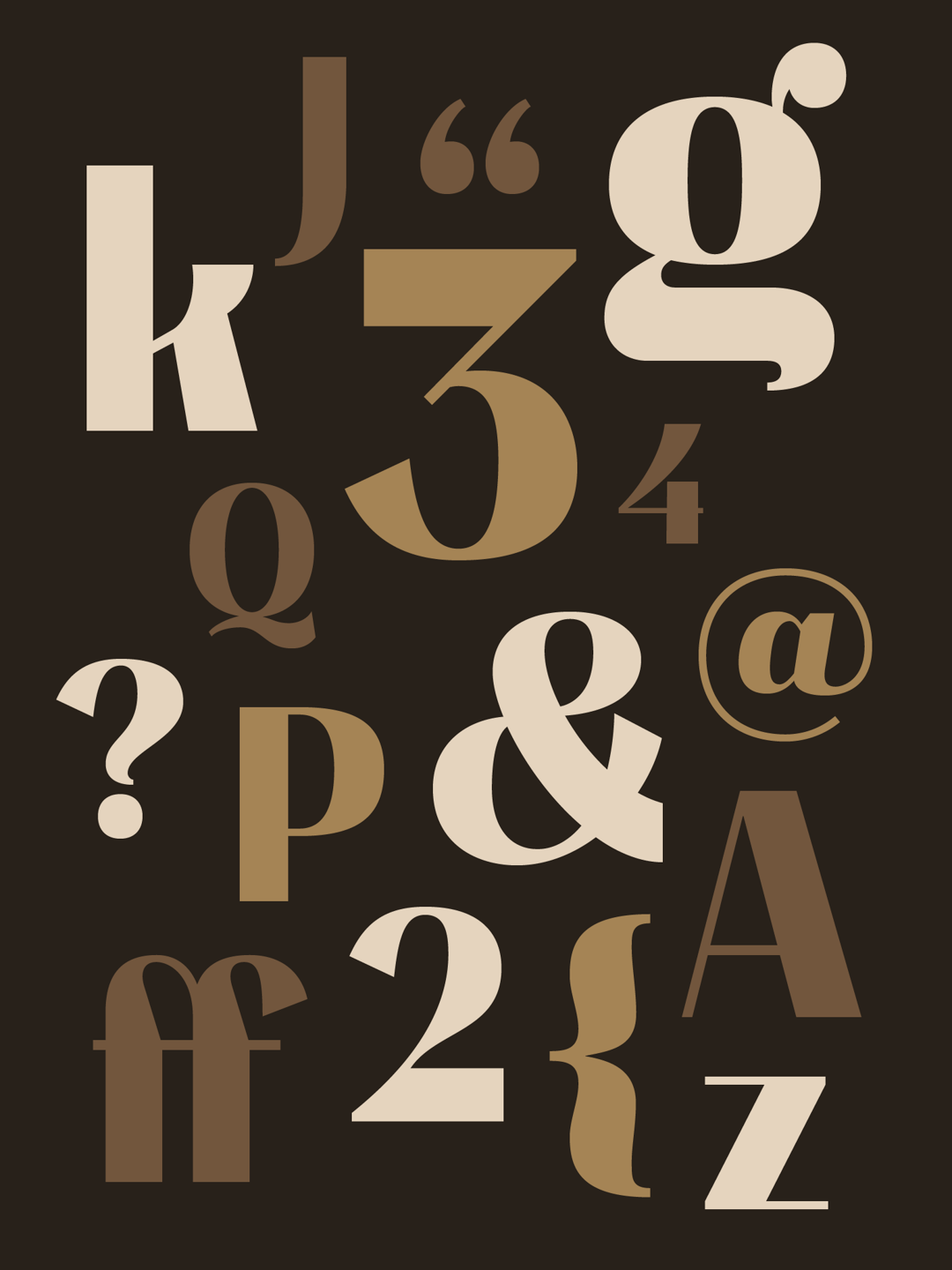
Dengo is a charming, high-contrast display sans, based on expansion contrast. Still a work in progress, it became a turning point in my confidence as a type design student and lover of the craft. It was born from TypeCookers as an italic, but I chose to start with the upright to learn more carefully and without rushing. Its name came after my best friend’s wedding — almost like a romantic pet name — marking the moment I realized my love for type design.
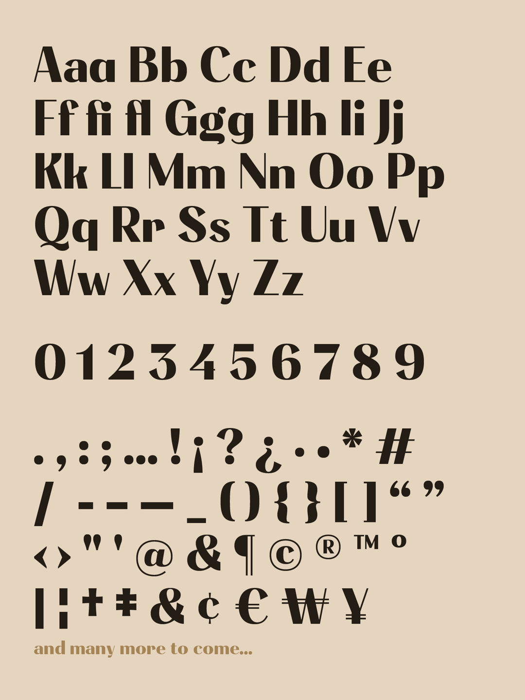
Dengo began with TypeCookers that differ from the final design, but set its direction toward high contrast and expansion. Throughout the process, I learned to adapt my way of working to the methodology taught, finding a healthier and more balanced rhythm. Expanding the character set early helped me feel progress through refinement. Last but not least, I realized that hand drawing and calligraphic understanding can make an unimaginable difference, turning the process into a space of learning, patience, and growing confidence.
Ícaro Fagali
Ícaro Fagali is a type designer in training based in São Paulo, Brazil. He spent 2025 immersed in letters and in building a deeper understanding of the type design process, and is eager to continue learning and designing in the years ahead.


