
Type Electives Display Type, Fall 2025
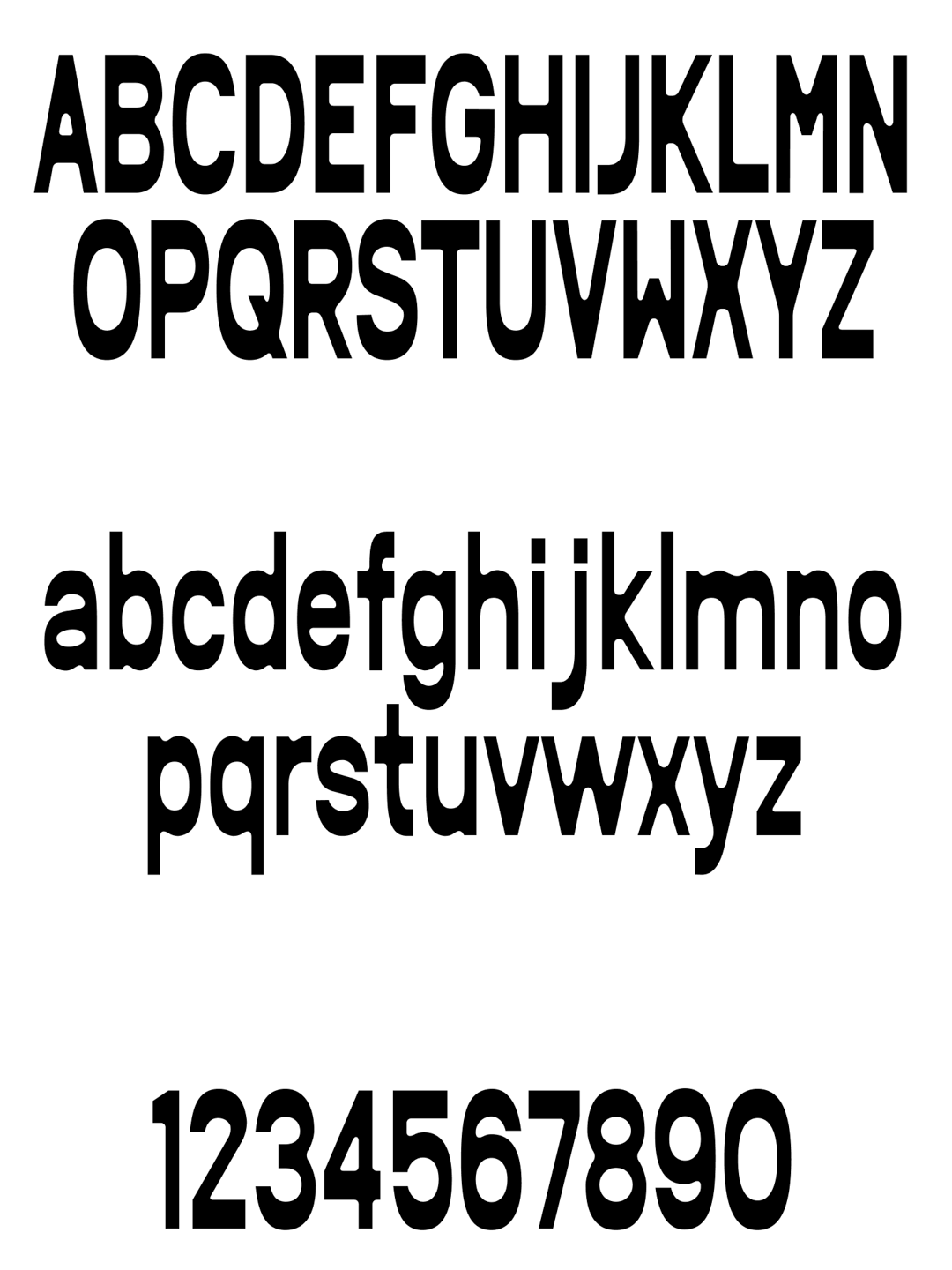
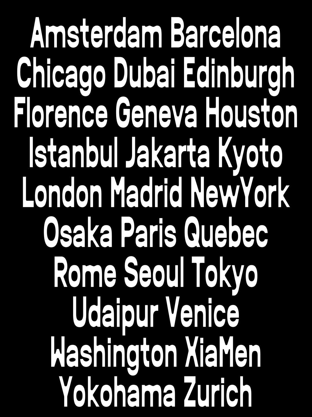
Norma
by Ian Chen
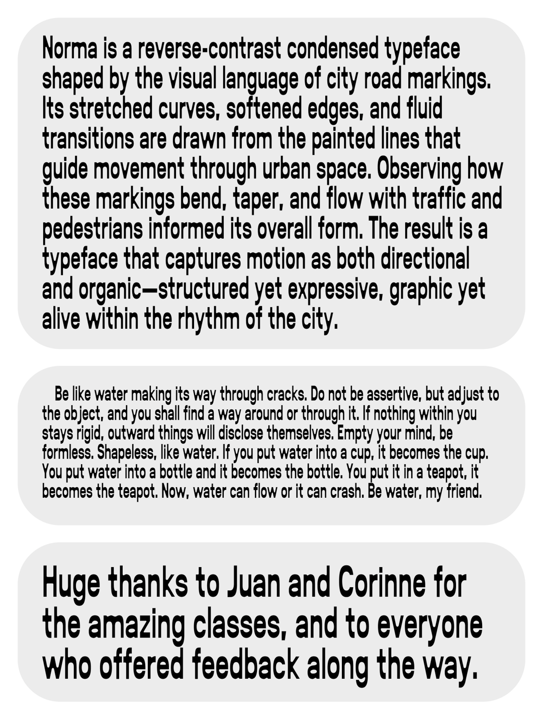
The original brief was to design a sans-serif typeface with a fluid, organic feel. While walking around the city, I started paying more attention to road markings and how they quietly shape city’s visual environment.

That observation led to Norma, a reverse-contrast, condensed typeface inspired by the visual language of city streets. It features softened counterspaces and smooth, fluid transitions, bringing a more expressive and human quality to something that’s usually very functional.
Ian Chen
Ian Chen is a designer in New York, making visuals and identities with culture, stories, and typography. Studied Visual Communication Design at the SAIC. Currently at Interbrand. Previously at Gretel, Red Antler, and FCB Chicago.


