
Type Electives Display Type, Fall 2025
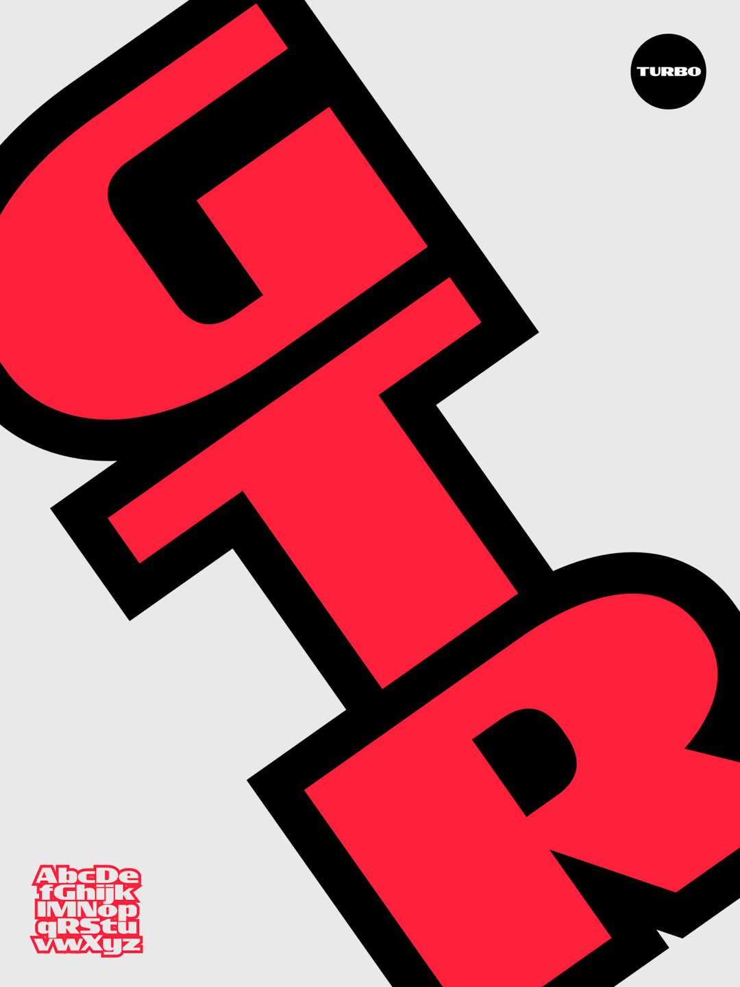
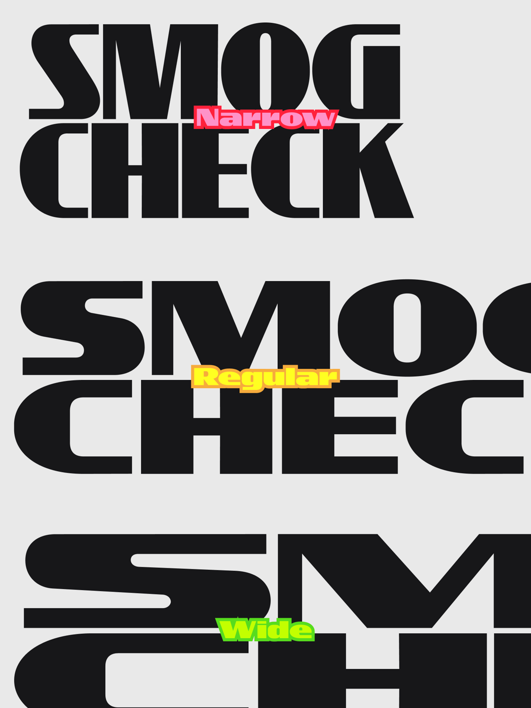
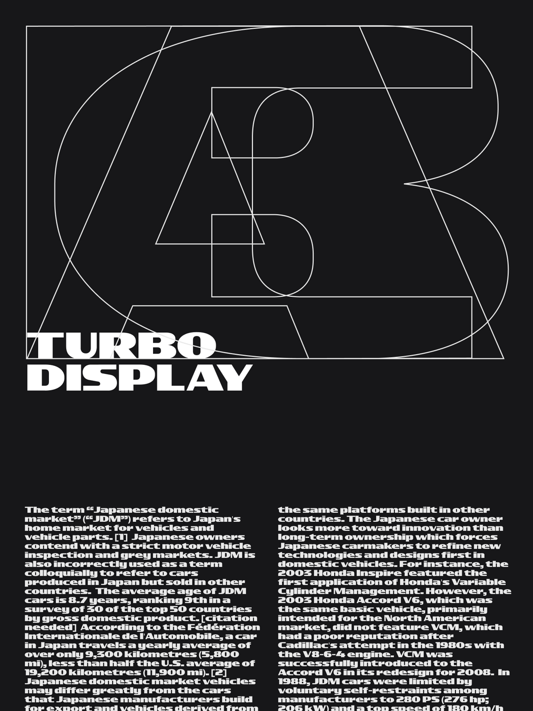
Turbo
by Edgar Casarin
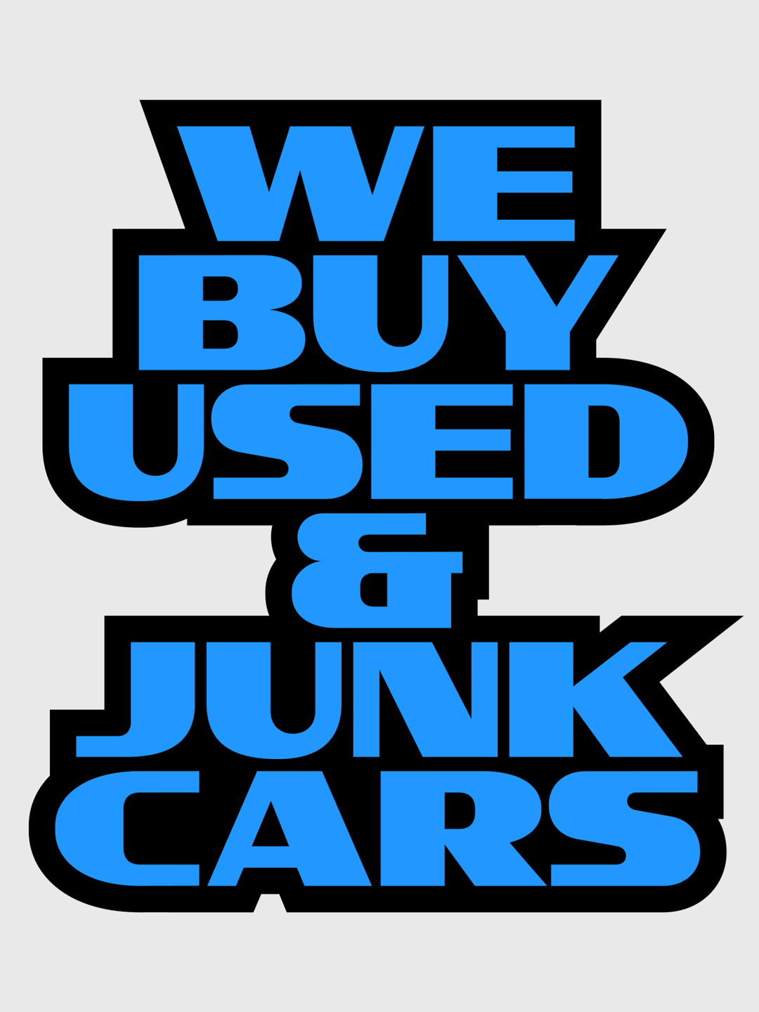
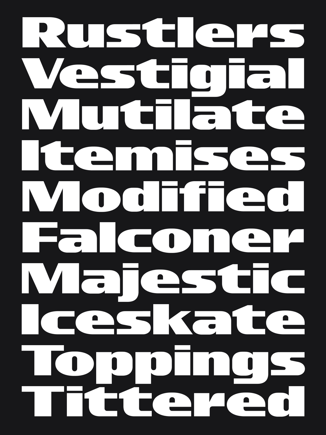
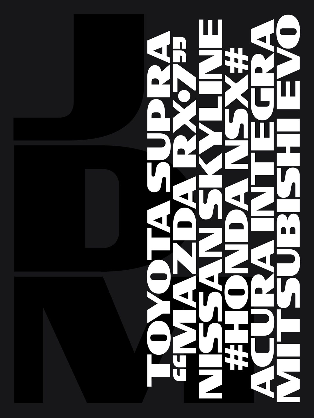
Taking inspiration from hand painted signs found in mechanic and auto shops littered around Los Angeles. Turbo Display makes design decisions based on what a sign painter might be thinking while painting during a hot sunny day. Considering high visibility for all the drivers that pass by shops at break-neck speeds, Turbo was designed heavy and wide. Simple, geometric letter construction and an interrupted translation design with little brush rotation so that sign painters wouldn’t have to sweat too much on an intricate design. The letter “S” really captures the design decisions that carry the rest of the typeface. Simple, fast, and highly visible.
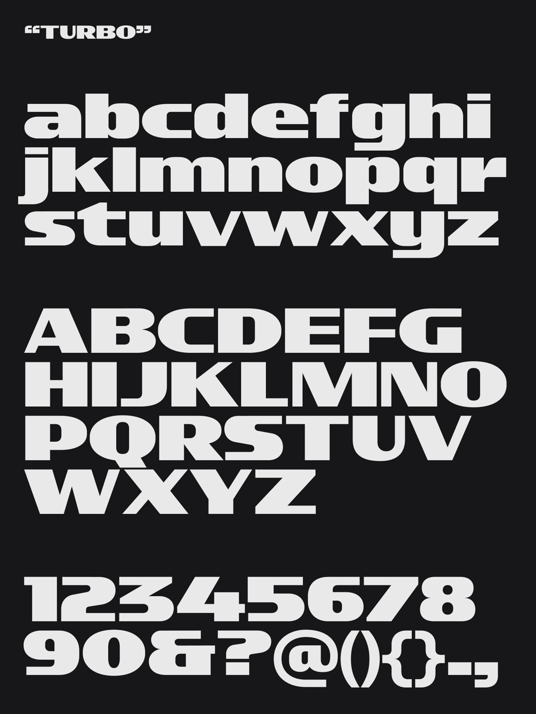
Throughout the development of the typeface, I experimented with many different tools and ways to write. Lots of TypeCooker experiments lead to interesting letterforms and design iterations. As much as I wanted to push the designs as far as the moon, one thing that really drove the final design was “keep it quick and simple.”


Edgar Casarin
Graphic Designer and Animator with a strong focus on typography and visual identities. I live and work between Los Angeles and San Francisco. I’m heavily inspired by everyday design artifacts made without extensive design training (think taxi business cards, auto-shop sign painting, insurance billboards, etc.)


