
Type Electives Display Type, Fall 2024
Chiflado Display
by Laura Garza
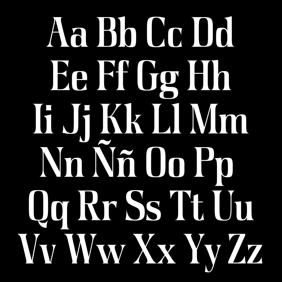
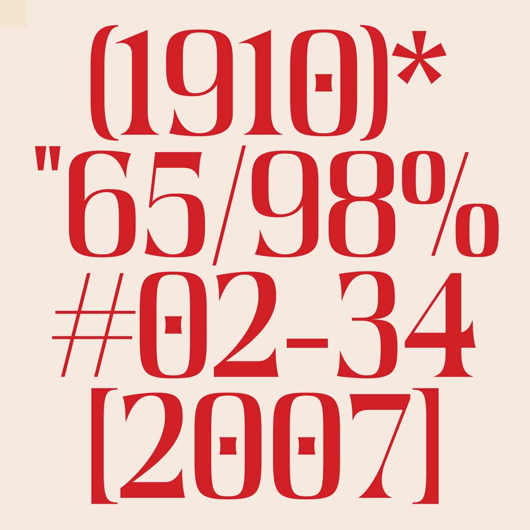
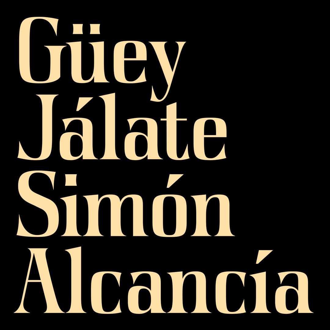
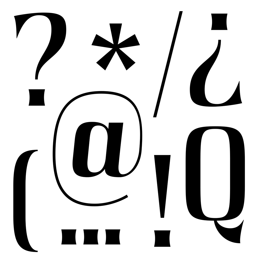
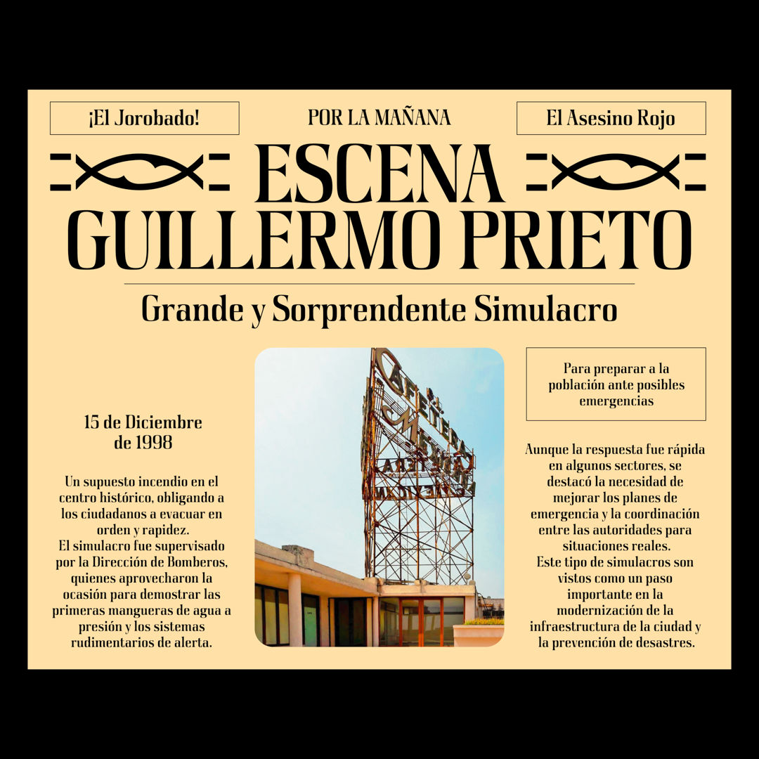
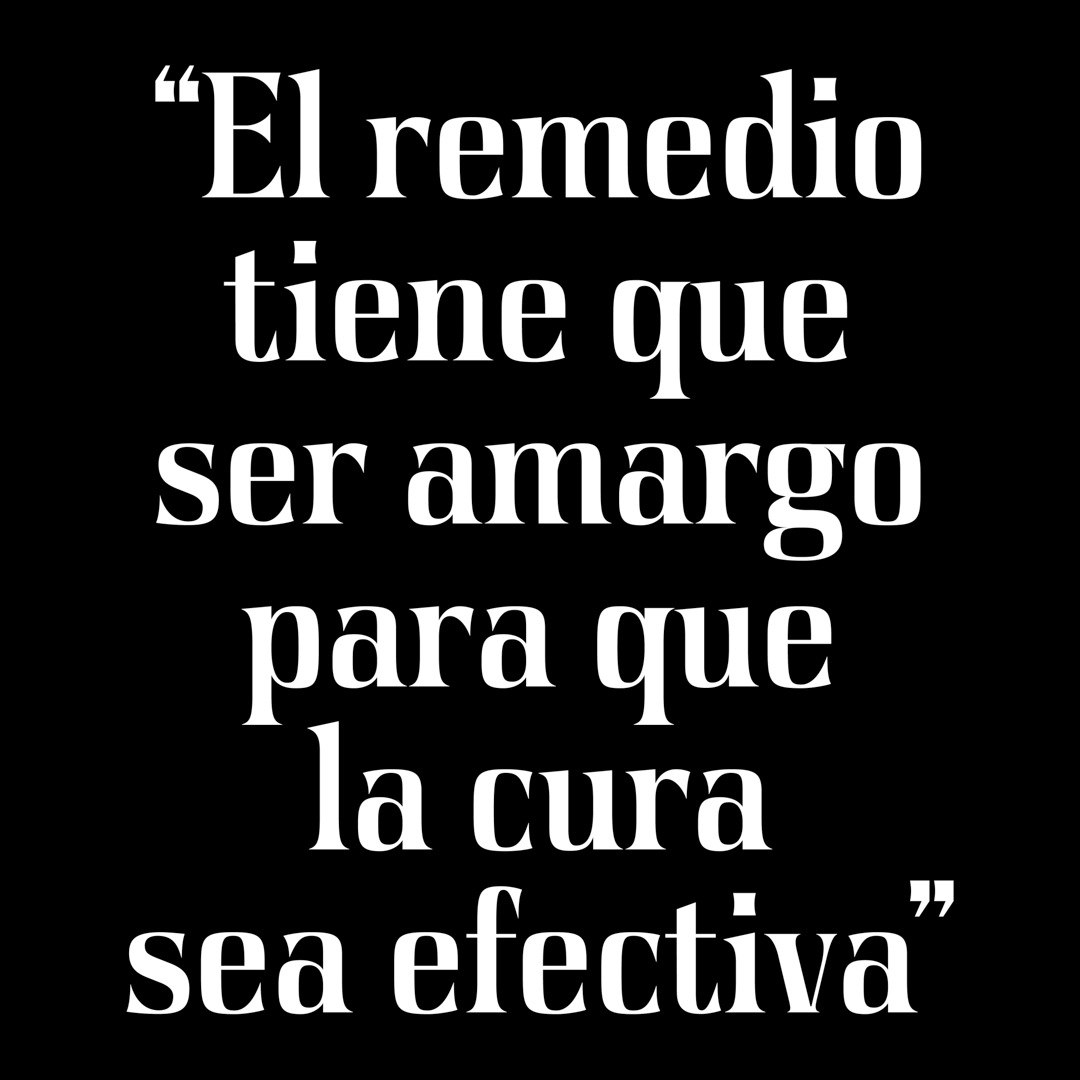
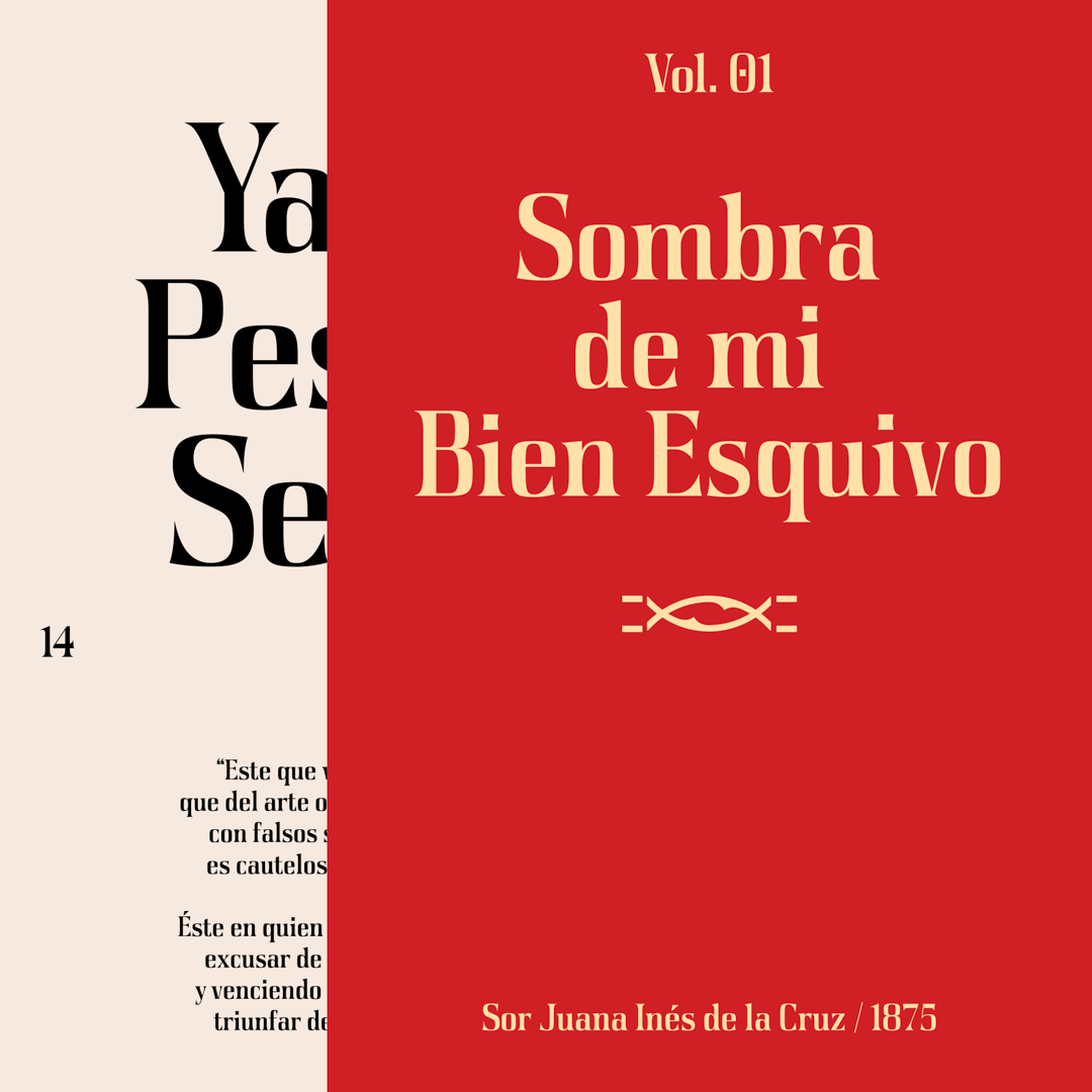
Inspired by Mexican “grabados” from 20th-century artworks. The goal was to design a typeface that captures key characteristics of the typefaces from that era. The result is a typeface with sharp edges, bold weight, condensed proportions, and high-contrast characters. It blends historical influence with a touch of playfulness and subtle quirkiness.
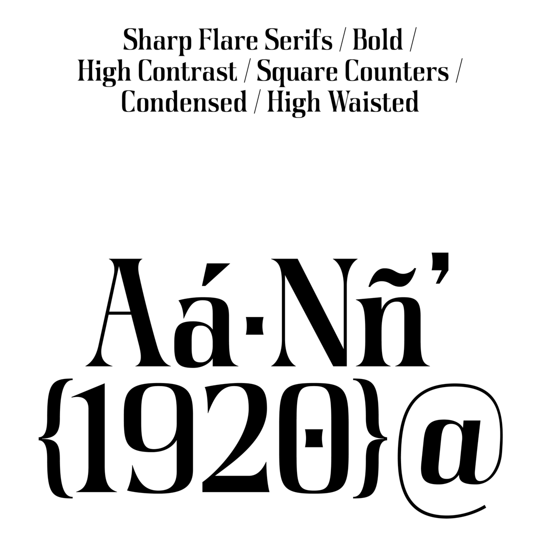
Researching the typefaces of this era was fascinating, especially uncovering imperfect letterforms shaped by engraving and other printing processes used at the time. These imperfections added character and uniqueness, infusing my project with a sense of spontaneity.
Laura Garza
Laura is a Mexico City-based graphic designer with experience across various design disciplines, specializing in branding, packaging, and editorial design.


